YAN TAN
Brand: Fashion
Creating an identity and visual language for the launch of YAN TAN, a sustainable and biodegradable knitwear company, designed and manufactured in the UK.
Studio Up North was tasked with creating a new brand identity and visual language for the launch of the UK’s most sustainably sourced knitwear brand. With the goal of combining lasting comfort with high end fashion. It was essential for YANTAN to create their products the good old fashioned way with, by proud British farmers and their friendly flock, creating unique clothing from the heartfelt care of our animals to the loving embrace of the wearer.
Isle of Paradise creator Jules Von Hep was hooked on desire to establish a new brand that embodied honesty and credibility through a home grown ethically sourced clothing brand, raising the awareness of the importance of supporting the once rich UK wool and farming industry. Helping to educate and captivate a new audience while building a loyal, fashion forward community that feel closer to the process as well as the clothes they buy while feeling grateful to the beautiful animals involved and championing their proud, British local farmers.
The mission was was simple: to be the leading knitwear brand that’s known for inciting change. Creating clothing from the farm, to the wardrobe, and back to the earth. A process made possible without the use of plastics or harmful dyes, with each garment styled to last a lifetime. All while being created to be bio-degradable, meaning our stunning rustic garments can continue to benefit the environment long after and fruitful lifetime. Resulting in beautiful clothing, that’s locally sourced, good for the soul and proud to be worn.
The mission was was simple: to be the leading knitwear brand that’s known for inciting change. Creating clothing from the farm, to the wardrobe, and back to the earth. A process made possible without the use of plastics or harmful dyes, with each garment styled to last a lifetime. All while being created to be bio-degradable, meaning our stunning rustic garments can continue to benefit the environment long after and fruitful lifetime. Resulting in beautiful clothing, that’s locally sourced, good for the soul and proud to be worn.
The brand aims to address many misconceptions linked to the wool industry, from questions surrounding ethics and protection of our animals, to questions around comfort while wearing knitted clothing. YANTAN’s aims are to be fully transparent through their end to end process (supported by Made in Britain) while continuously educating the wearer on how best style and dress their garments.
Teaming with agency: The Point, we were able to effortlessly cable together valuable insights, not just on the market and it’s landscapes but on the importance of the wool industry in the UK, which directed us to YANTAN’s ultimate aim:
“As Dorothy once said, there’s no place like home. And nothing makes us more proud to be British, than the rolling green hills of the countryside. Sadly, not every vista is as rosy as it seems. As many British farmers are struggling to maintain an income from home-grown produce, as global commercialisation takes over. This is very true of the wool industry, one that has been decreasing in value, and often dumps tonnes of fleeces every year. As softer, cheaper foreign imports fill our high street. So we decided now was the time to do something about it. Time to do our bit for a circular economy. Preventing wastage, removing any unnecessary travel, and supporting local manufacturers. We are going to champion British sheep and their farmers, by providing an exclusive collection of beautifully designed, high quality knitwear, that will be a wardrobe staple for a very long time. Designed, grown and made in the UK. And what’s more, there’s no plastic or nasties. So if you do ever dispose of it, it’ll go back to the earth”


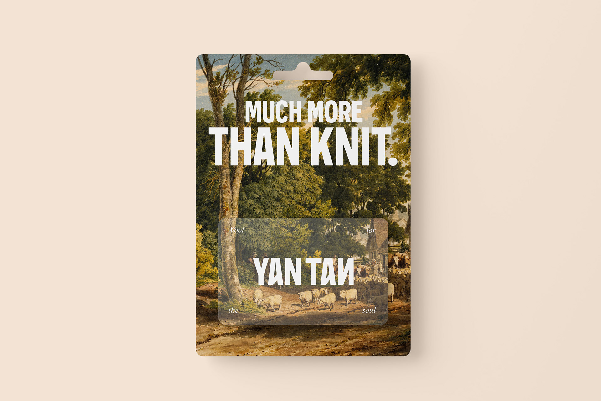
Supplied with all this knowledge, The Point were tasked with crafting the brand’s written strategy, which they did brilliantly by gracefully translating all of Jules’ desires for a better wardrobe, better craft and an even better future into the brands positioning and strategy system, all woven together by ideology: “Much More Than Knit” which harmonises the vision to incite change within the industry, with mission to become the leading brand in knitwear, ultimately pulling together the fabric of the business.
Now let’s get into how the brand is visually stitched together.
Jules Von Hep and Studio Up north wanted to unify farming’s rich history with YAN TAN’s modern philosophy of full transparency. Timeless Slow fashion design as it should be, designed for change, and made to last.
The Brand’s name was derived from the traditional sheep-counting rhyme “Yan Tan Tethera”, used by shepherds in Northern England.
Until the Industrial Revolution, the use of traditional number systems was common among shepherds, especially in the fells of the Lake District. The Yan Tan Tethera system was also used for counting stitches in knitting.
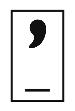
The Identity was created to replicate the tallying system by customising the “A’s” cross bar whilst the reversed “N”, paired with its subtle pattern driven look, represents the end cross stitched loop and repeated nature of our knitted garments.
Something said by The Point often lingered in our minds while crafting the visual language “it’s wool for the soul”. This stood out to us as such a warming statement that we wanted the brand to reflect this as our creative theme. We wanted to evoke happiness, and serenity through a sense of timeless craft and guilt free comfort that feels as raw as the wool woven together to create the beautiful garments.
Our primary colour palette was crafted using the old time-y phrases such as 'red sky at night, shepherd's delight' as inspiration. The colour hues are created from the vibrancy, sights, tones and tints seen from the beautiful vistas of British farms and are presented to convey the bright and dynamic nature of our brand.
Oil paintings represent that through the passage of time some things never change. They remain timeless, future proofed and elegant. An enduring art piece, considered beautiful more and more with age. An undying media.
This helped to heighten the brands unique brand philosophies while amplifying its respect for heritage and tradition.
When sifting through typefaces that best represented the brands narrative and ethos, we knew it was important to highlight the bold, dynamic and vibrant nature of the brand, whilst reaffirming the quality production involved in creating Yan Tan clothing… Enter Novecento, a typeface steeped in the same history as the brand it represents, a font family inspired by European typographic trends between the second half of 19th and 20th century. The font stands tall, proud, principled and well crafted.
Due to its big and bold nature, Novecento perfectly walks the line between informative and inspiring in a way that seamlessly enhances the beauty and educating nature of the messaging, imagery and paintings it partners with. All while Plantin MT is paired to express the more natural, caring and sustainable side of the brand as it shows attention to detail and a care for carefully crafted products.
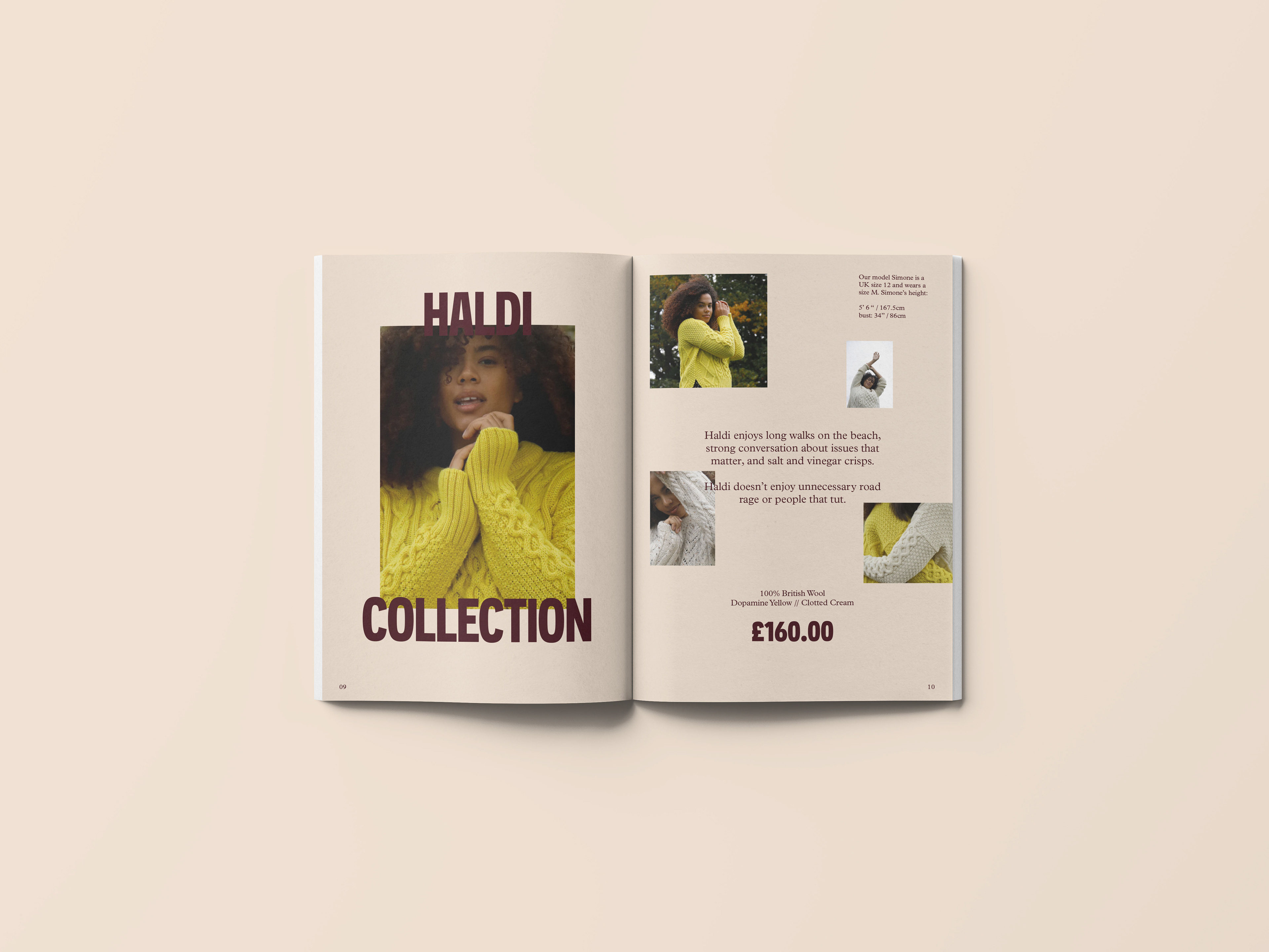
Finally, when highlighting people and showcasing our products, we wanted to show all people, faces, shapes and sizes, reiterating the inclusive nature of the brand, elevating from wool for the soul, to wool for every soul. YANTAN’s photography plans to tie-in with the values that harness the emotion of the product: Happiness, the rawness of our materials, craft, sustainability and the support for farmers and the British wool industry. The essence of who we are.
It was important for the identity and visual language to work seamlessly over a variety of applications, ranging from their online shop to the tags on the garments themselves. Thus creative a cohesive brand, that continues too warm the soul. SUN’s new identity exemplifies beauty and boldness, contemporary modernism with timeless craft to ensure tranquility, not only those who wear the garments, but to the stylish sheep that will hand you their coat.
That’s what it means to be much more than knit…
Client: YANTAN
Sector: Fashion
Discipline: Brand Identity
Design Team: Ya’Qub Mir, Gabi Duxbury, Jamie Kelly
Sector: Fashion
Discipline: Brand Identity
Design Team: Ya’Qub Mir, Gabi Duxbury, Jamie Kelly
Brand Strategy: The Point Agency
Placement: Studio Up North
Placement: Studio Up North
