
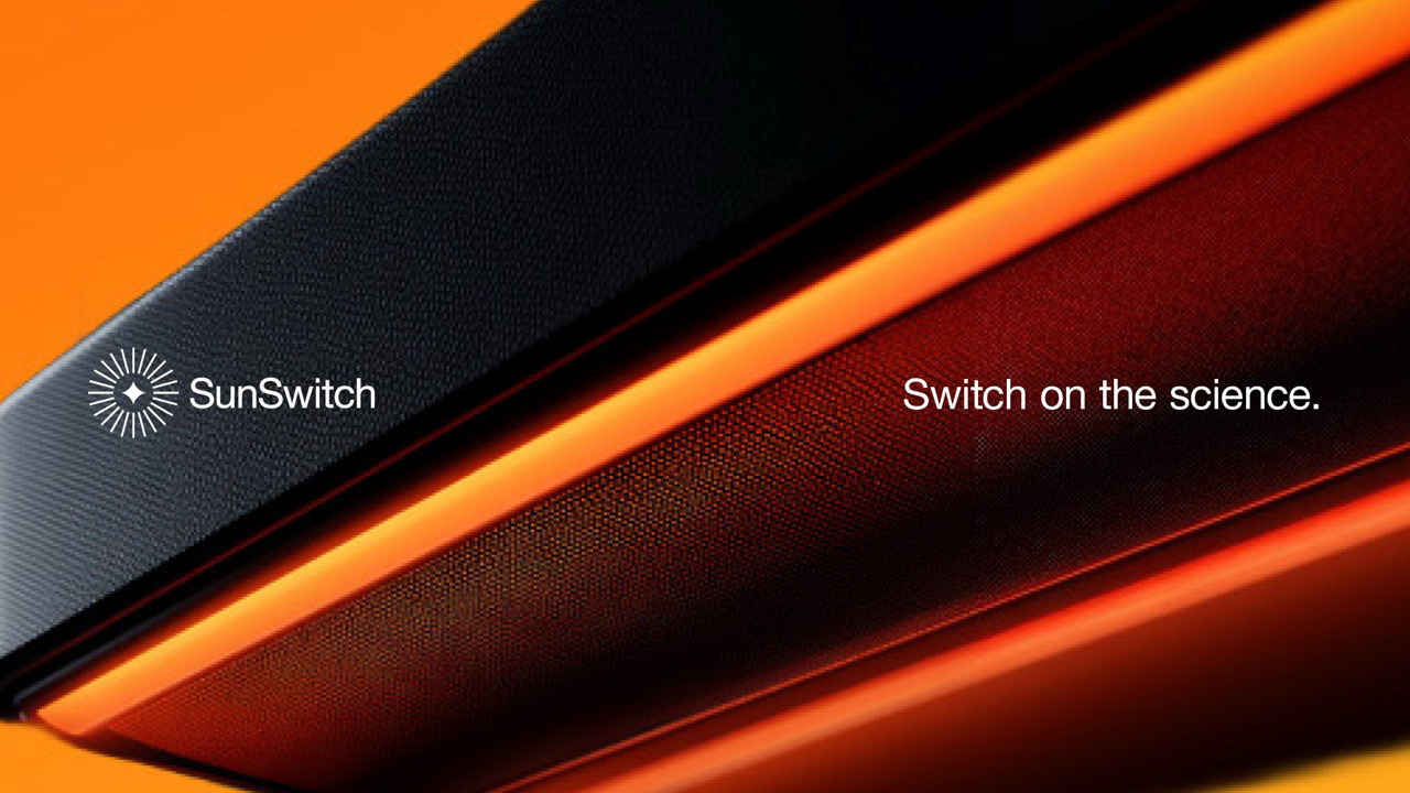
SunSwitch
Brand: Manufacturing & Industrial
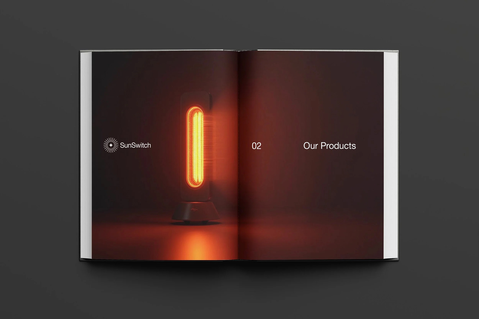
Bringing warmth to a brand's core
Who is SunSwitch
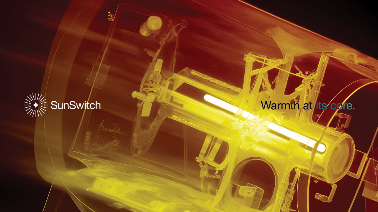
Established in 2001, SunSwitch is the innovative brand behind HeatLogik, a short-wave electric radiant heat technology that emits the same comforting warmth that you feel from the sun without any of the harmful UVs.
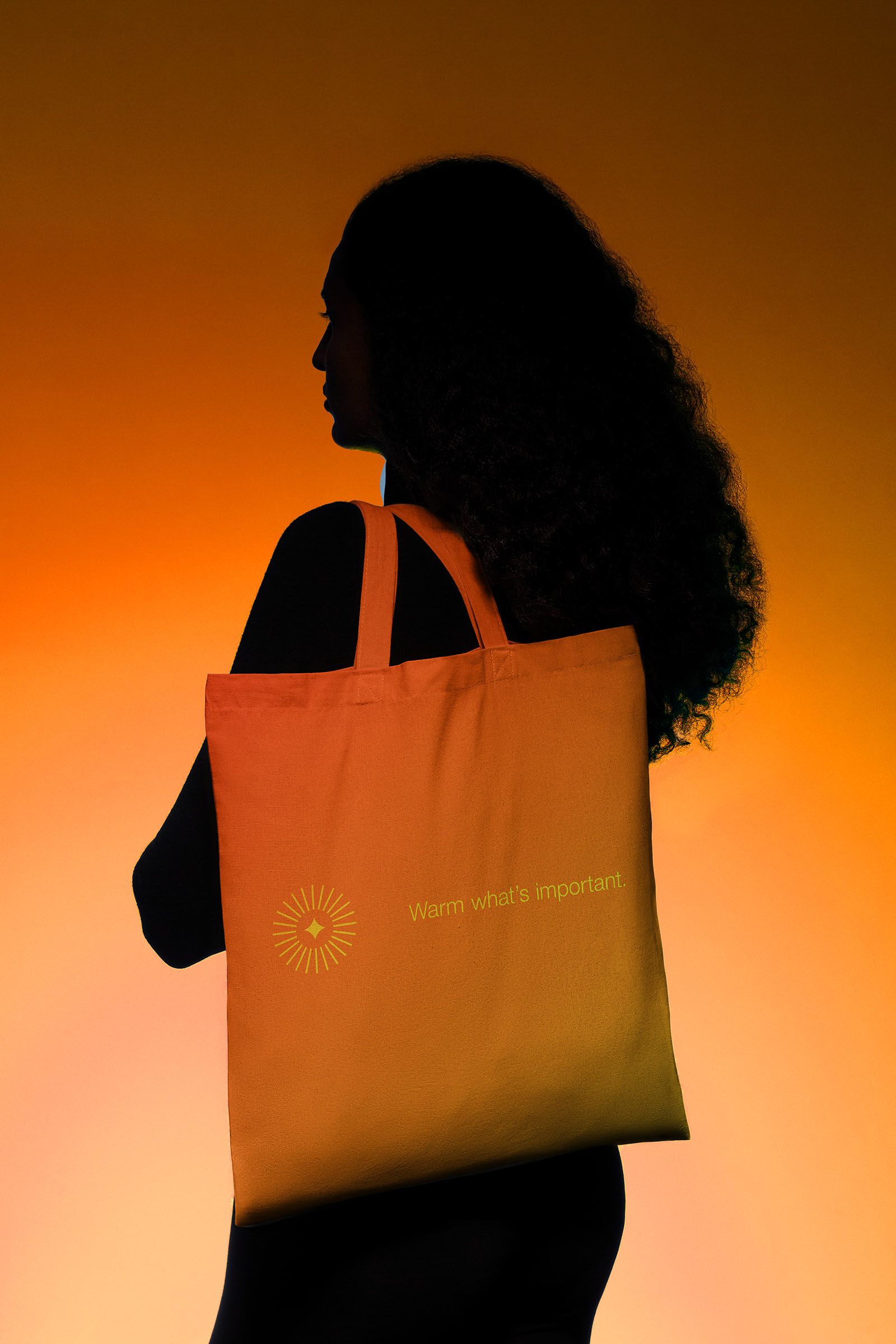
Their unique heating products creates directional warmth that targets the body not the air, meaning whether it be a large open spaced warehouse or animal enclosure at the zoo, SunSwitch’s products only warm what’s important, for a fraction of the price all whilst lowering carbon emissions.
This made SunSwitch a no-brainer for companies across a variety of industrial sectors looking for heating solutions that keep their people comfortable, happy and productive whilst reducing energy usage and avoiding wastage through heat escaping.
The Challenges
The main issues going into the rebrand came down to inconsistencies. SunSwitch had a mix of a mix of visuals, architectures and messaging across the different sectors that lack cohesiveness and created confusion for their many audiences.
With the brand facilitating for so many industries, SunSwitch often found themselves over explaining and over complicated their messaging, leading to their audience feeling overwhelmed by the large choice of products and an over abundance of information, ultimately leading to the target market failing to understand what options worked best for their facilities and why.
The current brand strategy also failed to reflect the innovative nature of the brand by not highlighting HeatLogik’s technological advancements and how it impacts a persons life, instead using messaging that positioned them amongst the competition instead of above.
The Opportunity
With this in mind we at Studio Up North recognised a large opportunity to create an over-arching brand strategy and messaging system that would create harmony across SunSwitch’s many touch points and get to the central focus that connects every sector, the desire to do right by people and to warm them so they can go about their day in comfort.
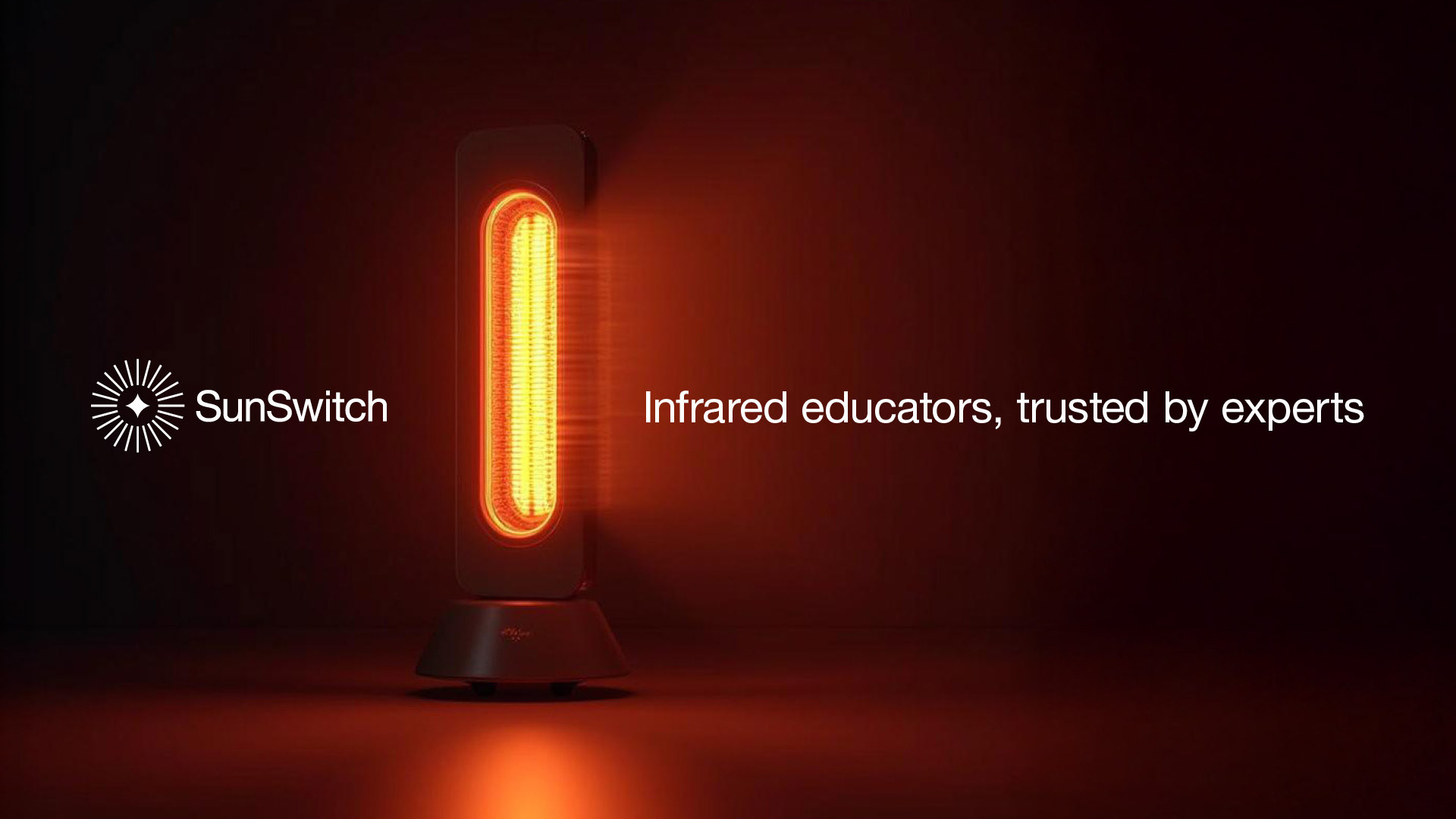
This more emotive side of the brand had to be paired with SunSwitch’s desire to be known as the “infra-red educators” which in turn helped to further position them as a leader in field. Turning them from a team that over-explains, into the pioneers that can articulate clearly, precisely and warmly. As all great educators do.

Strategic Decisions
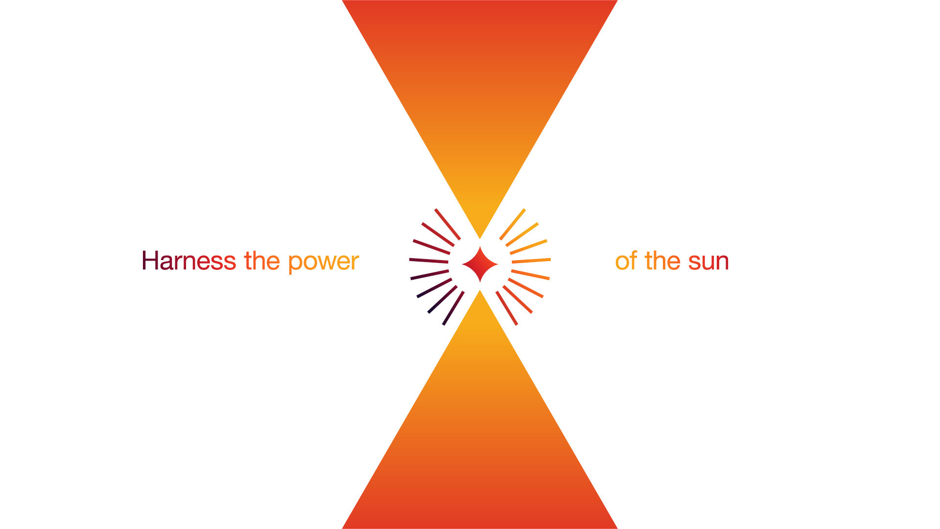
To give the brand cohesion it was important for us to find the one thing that every sector had in common, and create a message that would connect with each and every one of them. To us the answer was staring right back at us. It didn’t matter whether it was a warehouse, a church, a cruise ship or the side of the road. SunSwitch was always there to keep the people comfortable.
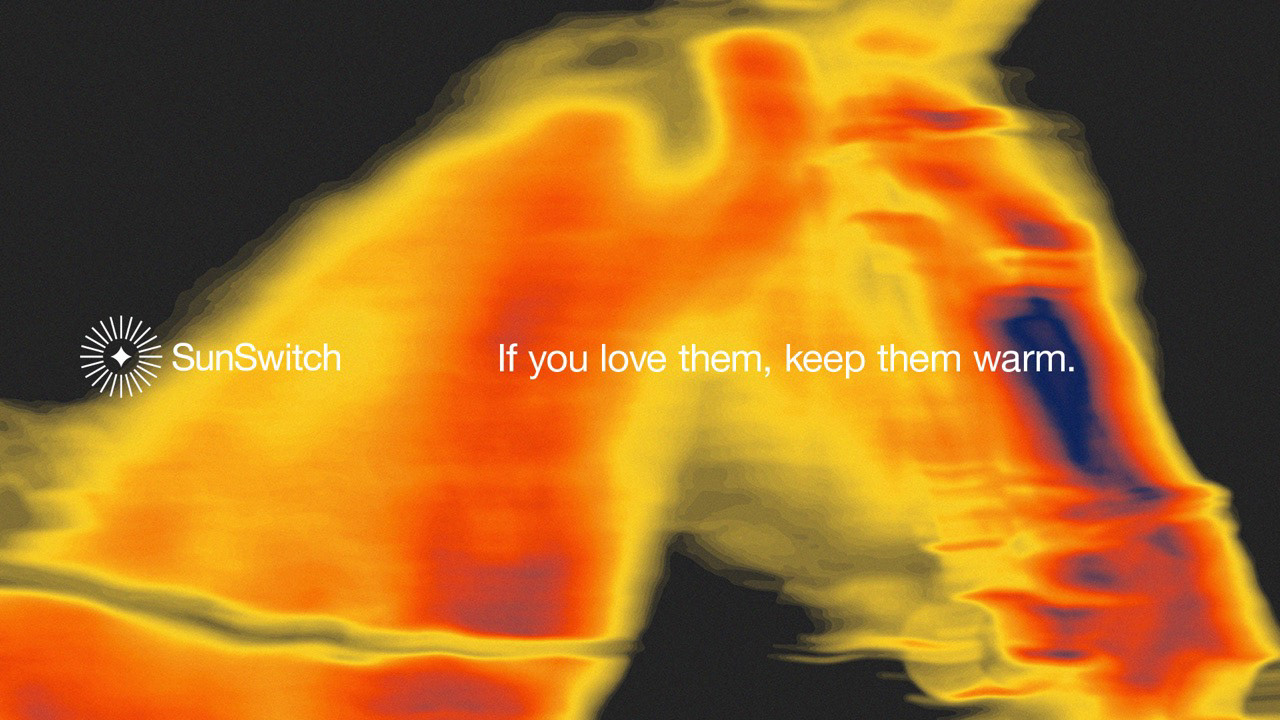
The Sun gives off a calming warmth that is almost impossible to replicate. When it hits you just right you feel complete, content and serene. So imagine if we could give that feeling to people indoors.
The Sun gives off a calming warmth that is almost impossible to replicate. When it hits you just right you feel complete, content and serene. So imagine if we could give that feeling to people indoors.
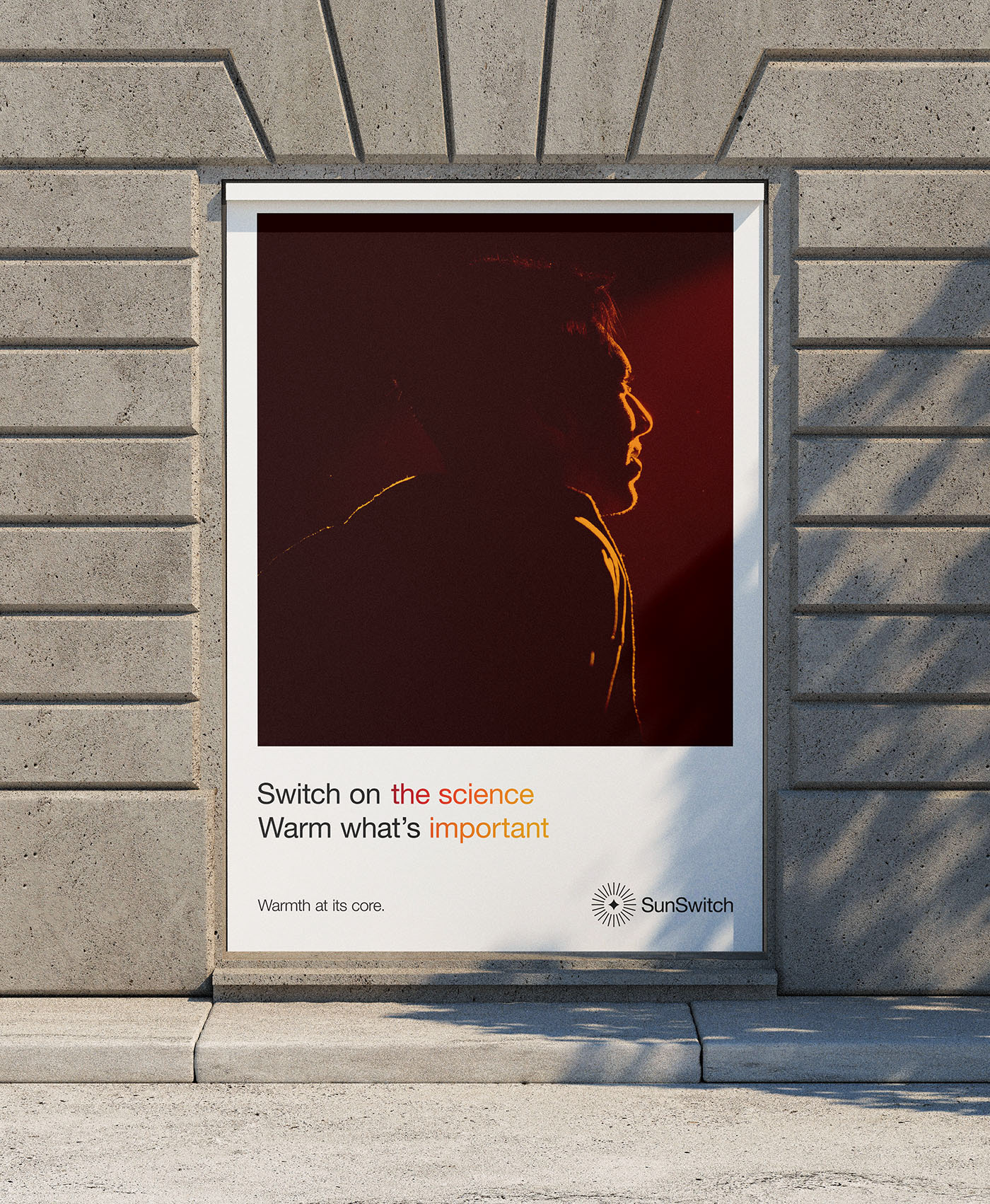
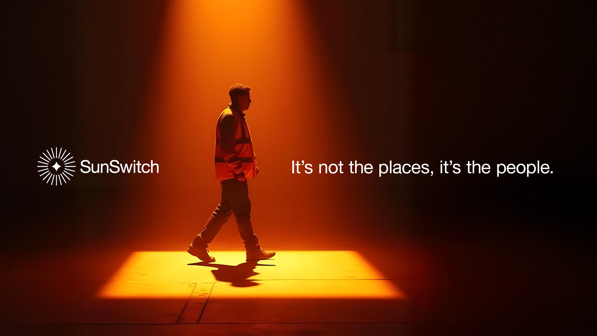
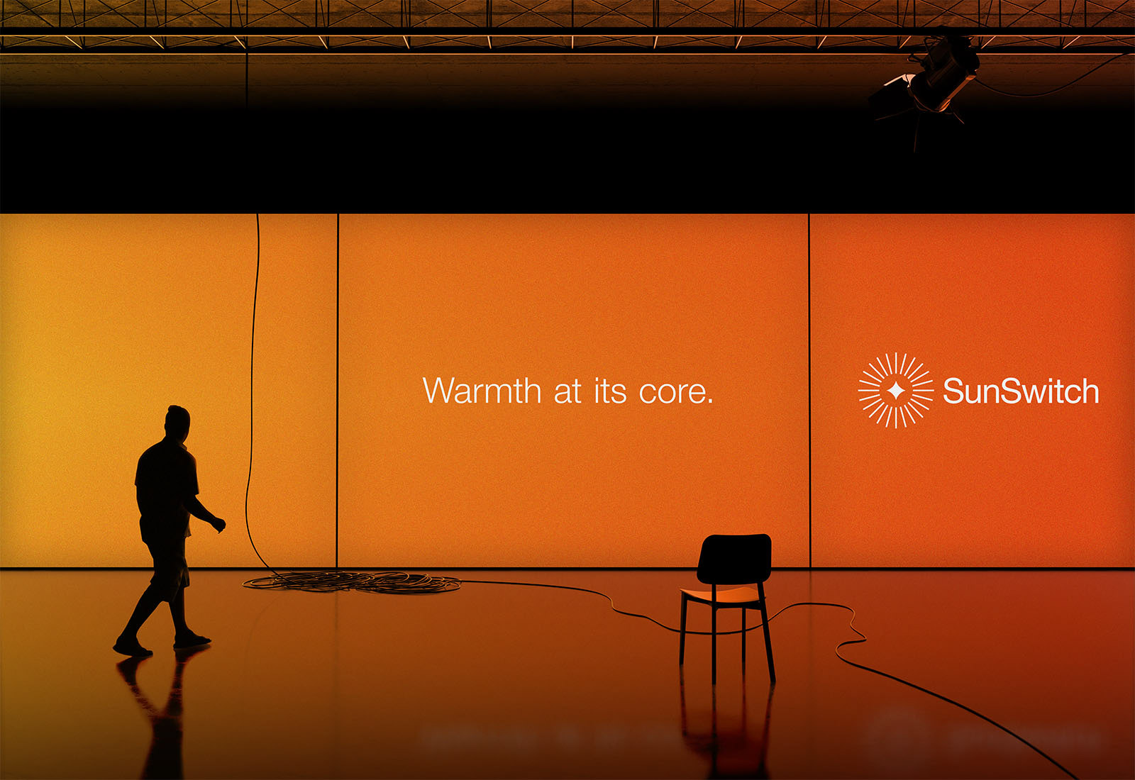
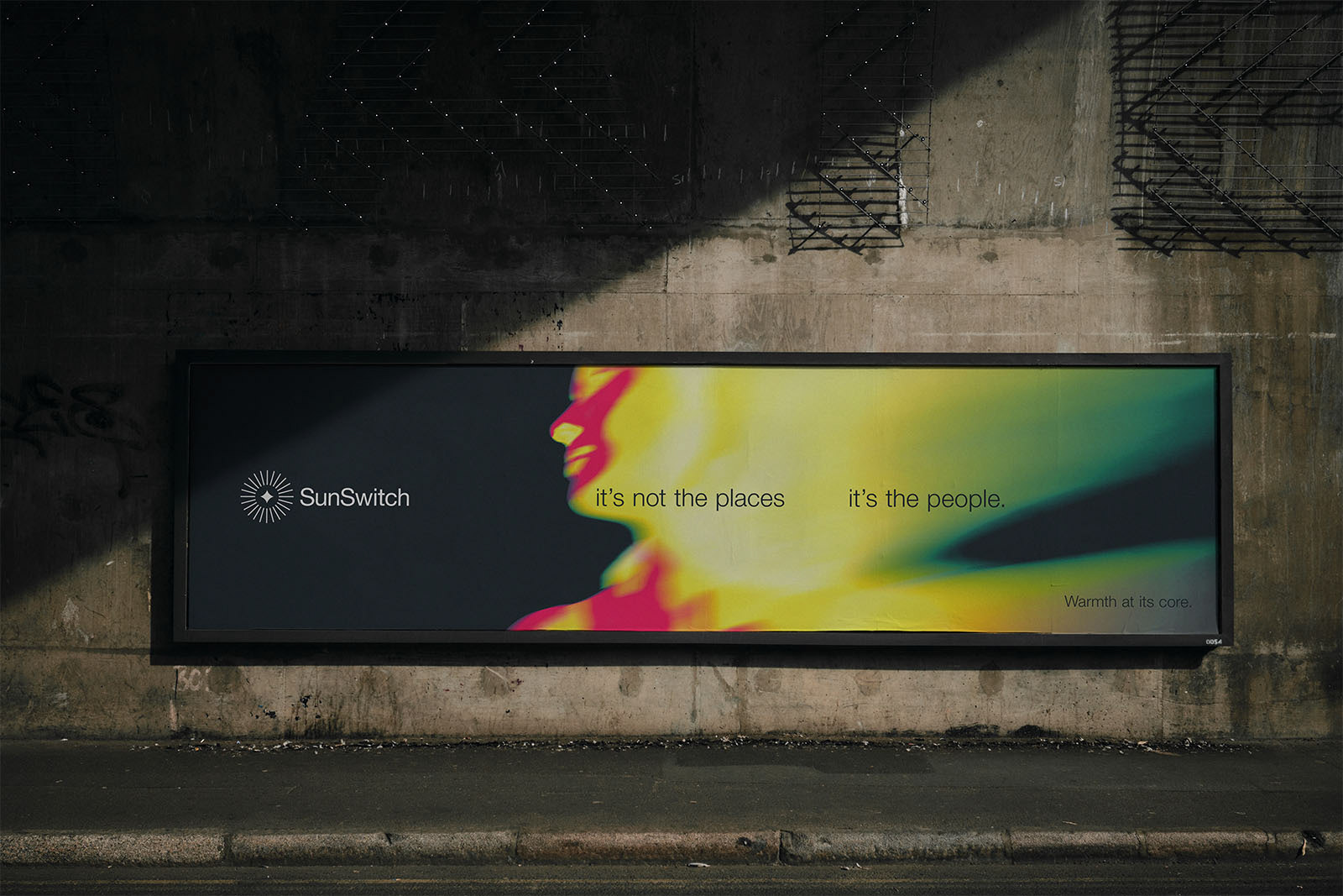
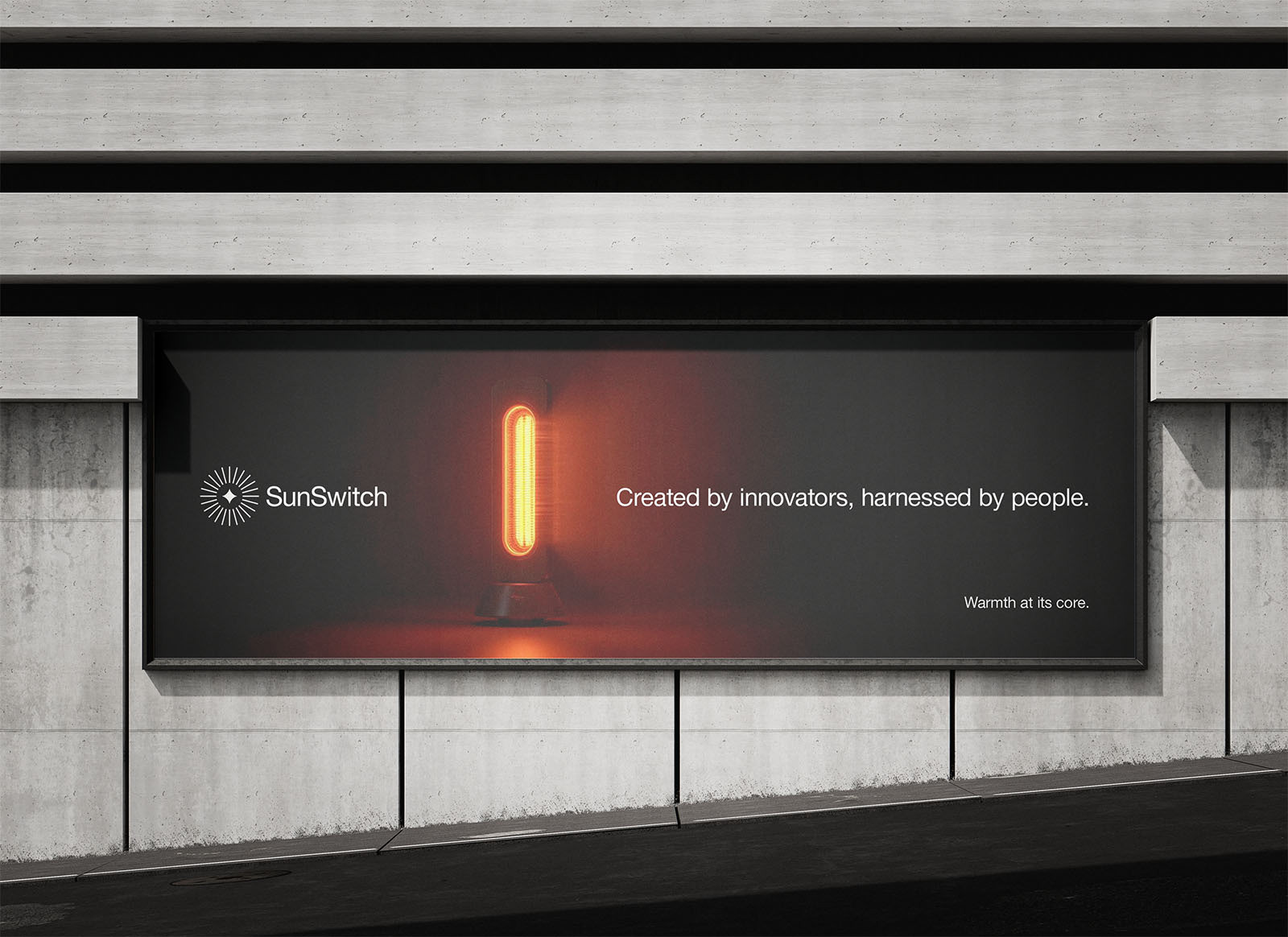
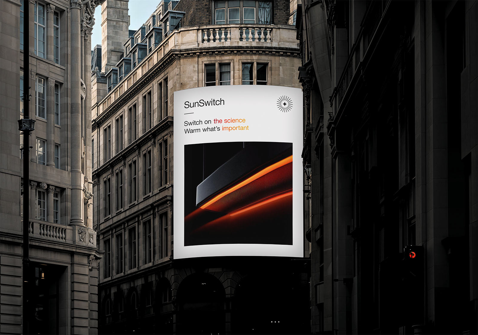
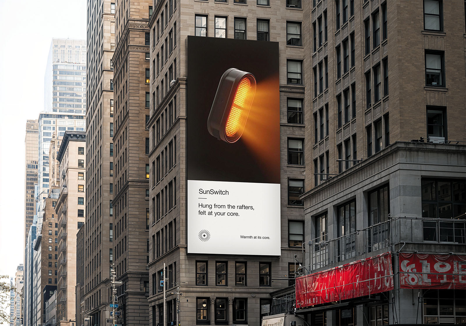
We phrased this as the kind of warmth you felt at your core. We felt like this leading message helped to create cohesion across all of our sectors whilst seamlessly expressing that the core of every business, is its people.
The core motif continued through the brands tone of voice, ensuring that core information was always given to the consumer. This helped the brand create a much better focus for informational hierarchy, identifying exactly what the audience needed to know and when without the fear becoming overwhelmed.
Design Decisions
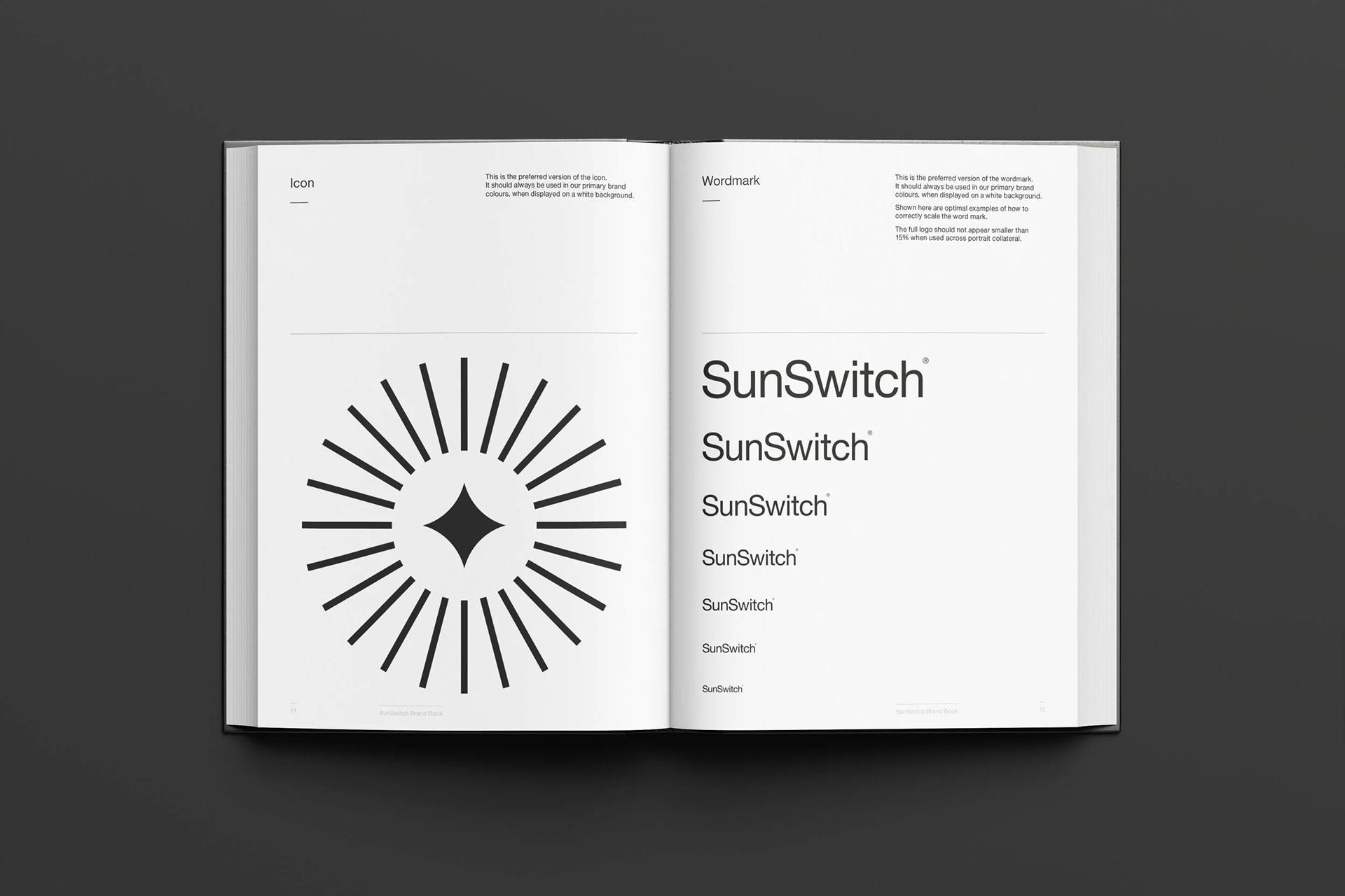
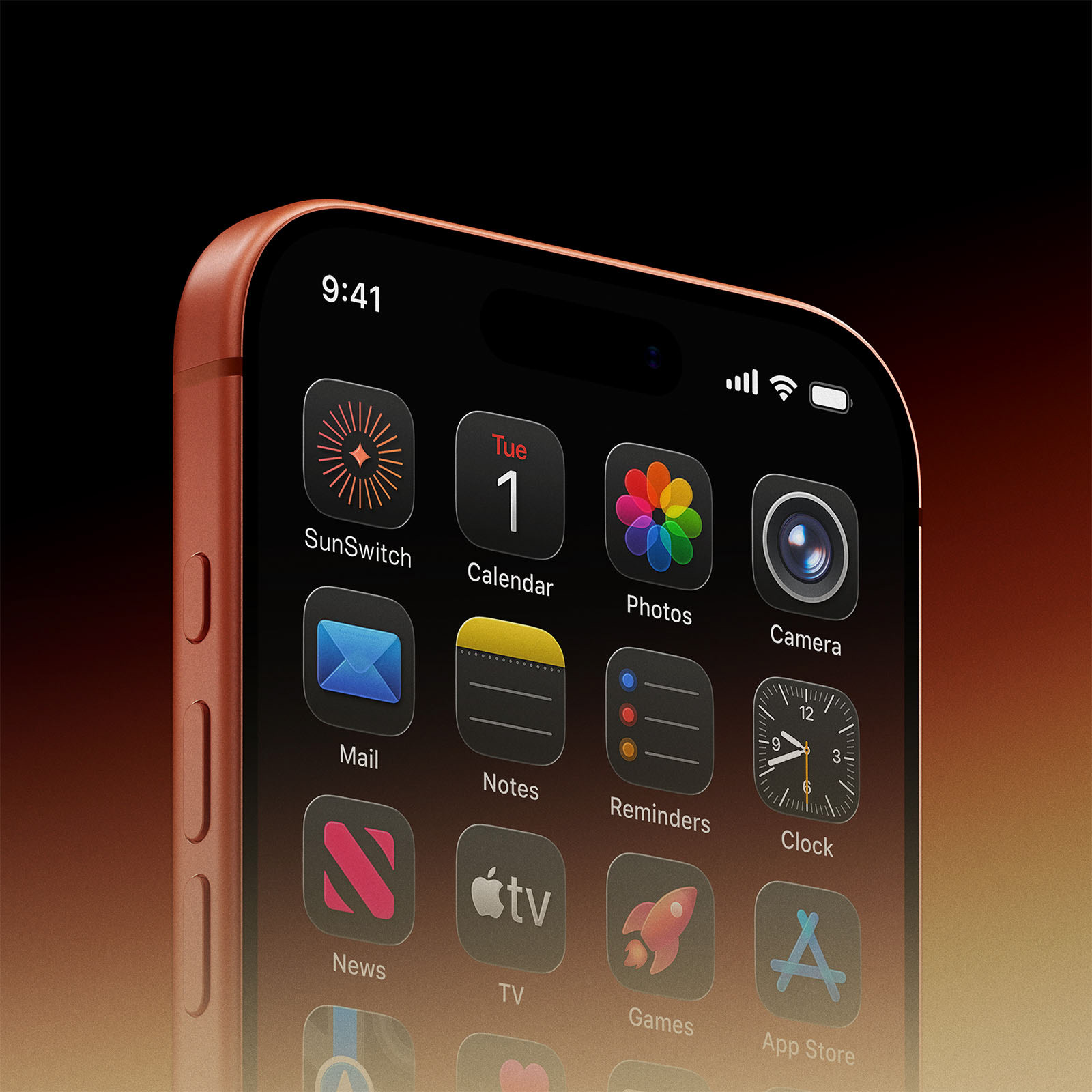
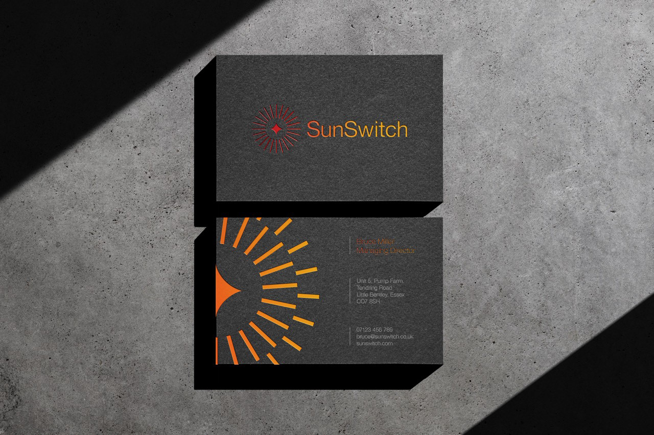
From there the identity concept was developed, all centred around past innovations on how we switched to science to gather education from the sun. The identity was crafted by studying 24 hour sun-dials, which used the suns position to cast shadows, accurately depicting the time of day. This beautifully created and ingenious approach led to further innovations which simply wouldn’t have been possible without first harnessing the power of the sun.
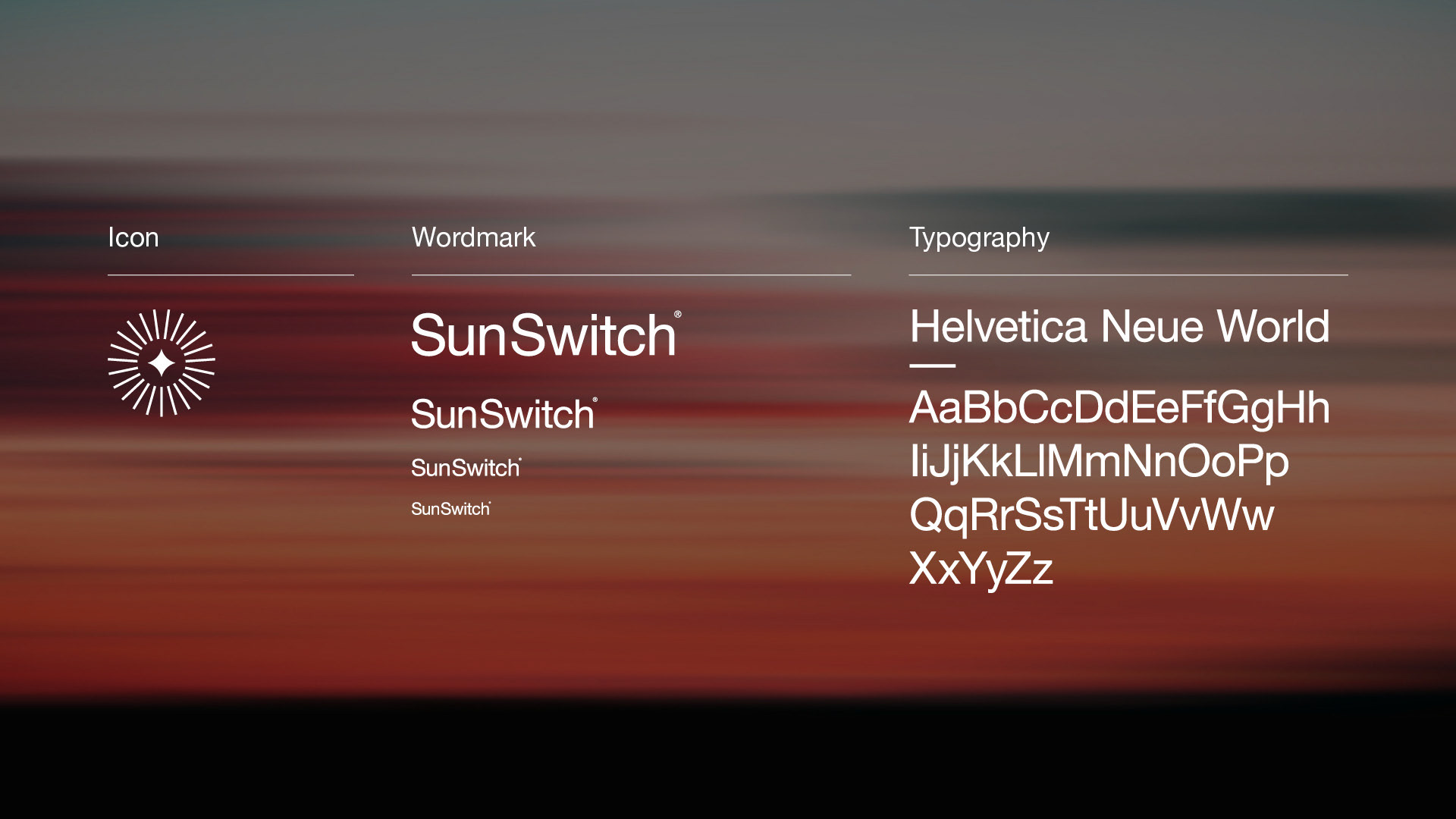
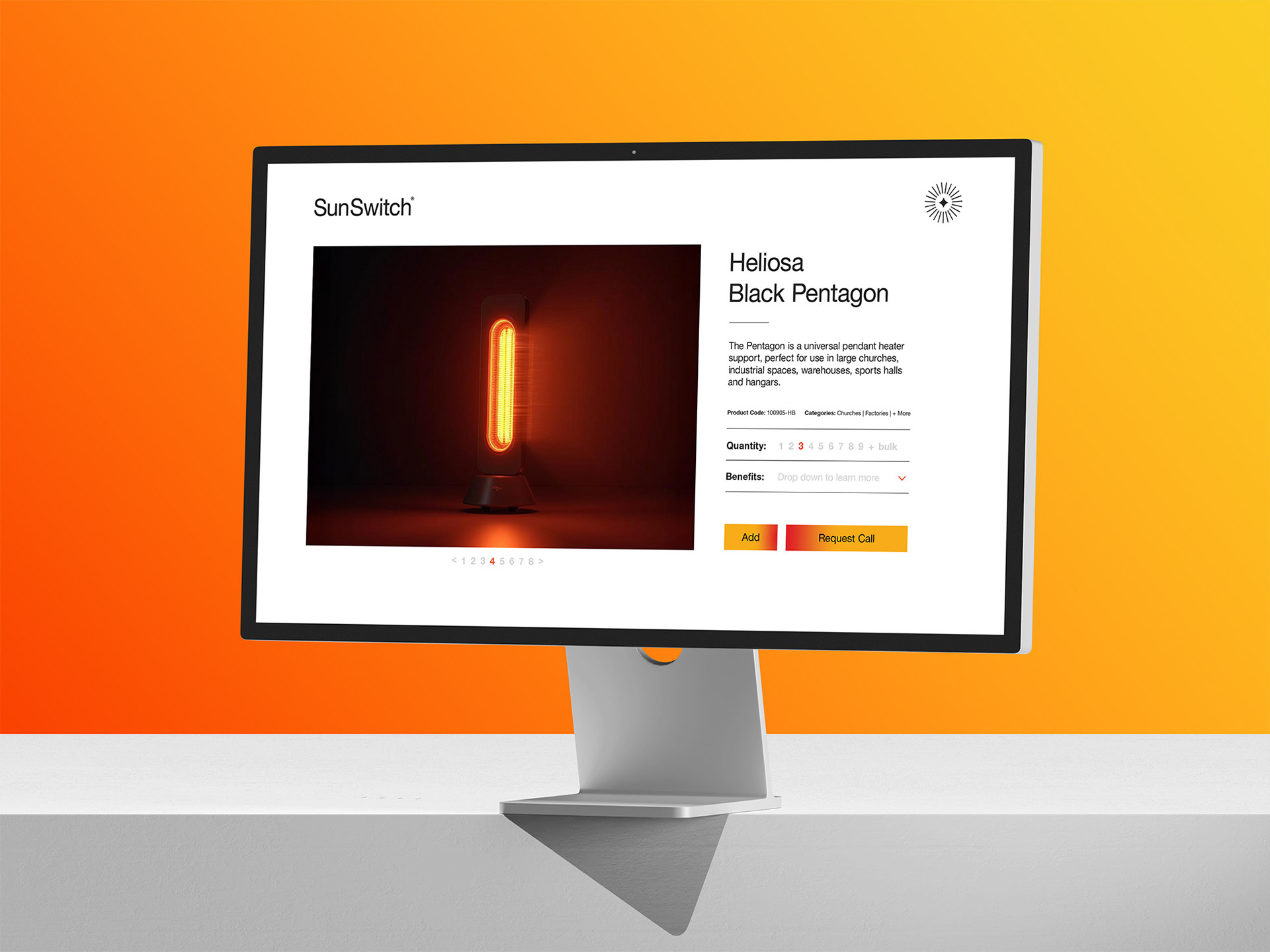
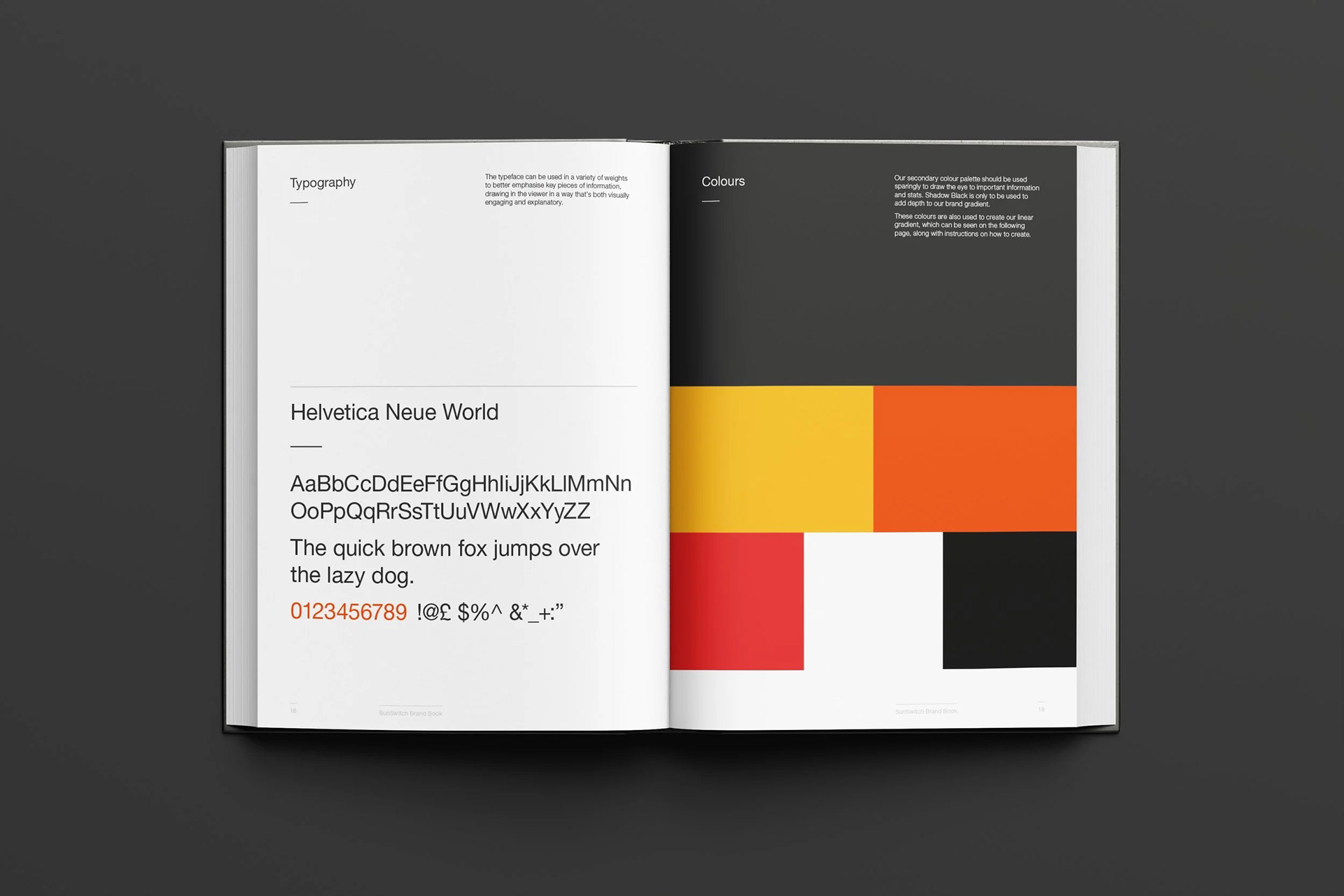
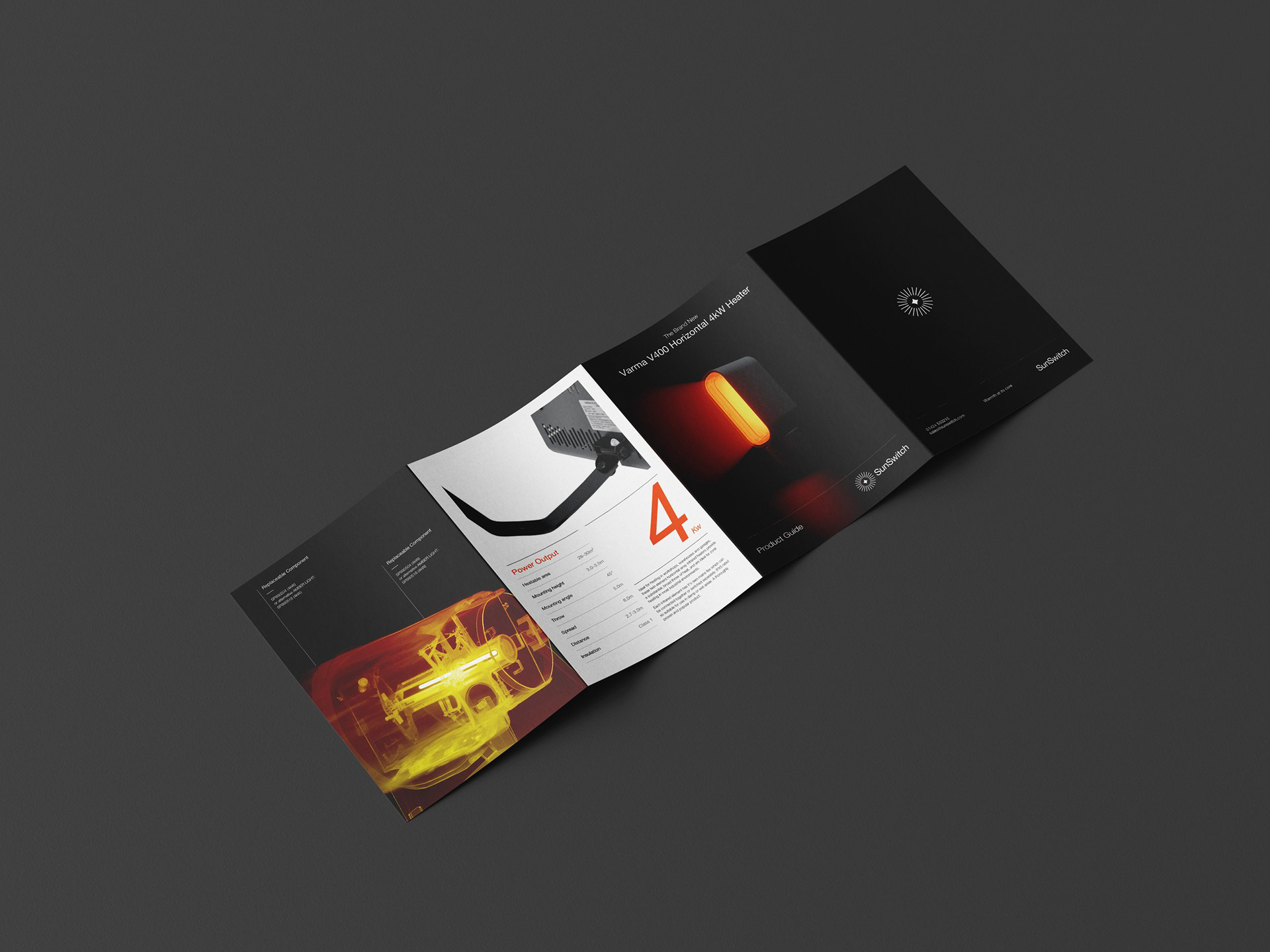
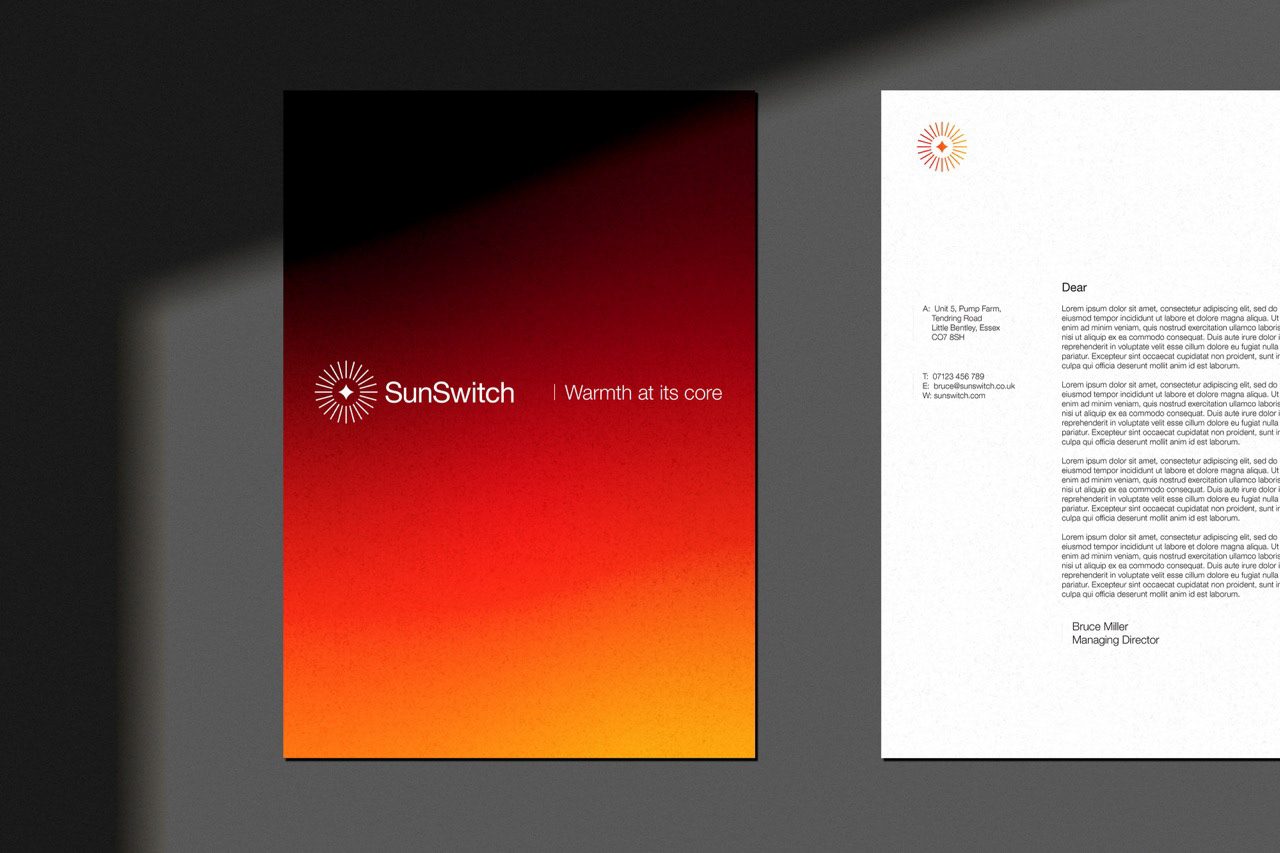
The clean, legible and technical Helvetica Neue World was selected as the main typeface to better emphasise the importance of articulating the core information to the consumer whilst a grid system was put in place to ensure there was always a clear informative hierarchy from a typographic, imagery and illustrative perspective.
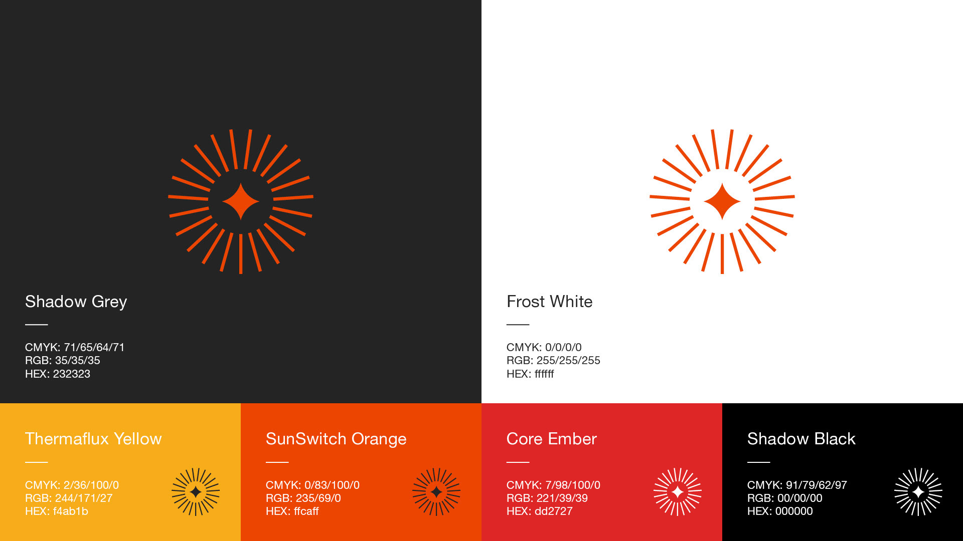
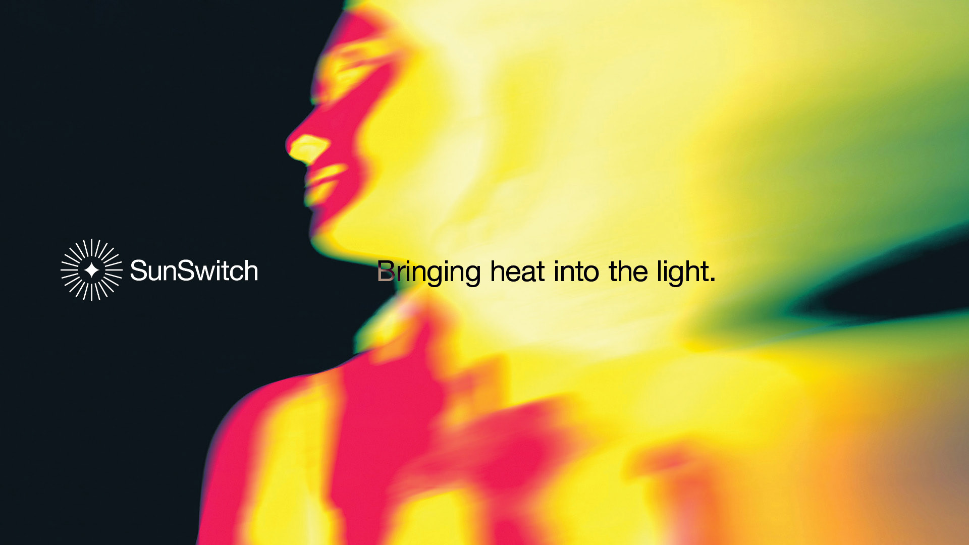
Our colours were inspired by heat maps and people imagery used said effect paired with a black or white backgrounds to better highlight the unique targeting ability of the SunSwitch machinery.
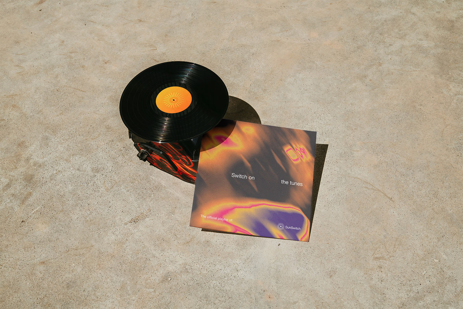
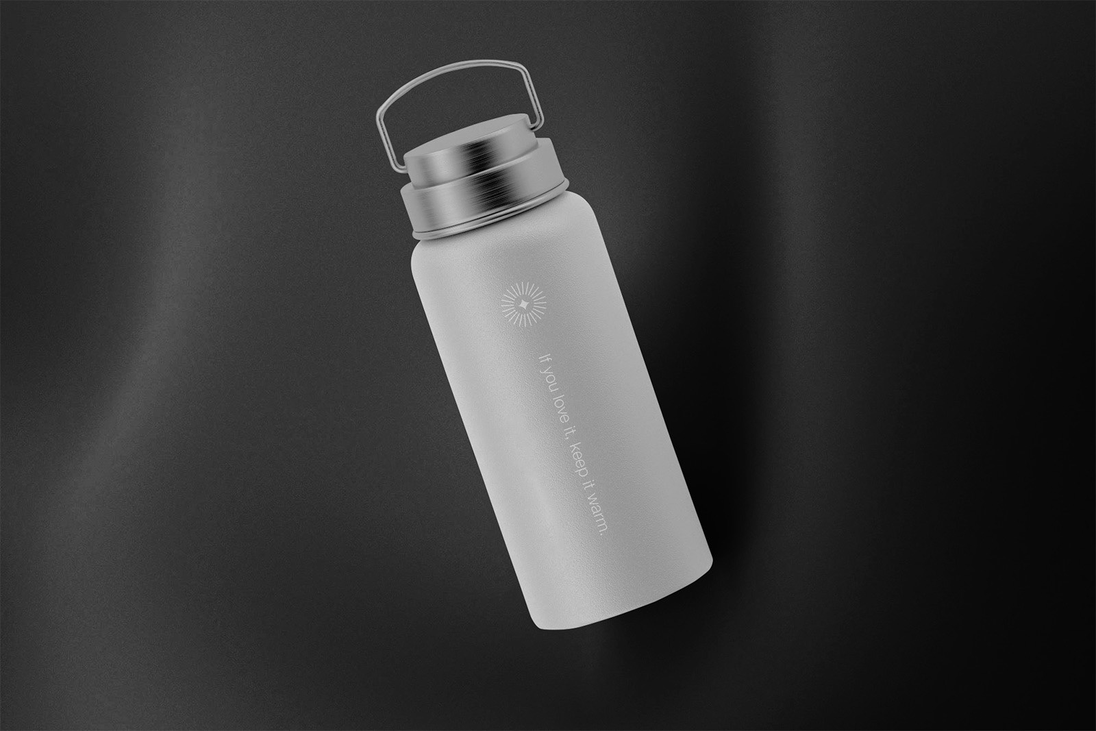
Roll Out
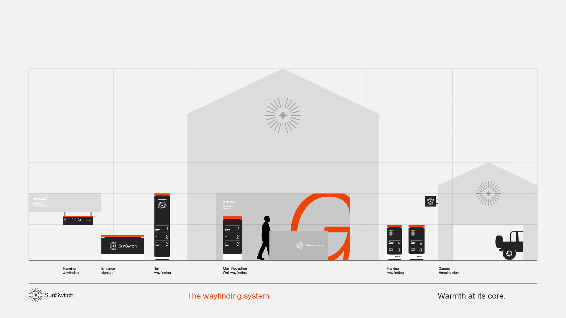
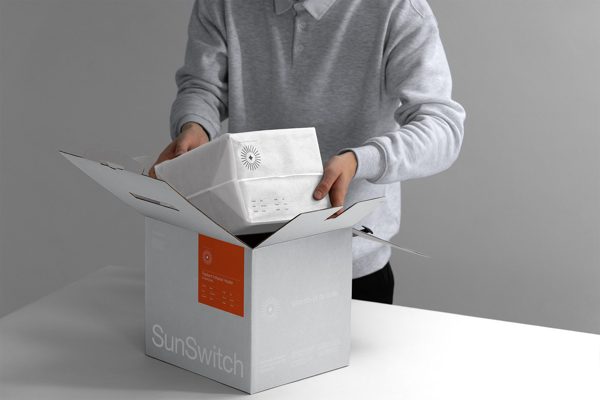
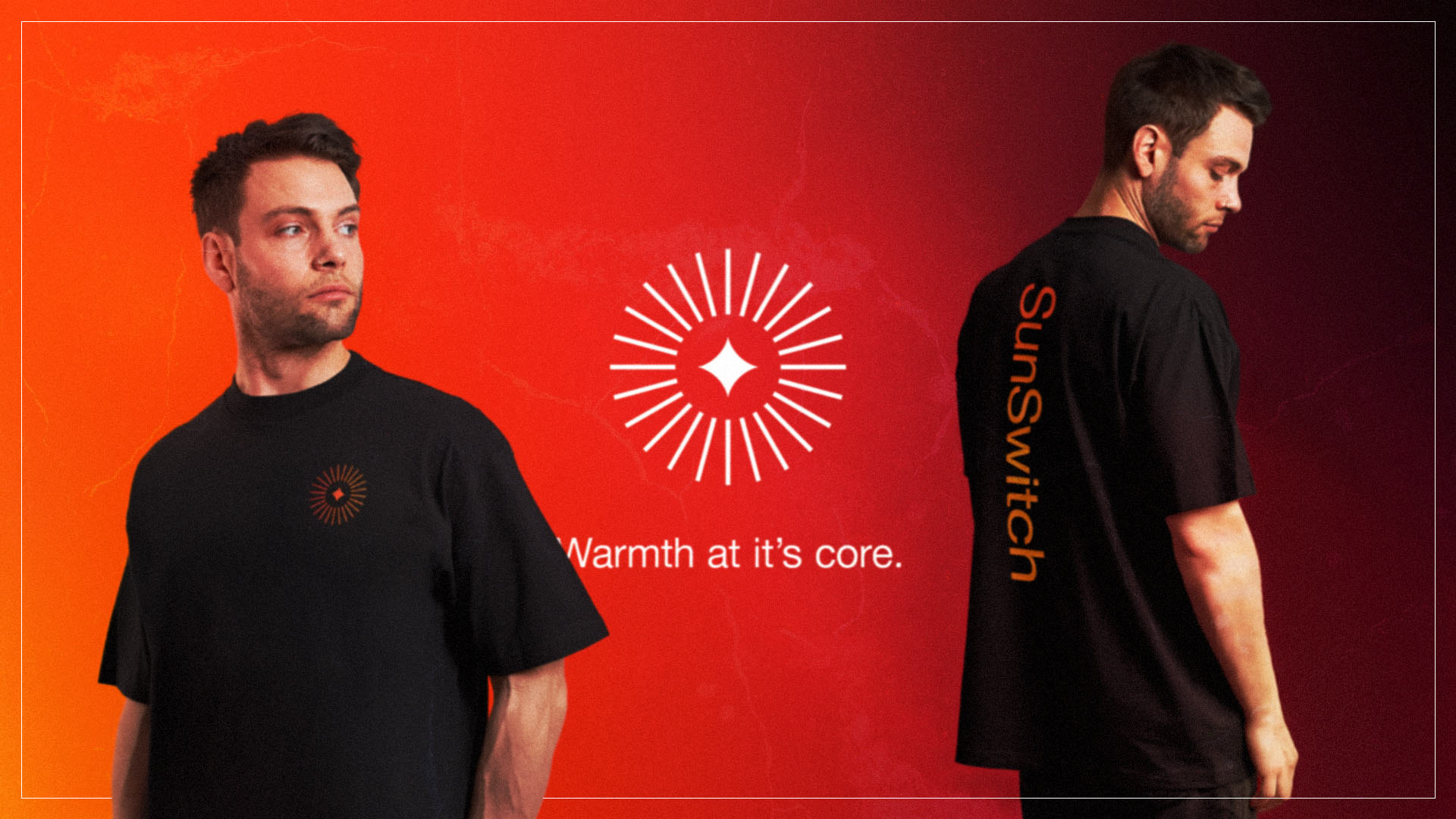
With the previous visual inconsistencies in mind it was important to us that we be as thorough as possible throughout the brand rollout. We set styles and rules across digital, print, animation, sound design and team merch, even considering SunSwitch’s beautifully restored classic Series 1 Land Rover that sat like a titan in their warehouse.

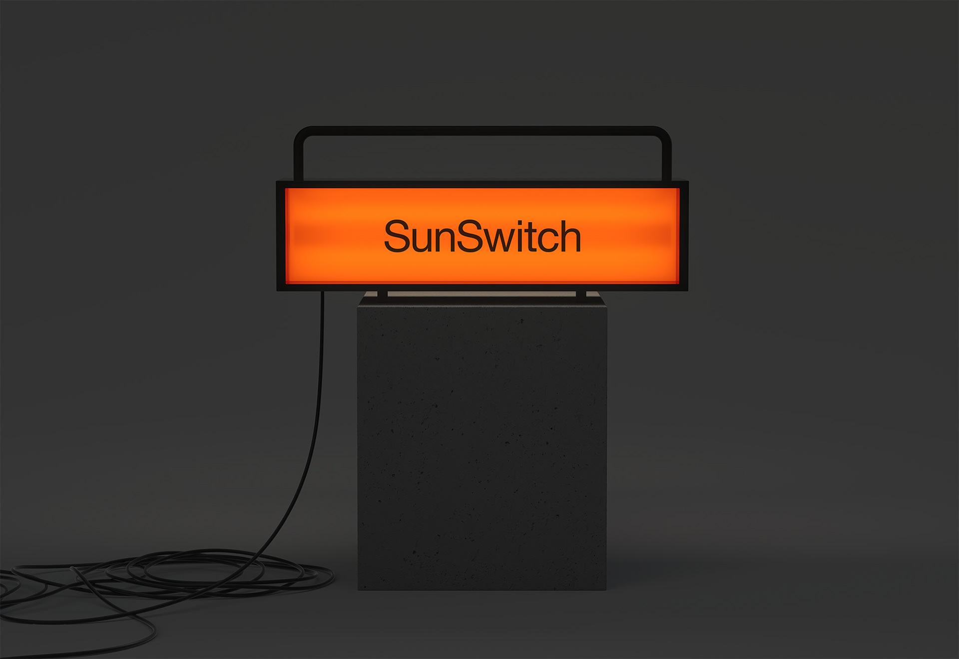


The new SunSwitch brand is confident, modern and flexible – giving the business the tools to express its authority in infrared heating solutions. From logo and messaging to motion and product collateral, every element works together to position SunSwitch as a leader in their category.
Client: SunSwitch
Sector: Manufacturing & Industrial
Discipline: Brand Identity
Sector: Manufacturing & Industrial
Discipline: Brand Identity
Brand Strategy: Mark Wolstenholme, Jamie Kelly, Ya'Qub Mir, Jenny Pilkington
Design Team: Ya’Qub Mir, Jenny Pilkington
Placement: Studio Up North
Design Team: Ya’Qub Mir, Jenny Pilkington
Placement: Studio Up North