SHS - Handling Solutions
Brand: Manufacturing & Industrial
Moving forwards and creating the new visual identity system for the leading provider of material handing and safety products.
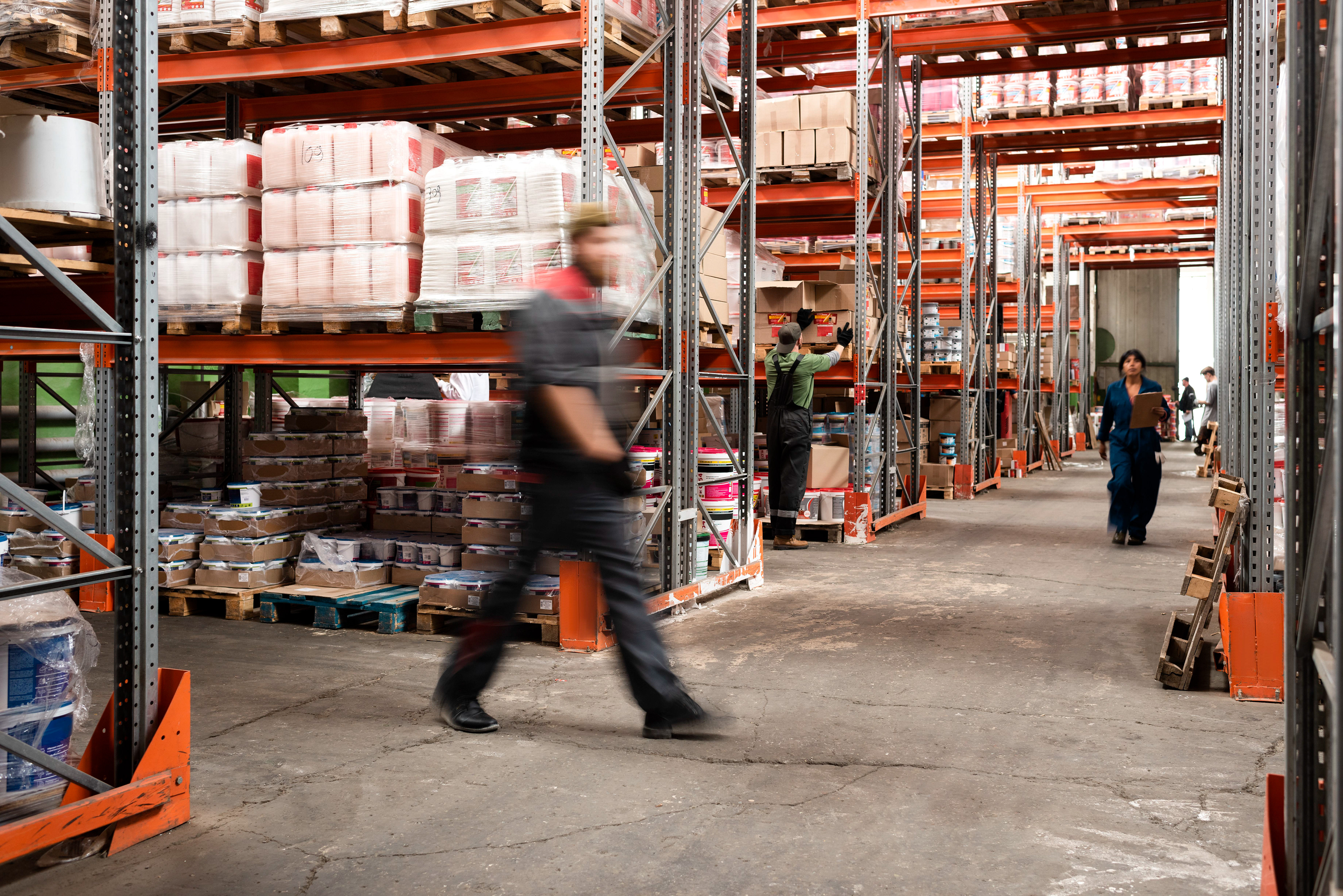
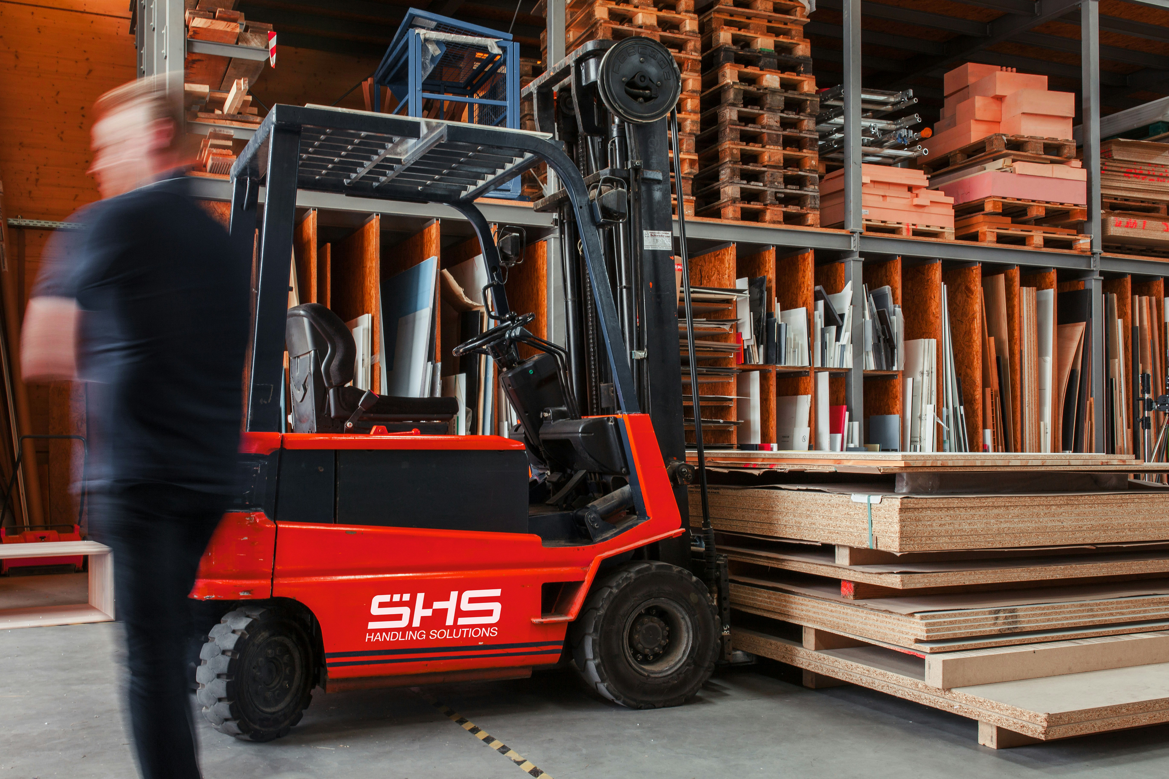
SHS Handling Solutions is the leading provider of material and safety handling products. Founded in 1998, this family-run business has earned a reputation over 26 years for its care, efficiency, constant innovation, and exceptional customer service.
SHS is committed to being on the cutting edge with a forward-thinking approach to customer service, continuously pursuing safer, more reliable, and sustainable solutions. However, their current brand and messaging system were not effectively conveying this commitment.
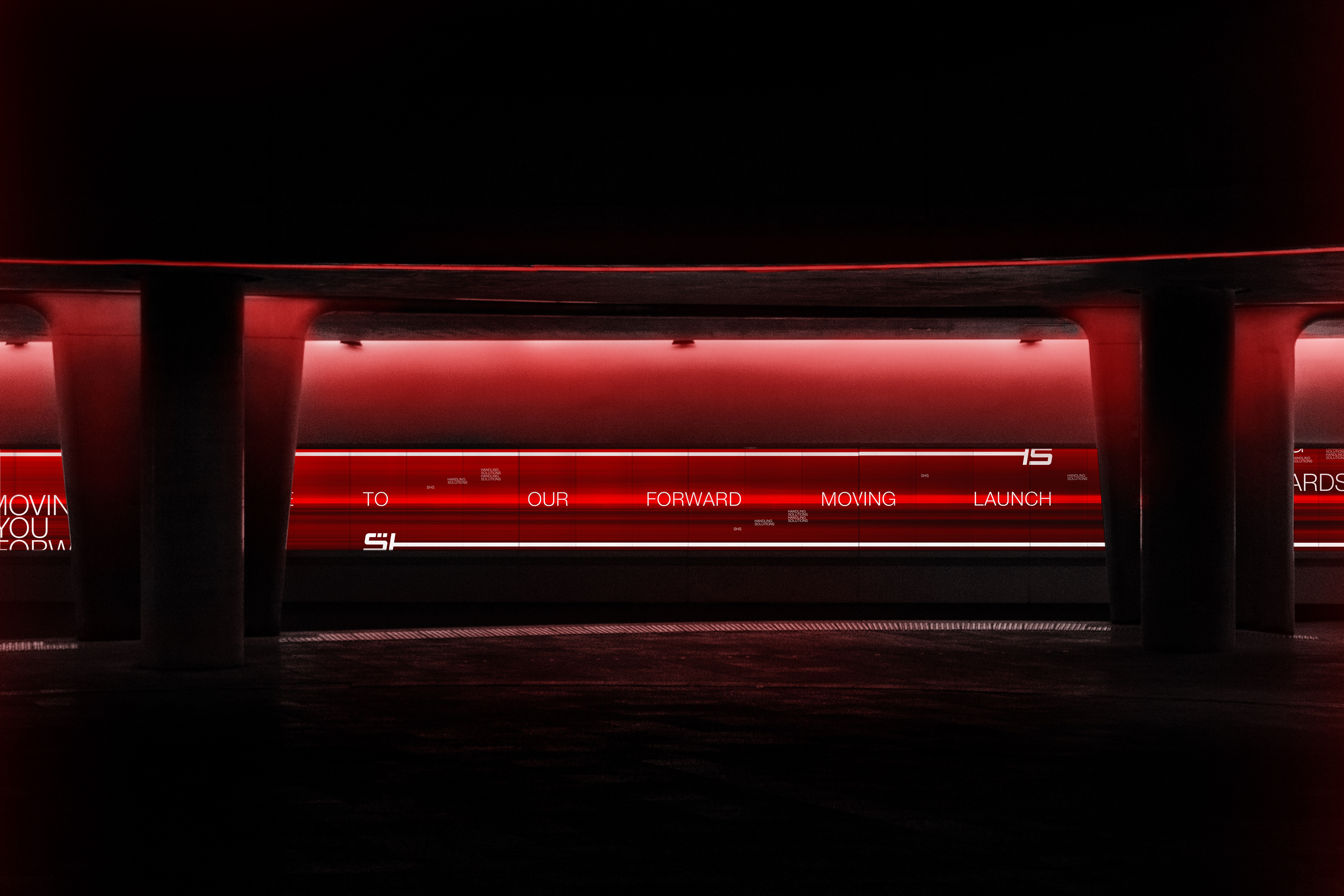
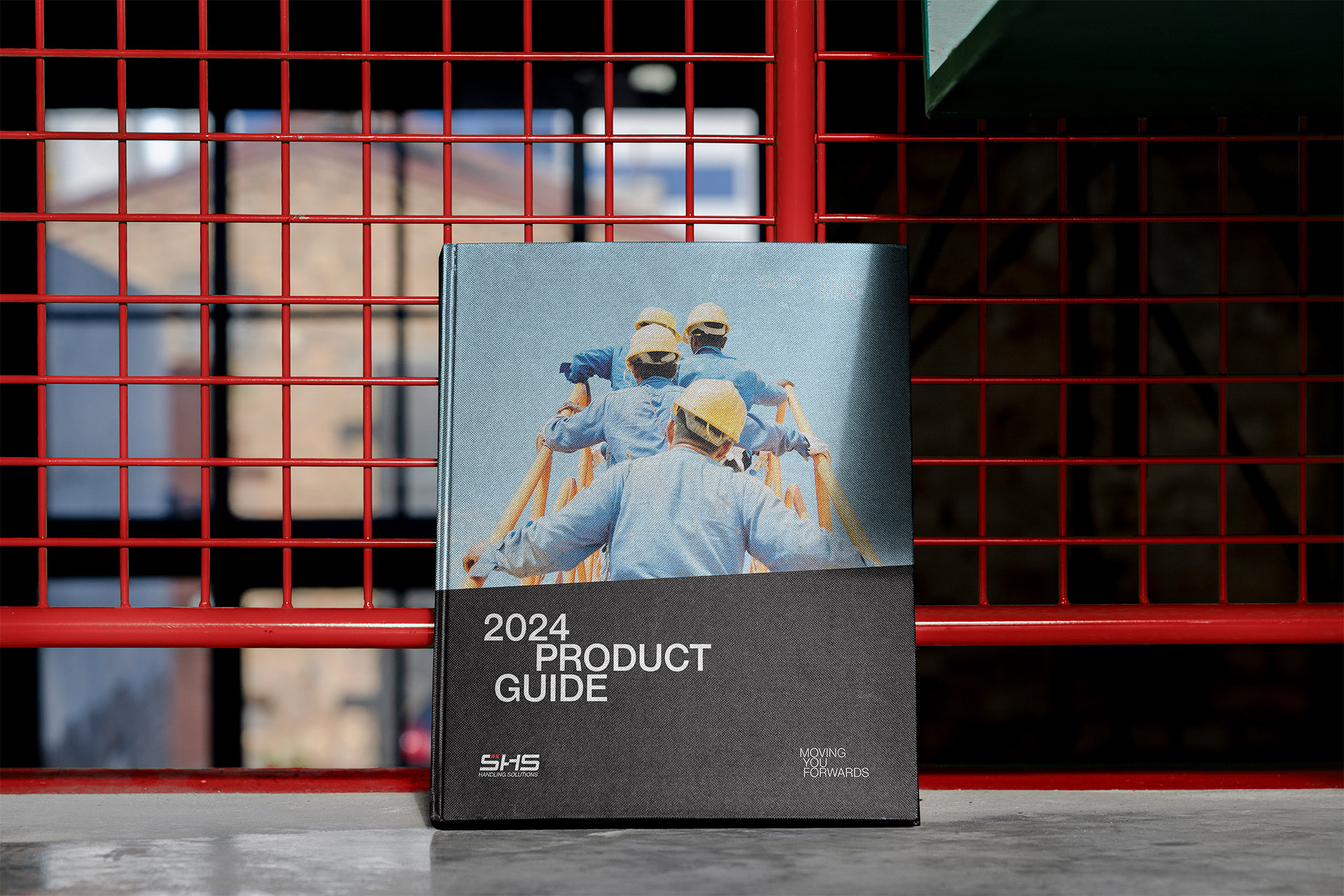
As SHS evolved internally, their branding started to appear increasingly outdated. They sought Studio Up North to rejuvenate their brand, visual language, and messaging architecture to better reflect their ambition and progressive attitude. The goal was to establish a brand that would stand the test of time and elevate their standards of innovation and customer service under the new mantra: "Moving You Forwards."
The new brand needed to communicate clearly across various sectors, highlighting commonalities and addressing the specific needs of their safety and material handling solutions. It was crucial that the brand’s identity be clear, recognisable, and built for longevity. The challenge was to convey the brand’s forward-moving nature without resorting to clichés or overused imagery.
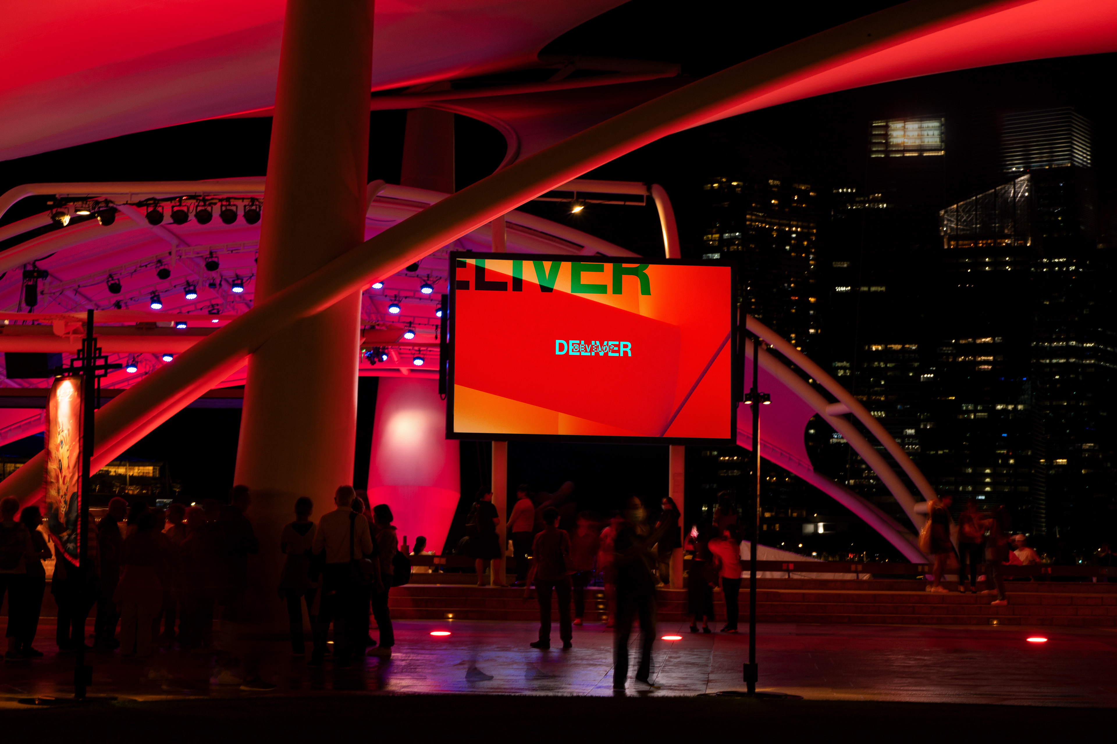
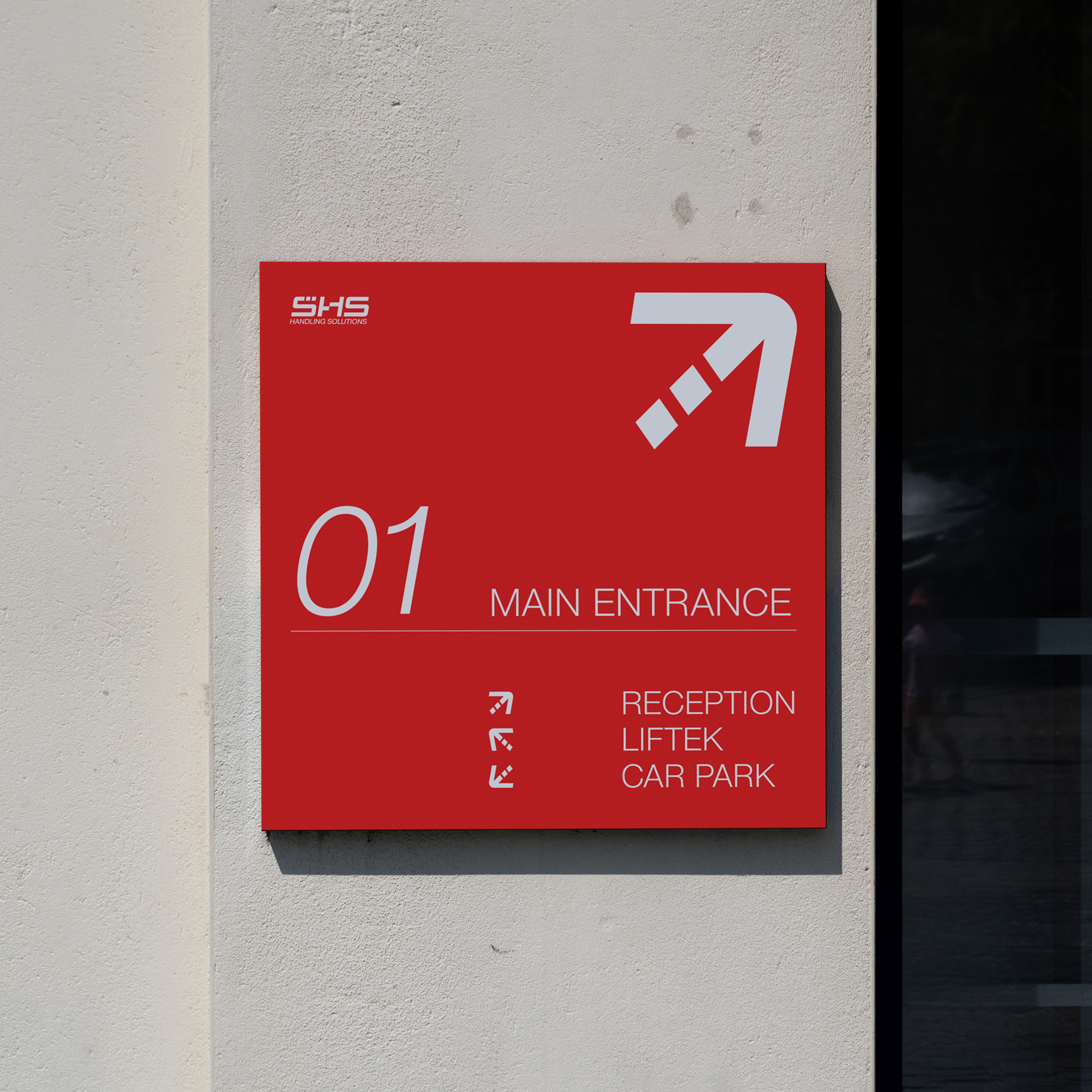
SHS desired a more sophisticated and structured approach, incorporating strong colours, modernist typography, and motion to reflect their role in enabling businesses to move goods more effectively. The brand needed to be adaptable and flexible while remaining legible across various media formats, creating a coherent and engaging visual architecture.
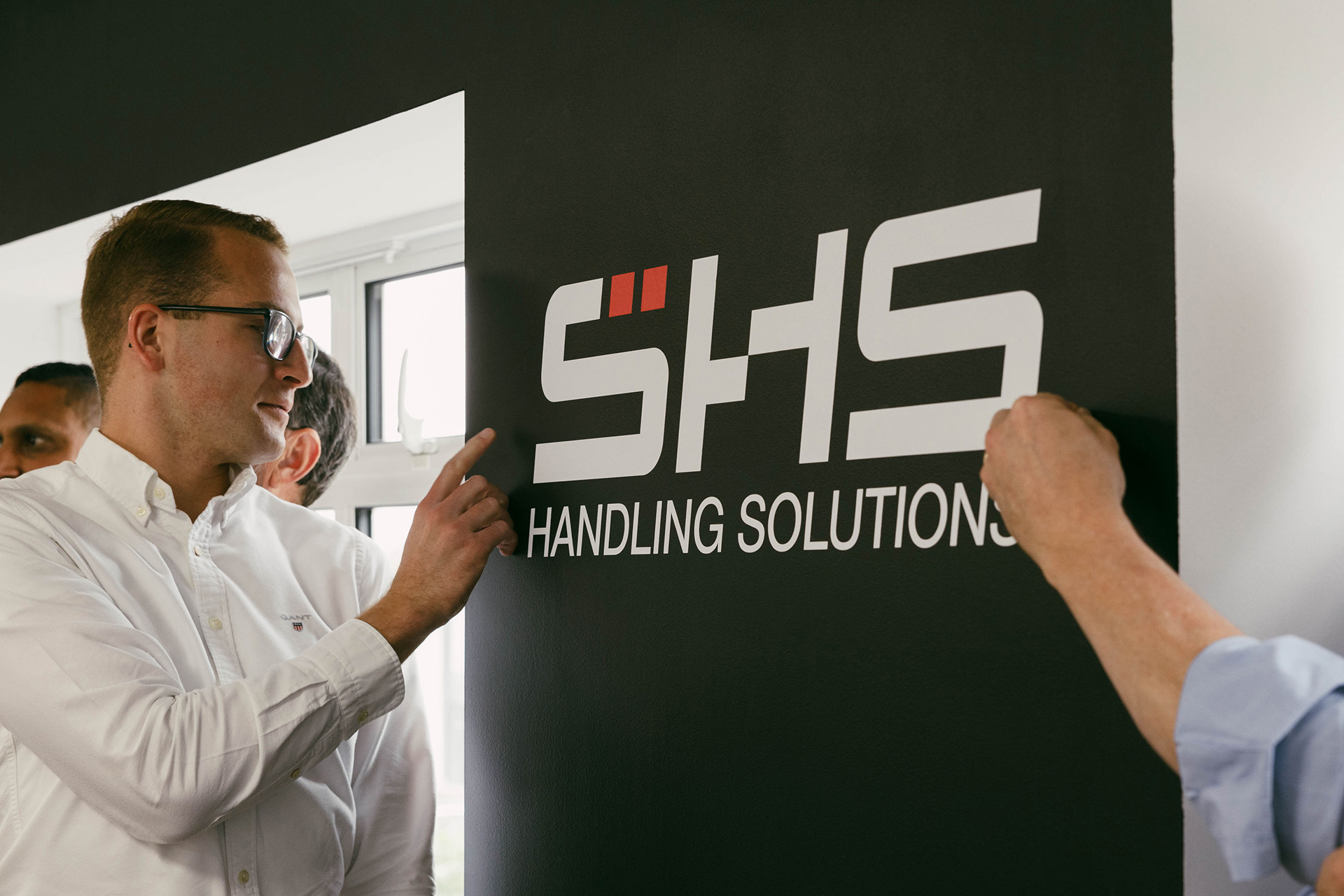
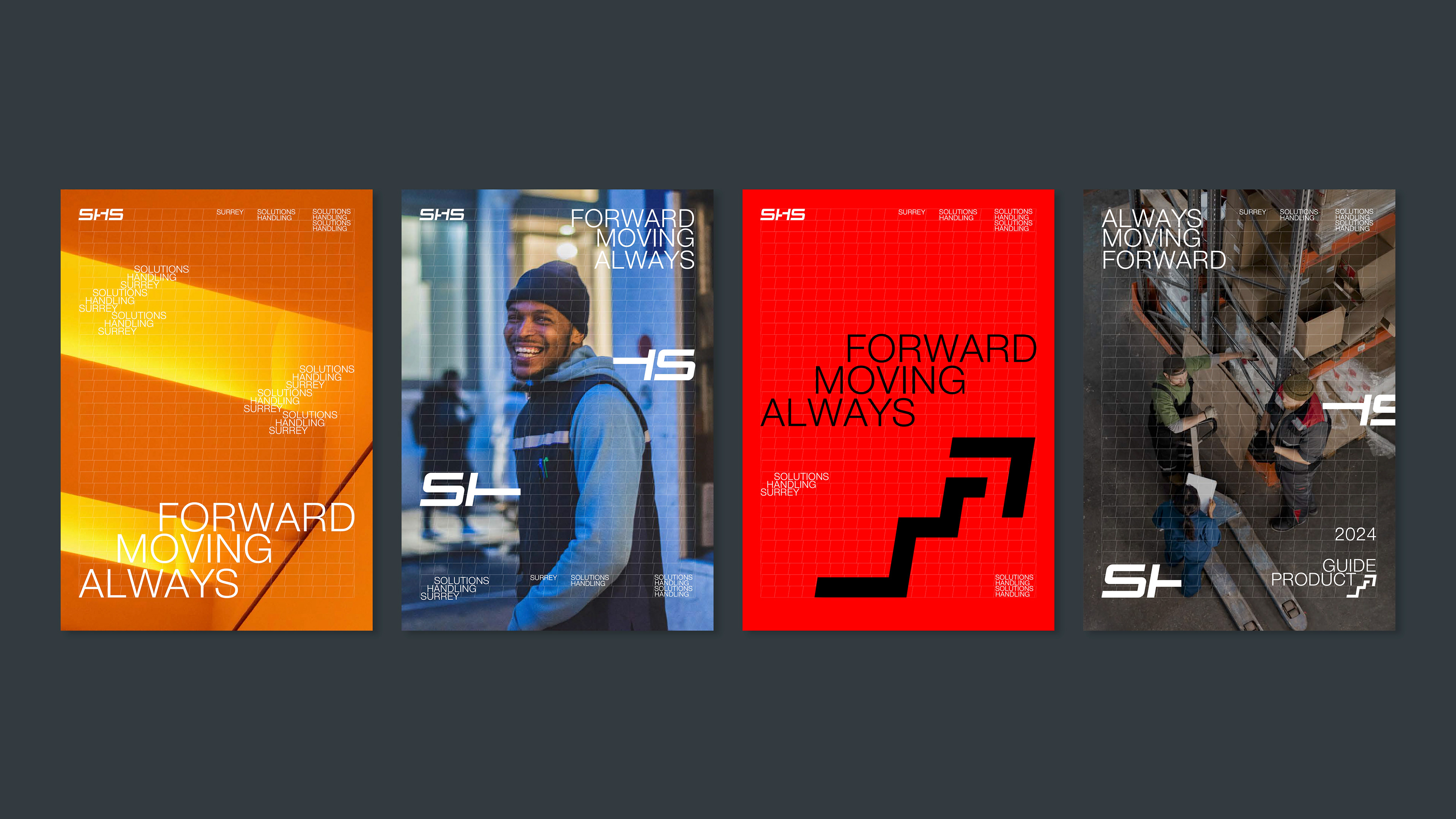
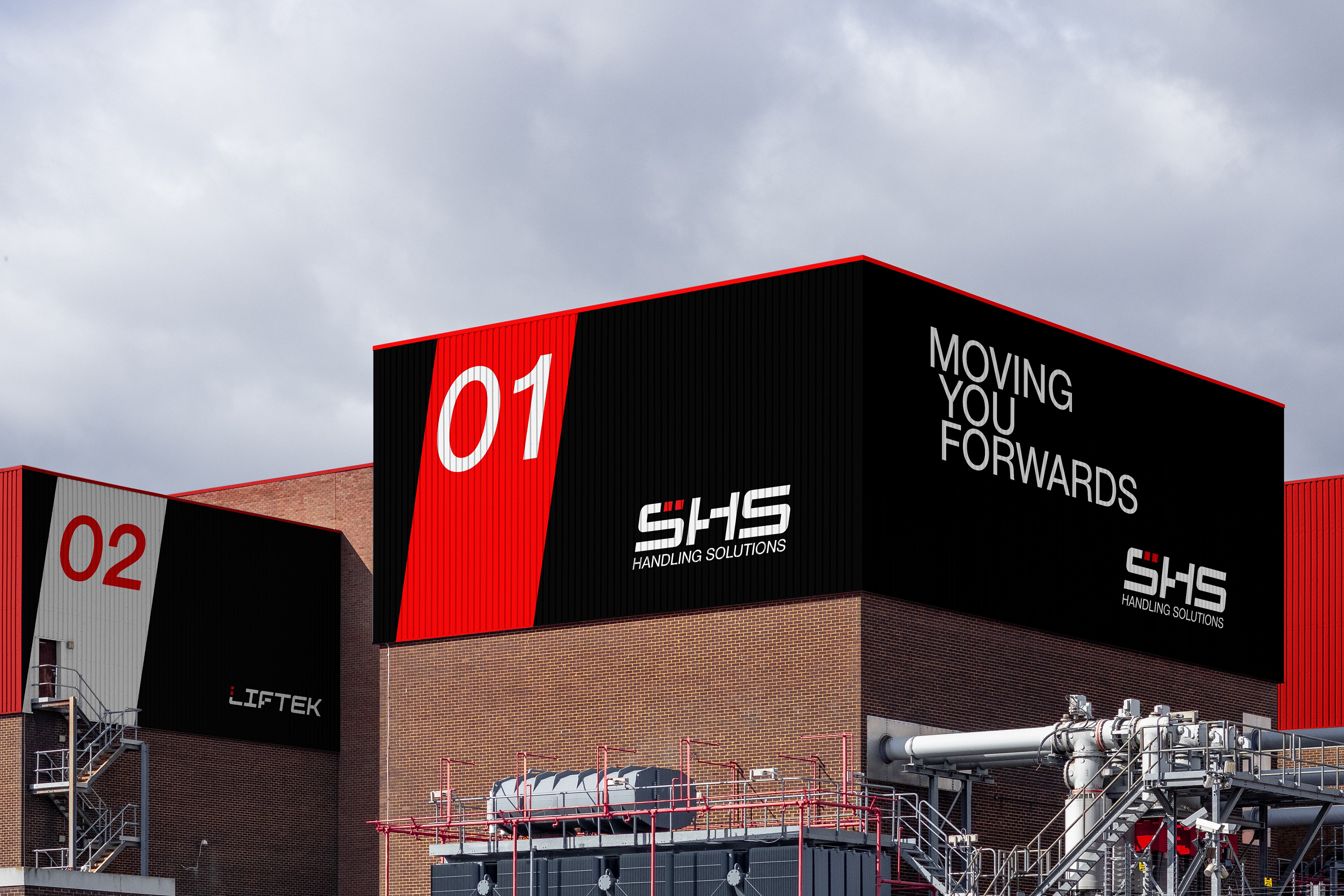
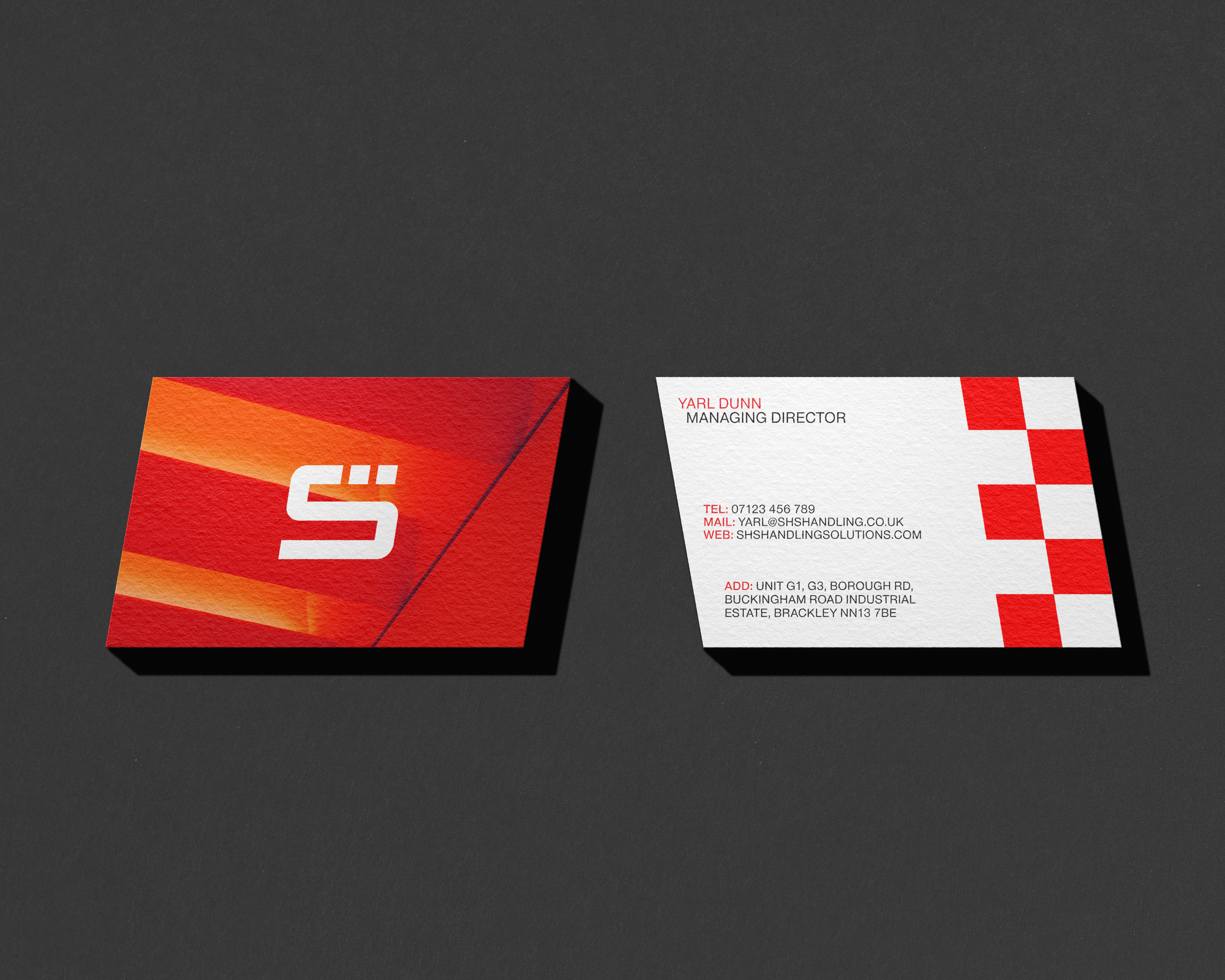
The new brand identity also had to reinforce SHS Handling Solutions’ commitment to quality, safety, and customer-centric solutions. The new logo was designed to unify the brand’s architecture and products while capturing the essence of the company’s dynamic approach and dedication to excellence. The design maintained the reliability and trust SHS has built over the years.

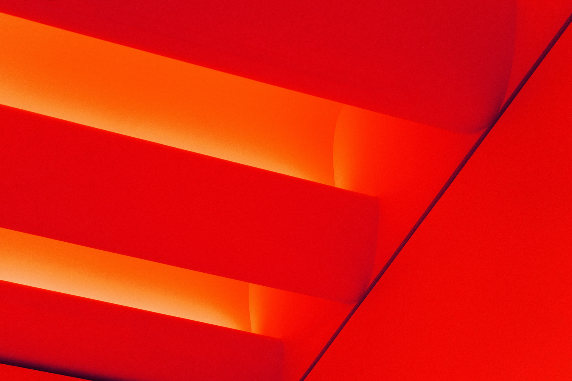


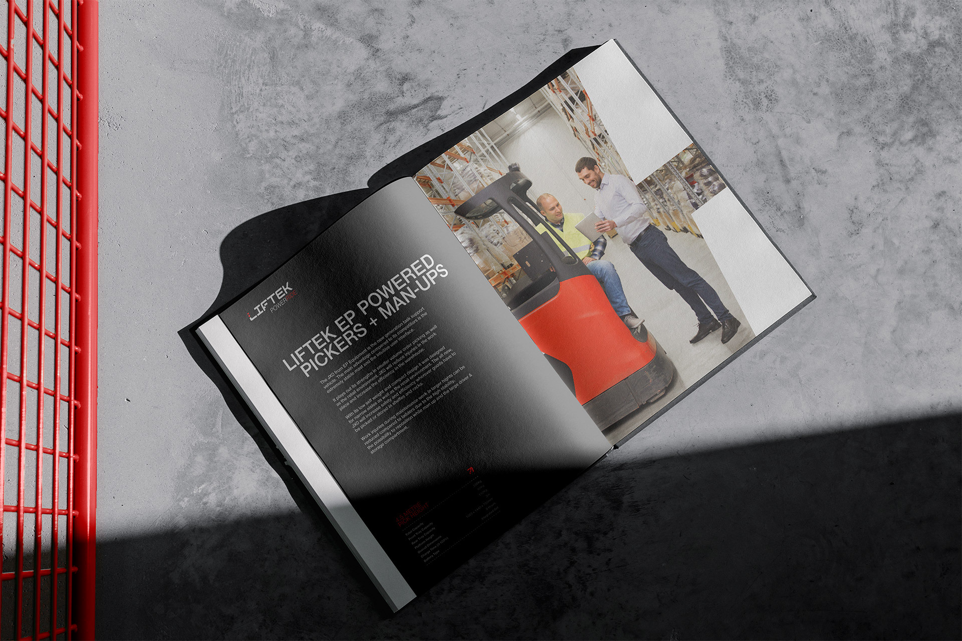
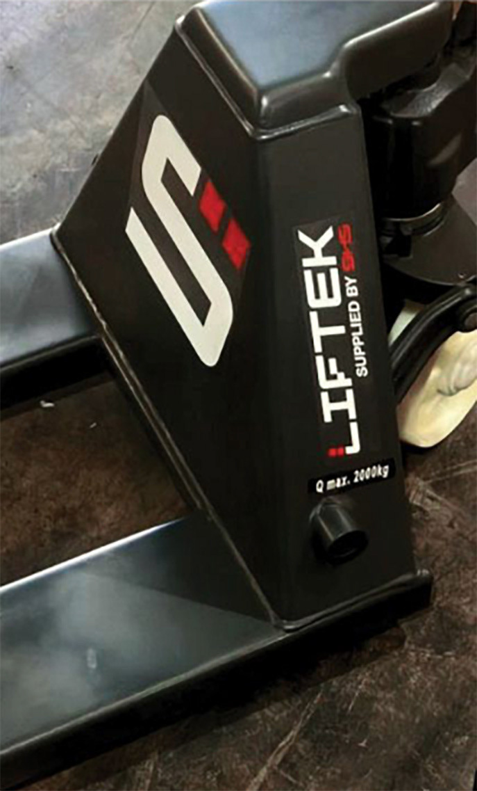
The word mark was crafted with structure, clarity, and motion in mind, using a strong typeface that balanced form and function. Two red chevrons were incorporated to connect with the brand’s history and unify SHS, Liftek, and its products. The “H” was designed with a raised crossbar to signify forward motion and flexibility, and the entire identity was tilted 10 degrees to enhance the sense of movement.
These design elements were applied throughout the visual language to create a unique grid system that accommodates information, imagery, iconography, and colour in an adaptable and distinctive manner.
With its new identity, the company is positioned to continue its growth and expand its reach, providing unparalleled service and support to its clients.
Client: SHS Handling Solutions
Sector: Manufacturing & Industrial
Discipline: Brand Identity
Sector: Manufacturing & Industrial
Discipline: Brand Identity
Brand Strategy: Jamie Kelly, Mark Wolstenholme
Design Team: Ya’Qub Mir
Placement: Studio Up North
Design Team: Ya’Qub Mir
Placement: Studio Up North