Love Letters
Print & Packaging: Entertainment
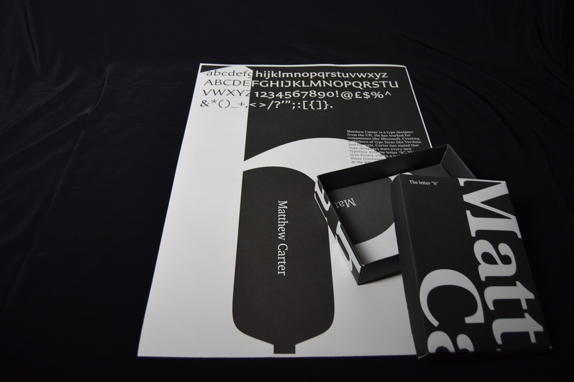
This project was a lot of fun. We were simply tasked on focusing on typography and creating a poster around it. One of my favourite type designers is Matthew Carter. He has worked in both the modern and post-modern era.
During the Helvetica documentary he talked about how he started all of his new typefaces with the letter h because it’s a letter with an ascender, width and curve, so it’s easier to design a typeface when a letter has the characteristics of most letters in the alphabet.
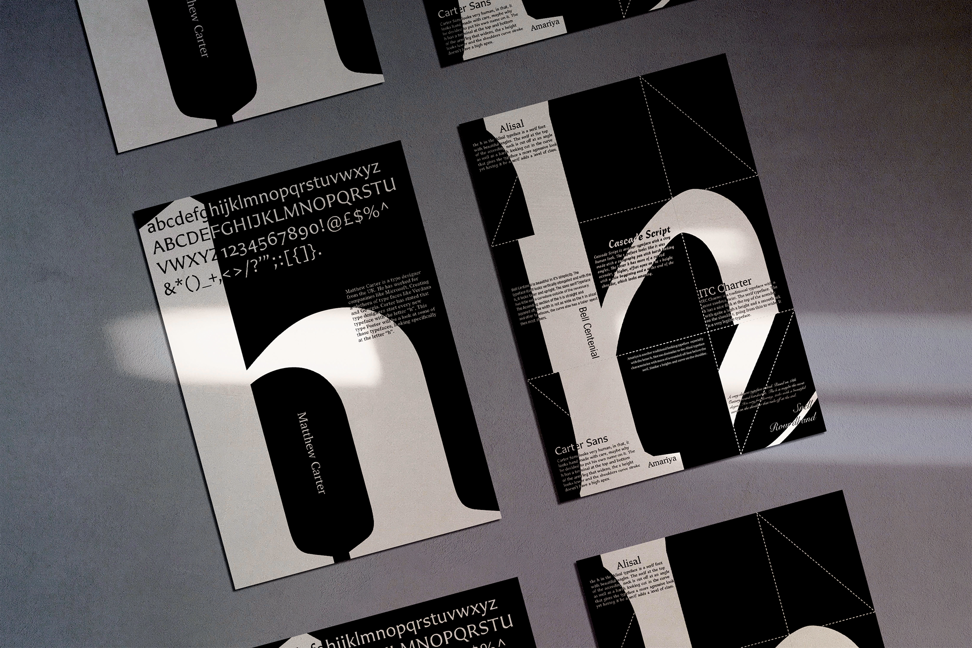
This fascinated me, so my poster was based around the letter h, looking at and analysing various letter h’s designed by Matthew Carter.
I made a piece of packaging to go along with it, with simply his name, wrapped around the box.