Eighteen
Brand & Campaign: Charity
Brand Identity and Campaign against the use of child labour.
I’ve always heard statistics surrounding child labour, but I found that numbers on a screen de-humanise the impact this issue has on those children’s lives. I didn’t want, what I call, a shruggable campaign and at this point in my university project, I had relied on humour throughout my work, however for a project of this topic, I felt that a much different tone of voice was a must.
“Child labour is a particular issue for fashion because much of the supply chain requires low-skilled labour and some tasks are even better suited to children than adults, In cotton picking, employers prefer to hire children for their small fingers, which do not damage the crop”.
“There is no supervision or social control mechanisms, no unions that can help them to bargain for better working conditions. These are very low-skilled workers without a voice, so they are easy targets”. (Moulds, n.d.)
“There is no supervision or social control mechanisms, no unions that can help them to bargain for better working conditions. These are very low-skilled workers without a voice, so they are easy targets”. (Moulds, n.d.)
I came across these quotes while researching fashion brands for my university final major project. Truth be told at the time I was spinning my wheels, unsure of what my final major project would actually be. I figured “I’m getting more into fashion, maybe I do something related to that… I’ve always wanted to design a pop up store, that’d be fun”.
But seeing quotes, hearing the disgusting trials and tribulations that these children have to suffer through on a daily basis quickly changed my tune.
But seeing quotes, hearing the disgusting trials and tribulations that these children have to suffer through on a daily basis quickly changed my tune.
I was surprised by my own lack of awareness and (at the time) the a lack of care people felt around the situation.
The first thing I wanted to do from a strategy perspective was get a good understanding on exactly who my target market should be. I felt that understanding who I was speaking to would directly effect the campaigns tone of voice.
So I spoke to people, a lot of people. Conducted interviews with family, friends, lecturers, whoever I could get chatting too, somehow I’d get the topic of child labour into the conversation.
I had noticed that the people who struggled to talk about the conversation the most was young parents. It felt like these were the people who could empathise with the situation the most. A lot of them picturing their own children in conversation, imagine the heartbreak they would feel knowing their children could be working in gruelling conditions, against their will.
I’ve always loved the quote “Advertising is speaking to one person, a million times over”. Now, I don’t know who originally said that, but it stuck with me throughout the course of the project and even beyond that.
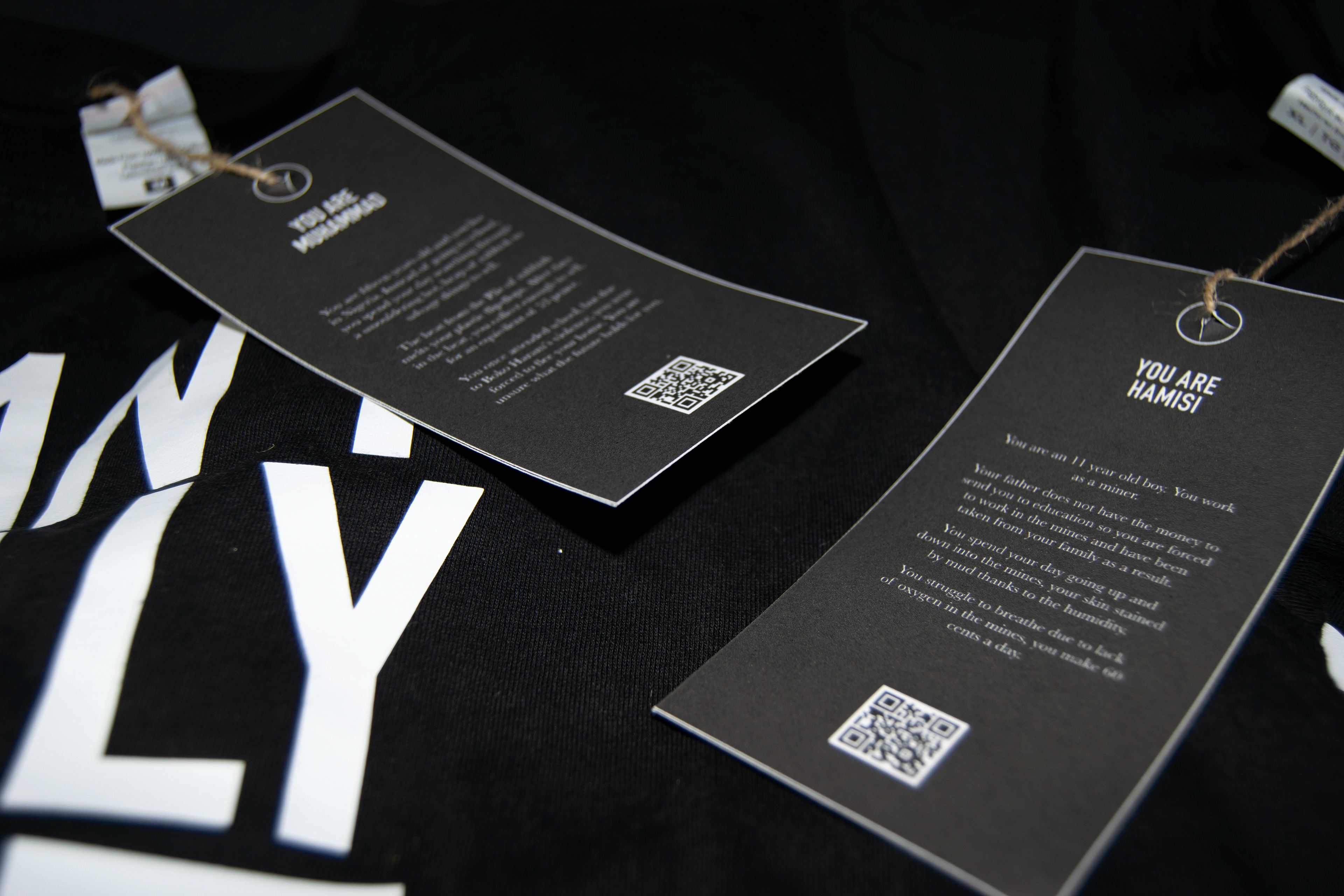
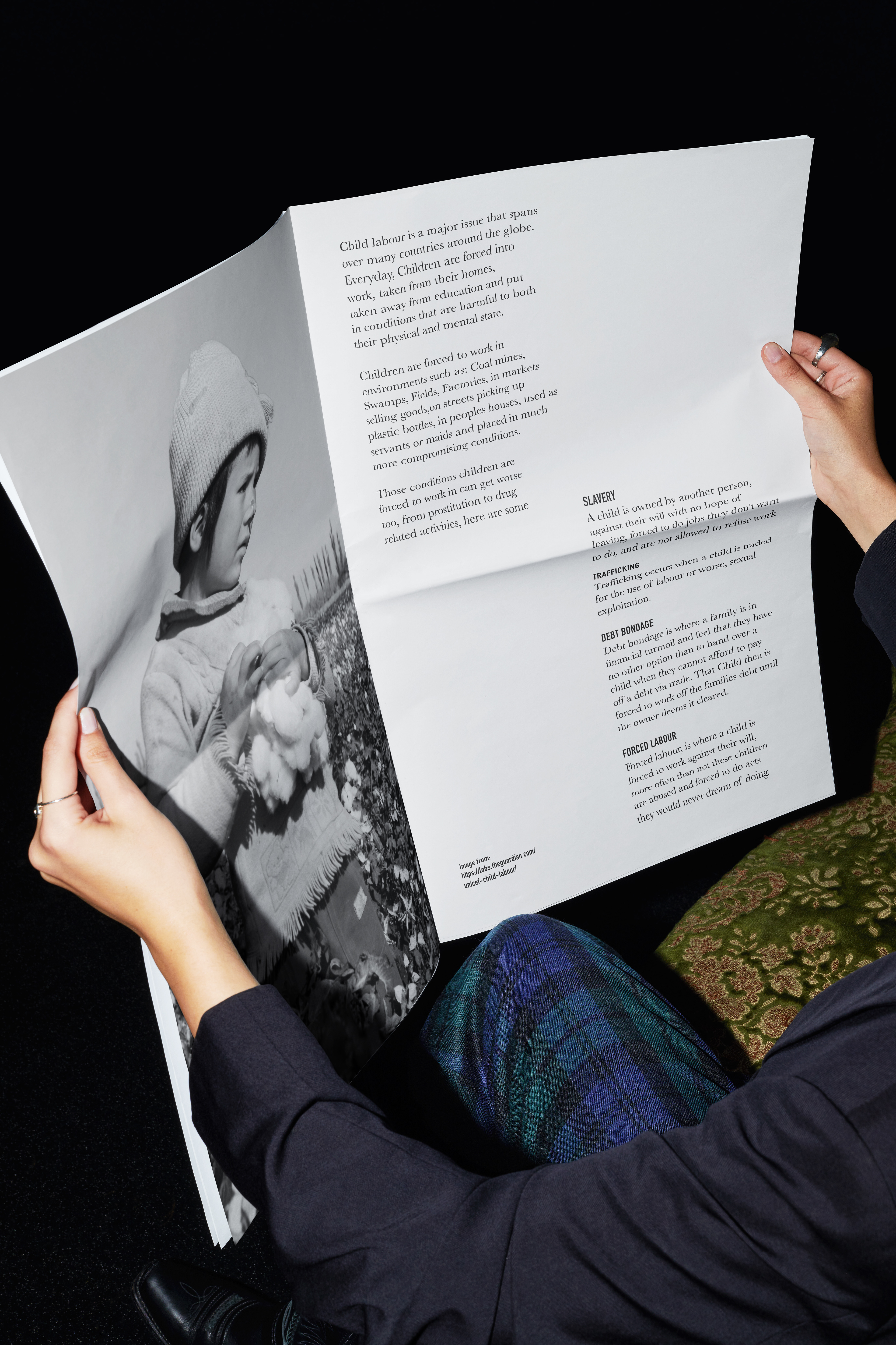
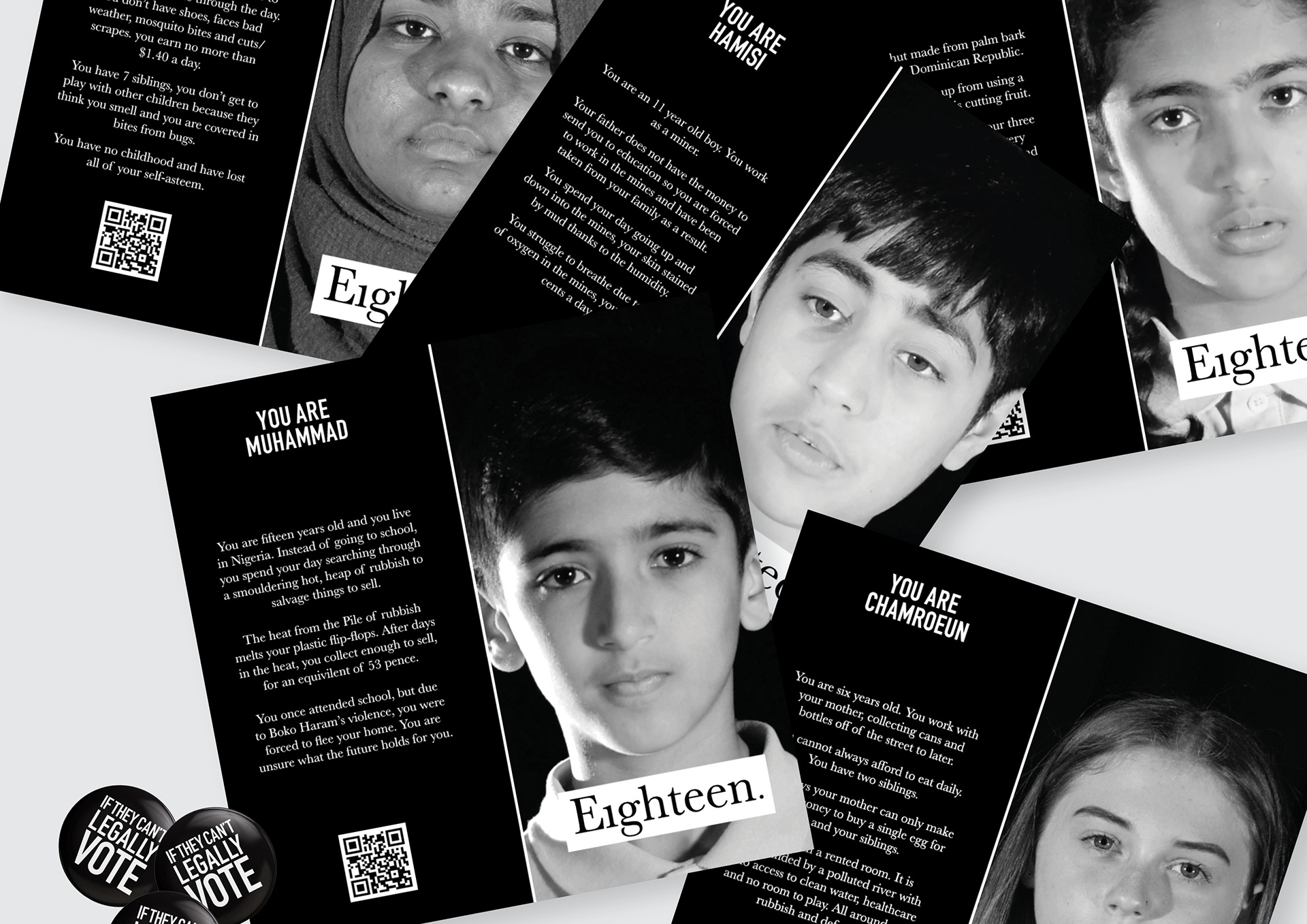
As a result, the idea of the campaign came about. It’s one thing to hear facts and figures but it’s another thing entirely to hear directly from a child.
Children have naturally curious minds, any parent can talk about how many questions a child asks them in a day, I know my dad certainly can. A lot of these questions are nonsensical, but what happens when a child asks you a questions that stops you in your tracks.
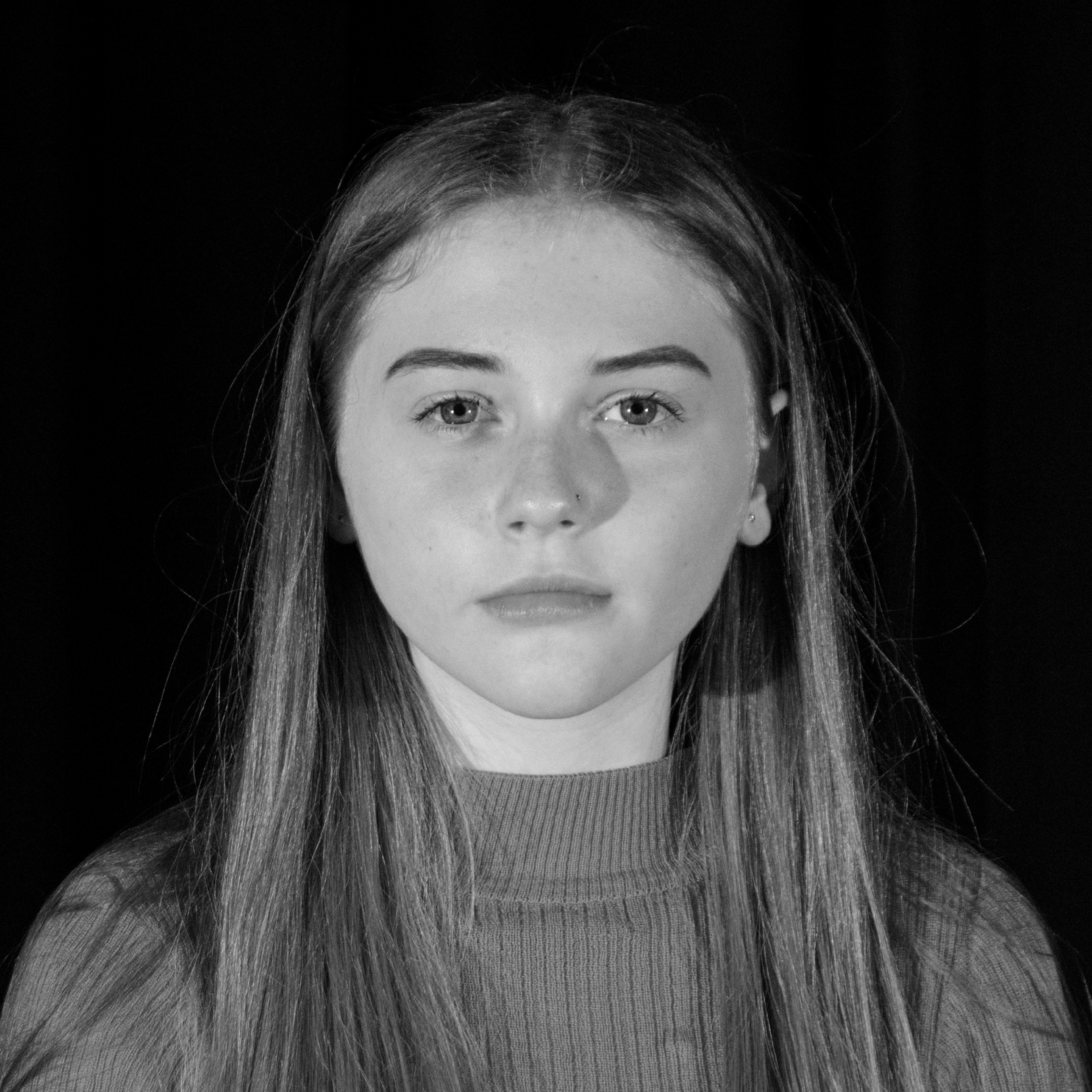
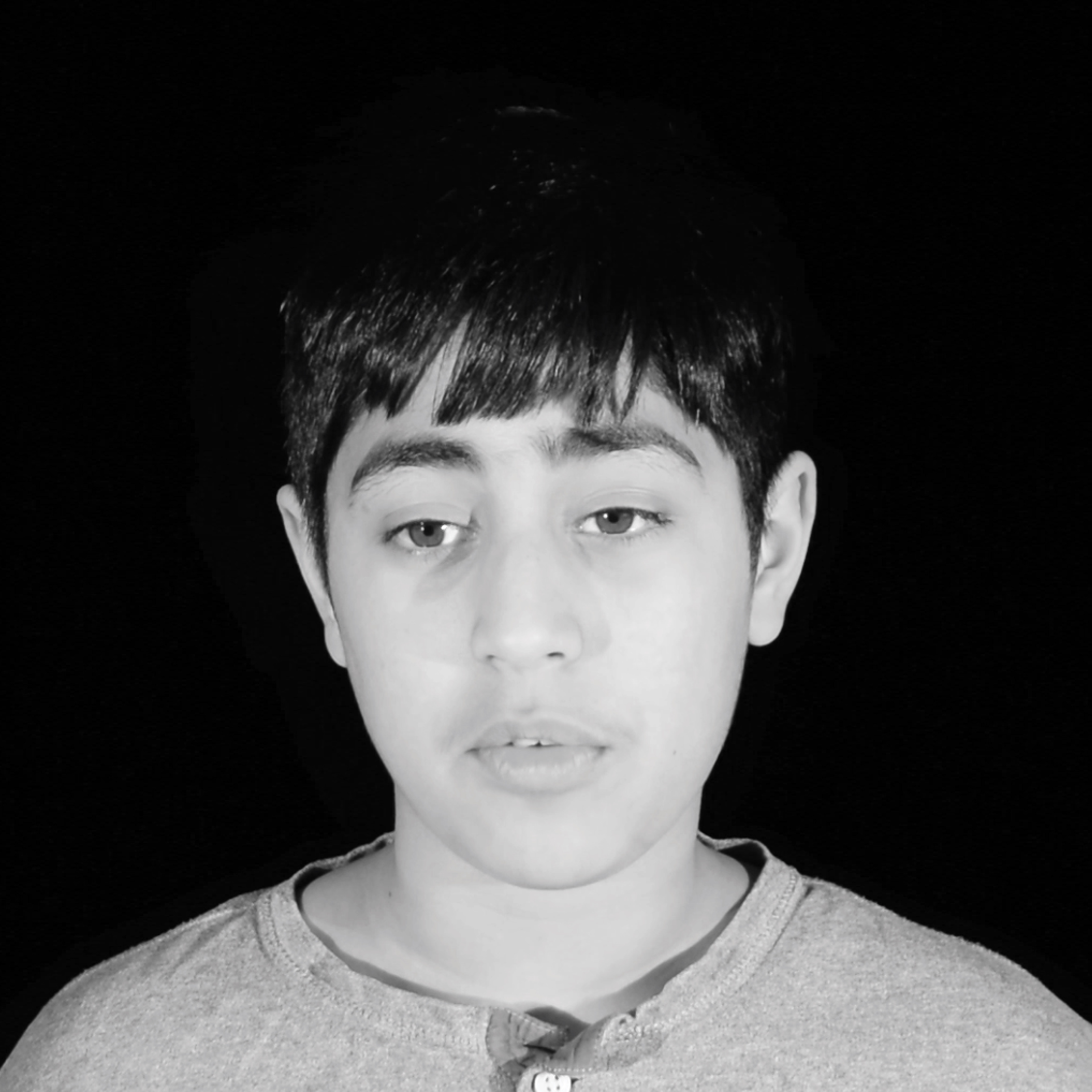
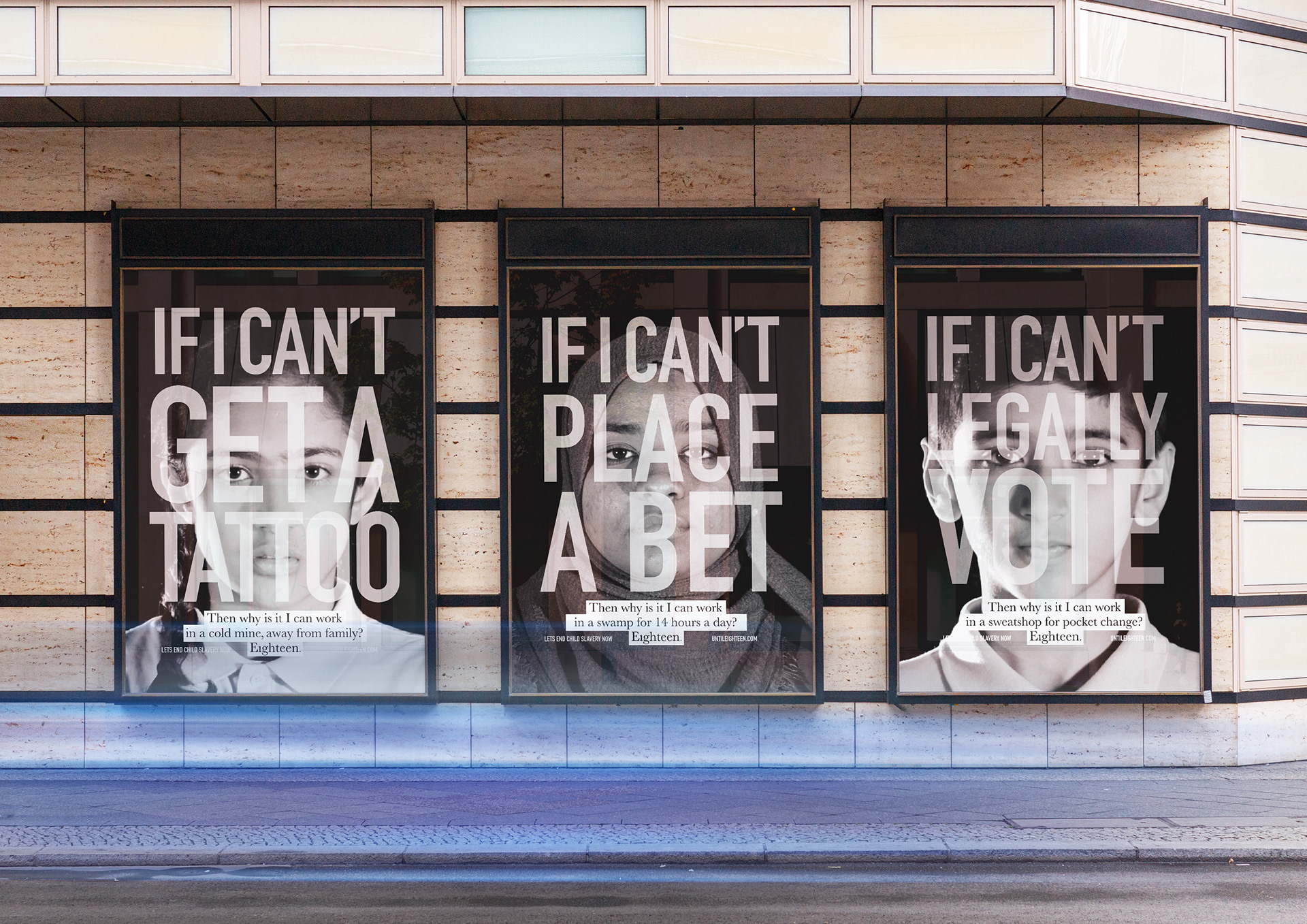
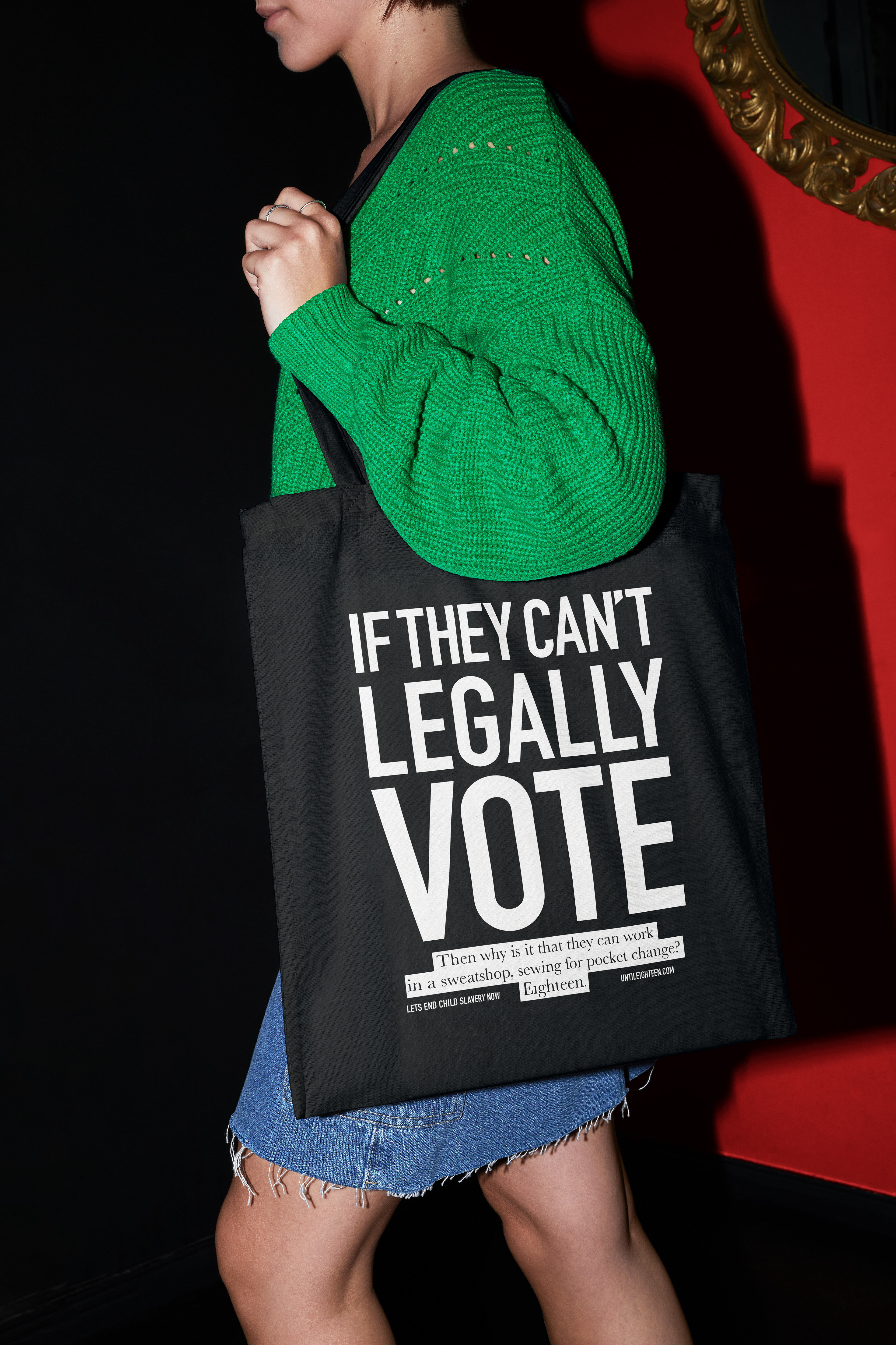
This theory became the backbone of the campaign. A one on one conversation with a child simply asking why you have to be eighteen here, to get a tattoo for example, yet children are being forced to work from toddler age.
This theory became the backbone of the campaign. A one on one conversation with a child simply asking why you have to be eighteen here, to get a tattoo for example, yet children are being forced to work from toddler age.
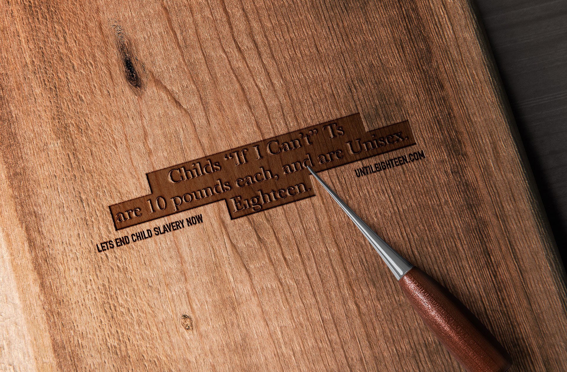
The goal for Eighteen was to raise awareness child labour used across big name brands. Informing young parents and hopefully encourage them to think twice about where they buy their clothes.
Many people assume that child labor is a thing of the past, an out of date ideology from a bygone era, when in fact, many big name fashion brands continue to use this, finding “clever” ways to skirt around the labour laws.
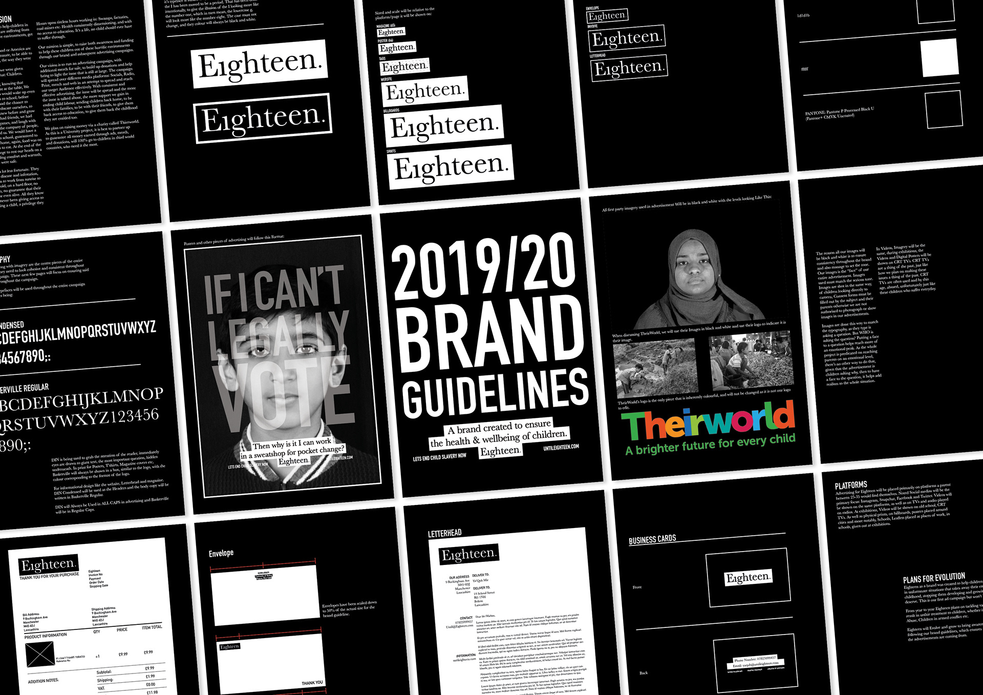
I wanted to craft an identity and visual language that represents this: an out of date philosophy in a modern day setting. I felt this was most likely to stand out as “the thing that doesn’t belong”.
I wanted to craft an identity and visual language that represents this: an out of date philosophy in a modern day setting. I felt this was most likely to stand out as “the thing that doesn’t belong”.
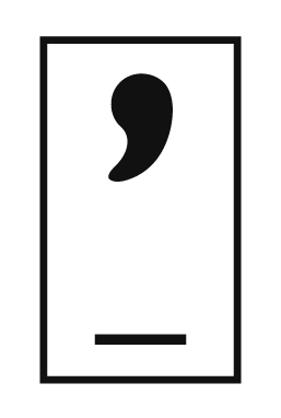
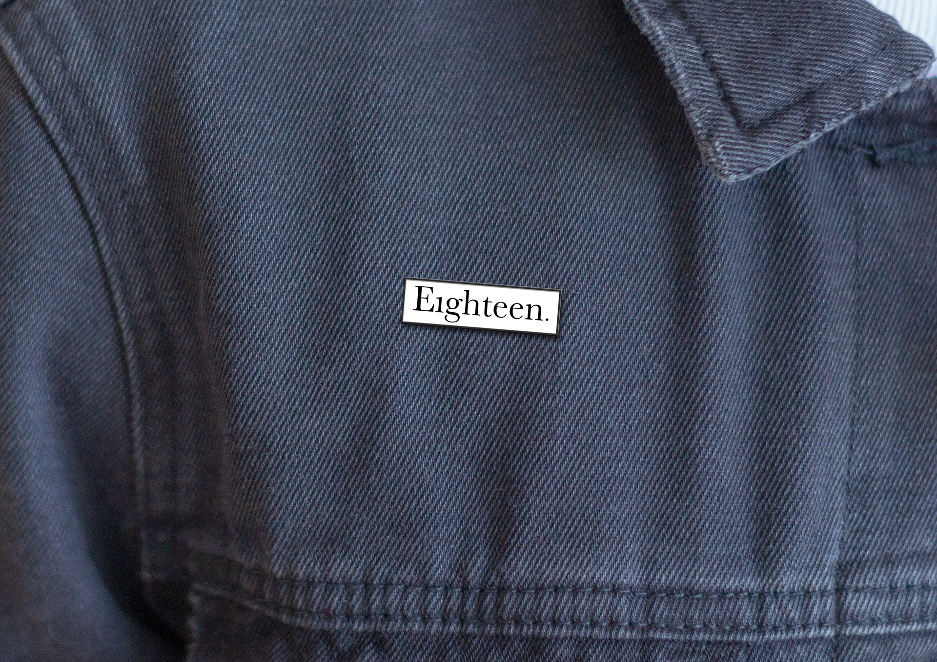
Baskerville was used in the word mark to give the brand that out of place feeling while DIN was utilised in the campaign’s visual language to give further impact to the questions asked by the child.
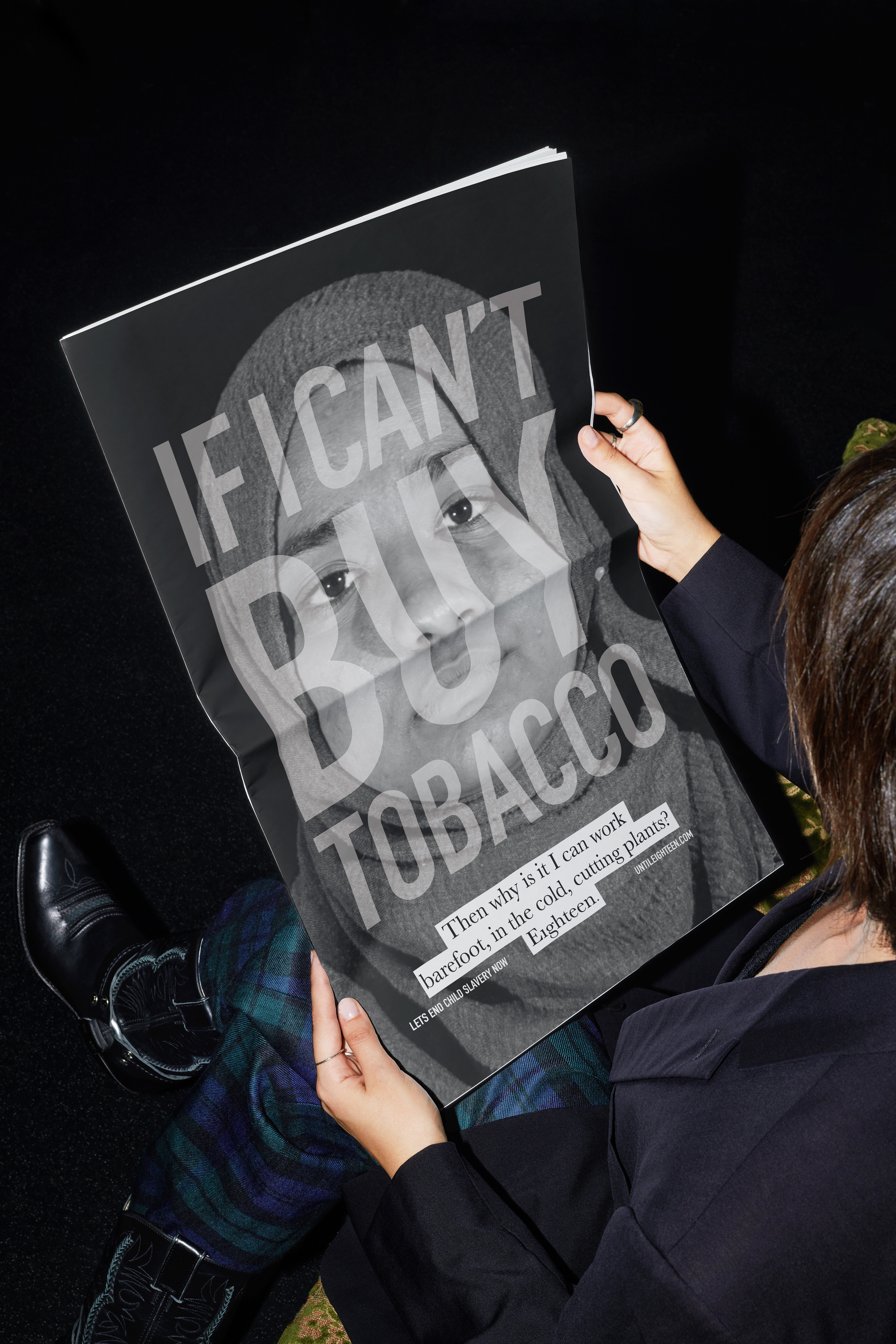
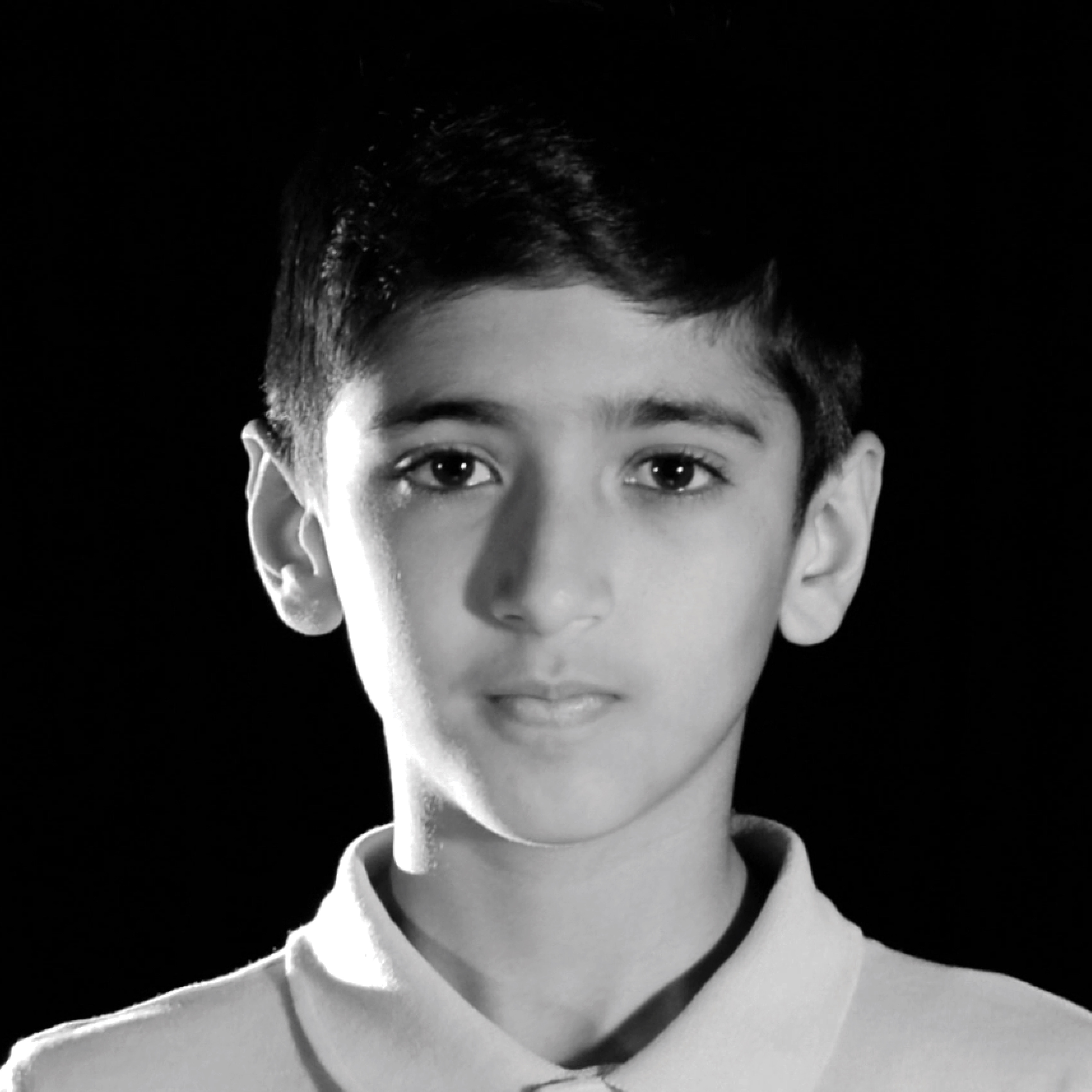
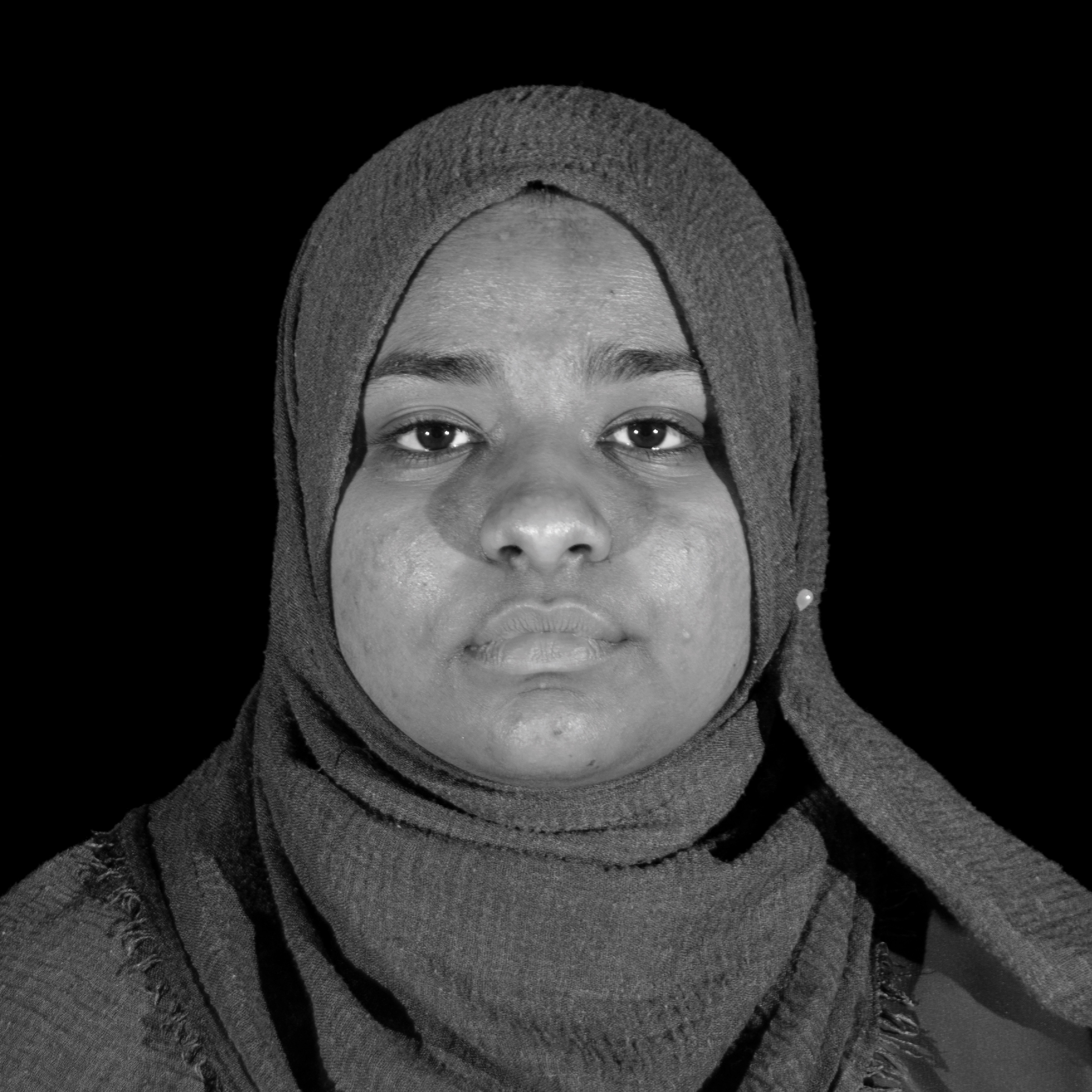
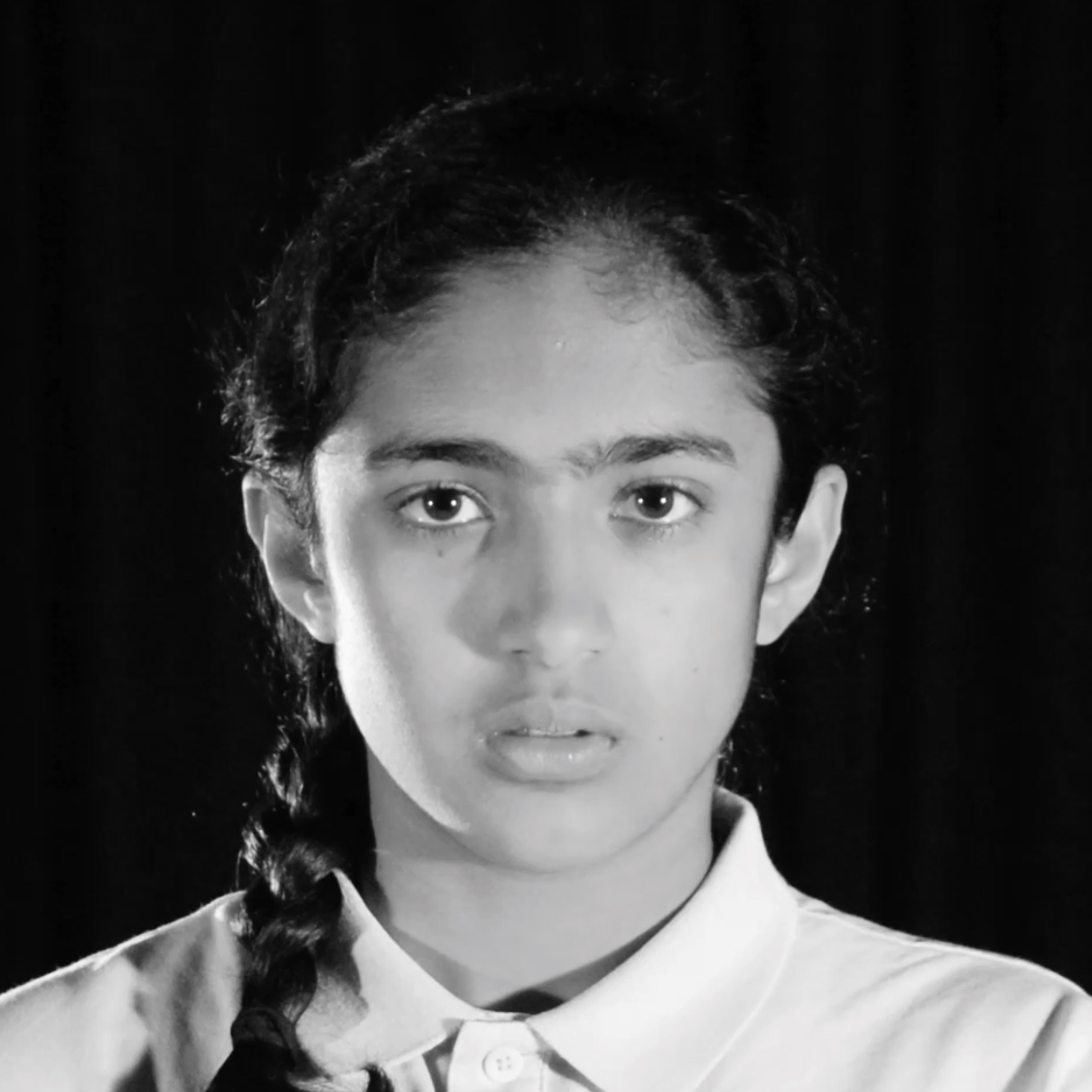
The typography was then placed over black and white somber imagery, with the children looking straight into the camera. This gave the effect of eye contact during a one on one conversation, seeing the pain on their face while asking such impactful questioning, to the person they expect to have all the answers.
The entire campaign and end of year exhibition was ran through CRT TVs or used CRTV effects to further stand apart as an out of date medium, in a world where everything is flat screened and supposedly polished.
Client: University Project
Sector: Charity & Not-for-Profit
Discipline: Brand Identity & Campaign
Design Team: Ya’Qub Mir
Placement: University of Bolton/Bolton School of the Arts.
Sector: Charity & Not-for-Profit
Discipline: Brand Identity & Campaign
Design Team: Ya’Qub Mir
Placement: University of Bolton/Bolton School of the Arts.