Multevo
Brand: Civic and Public
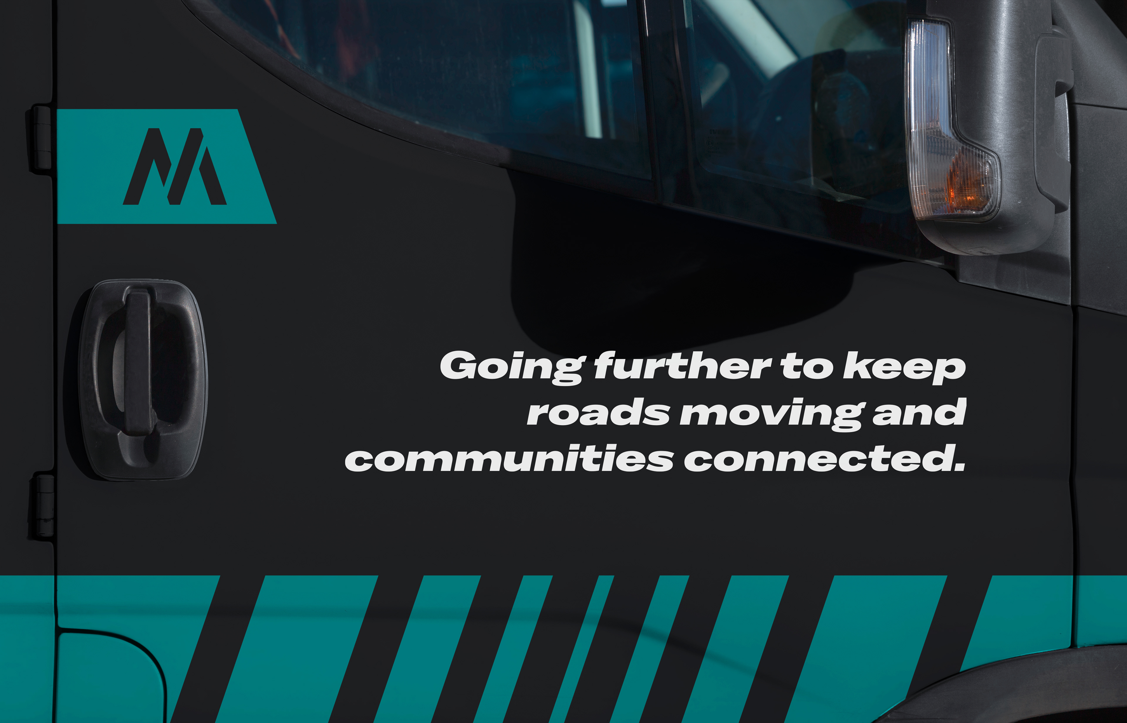
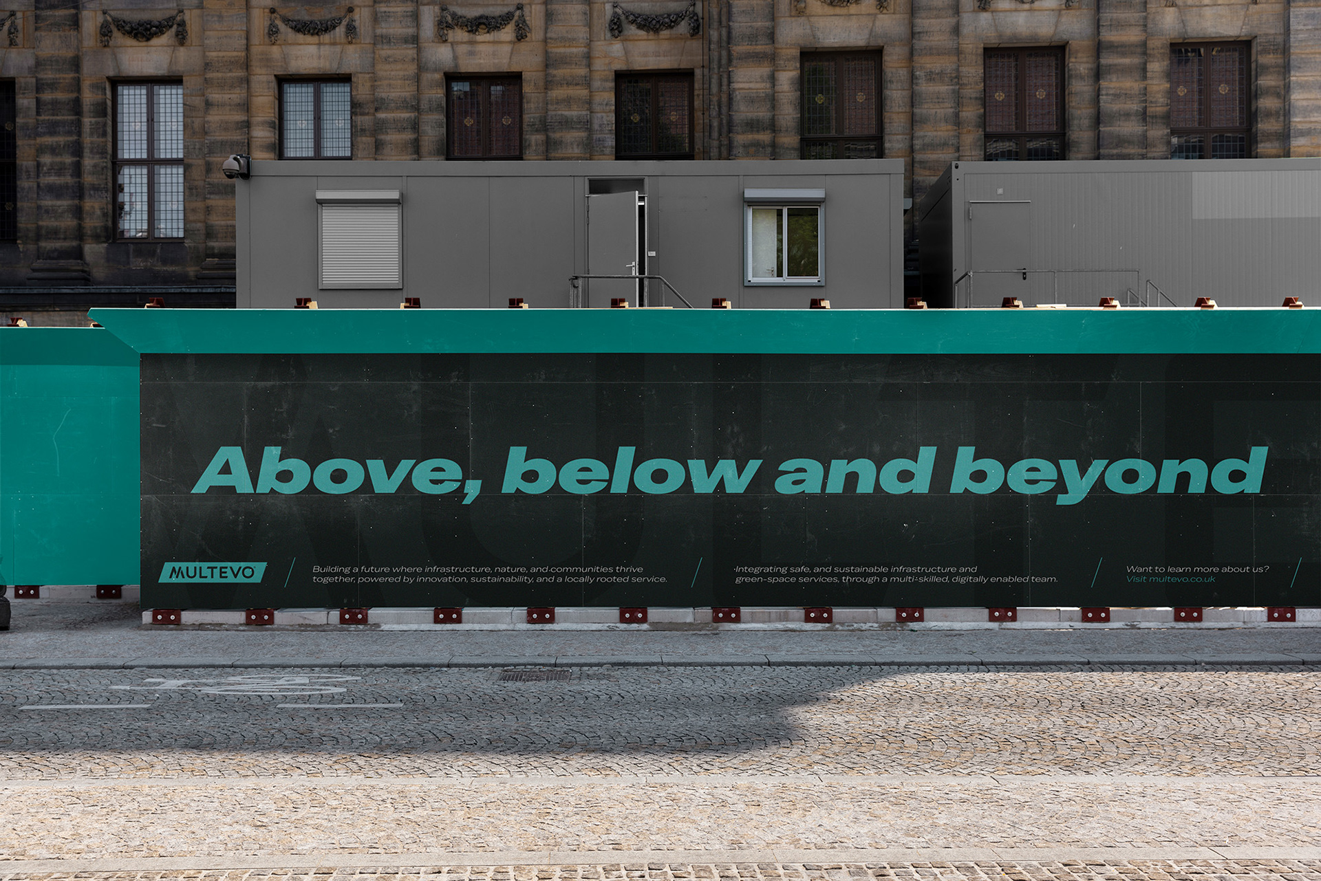
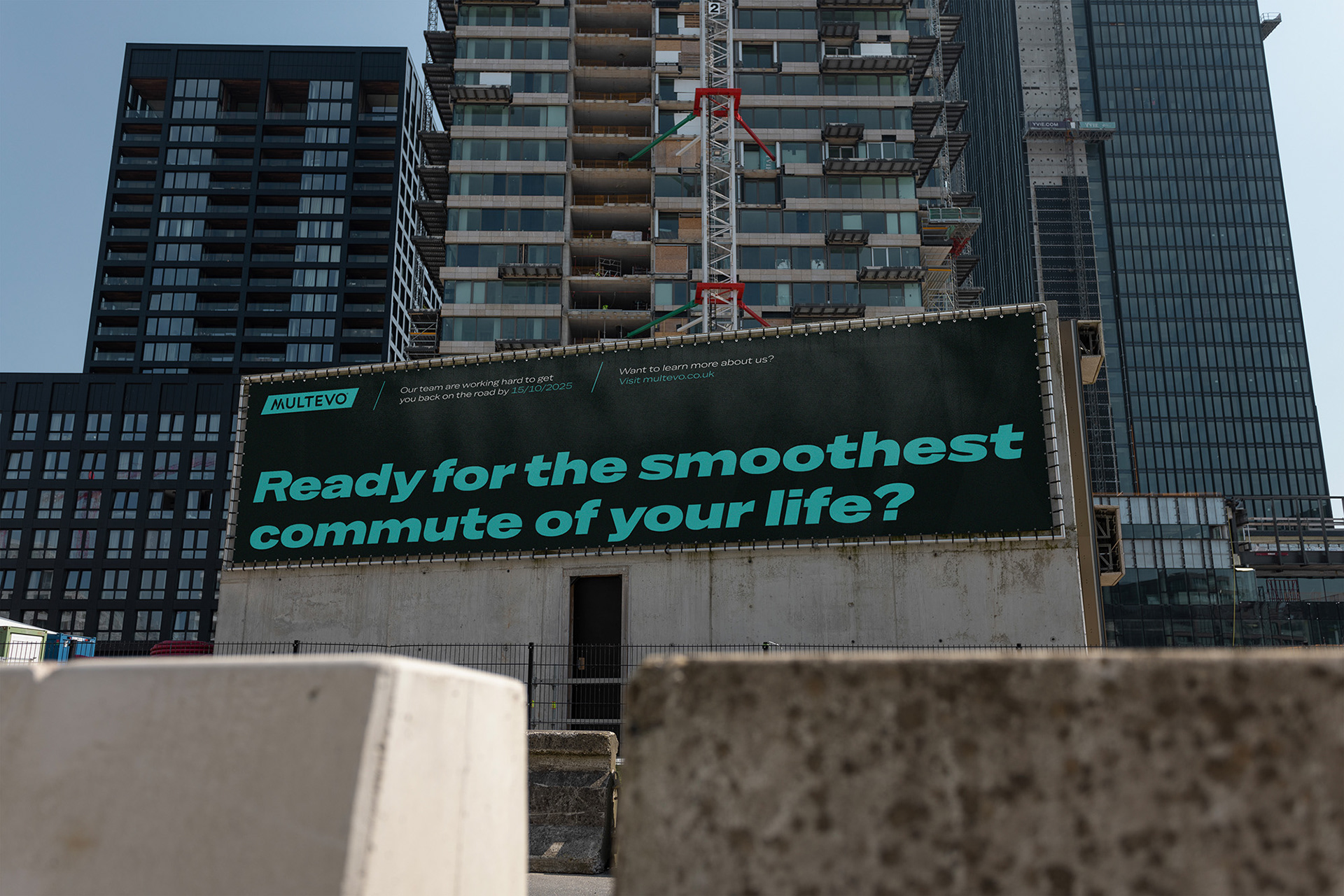
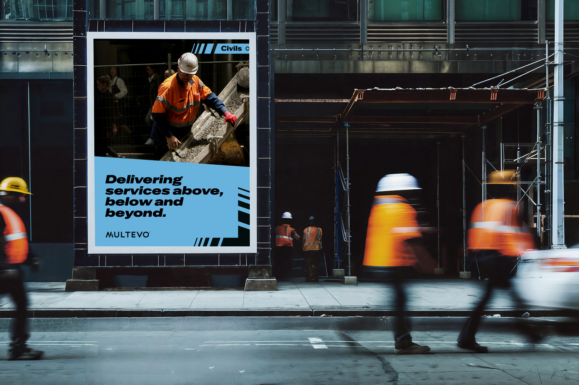
Going above, below and beyond
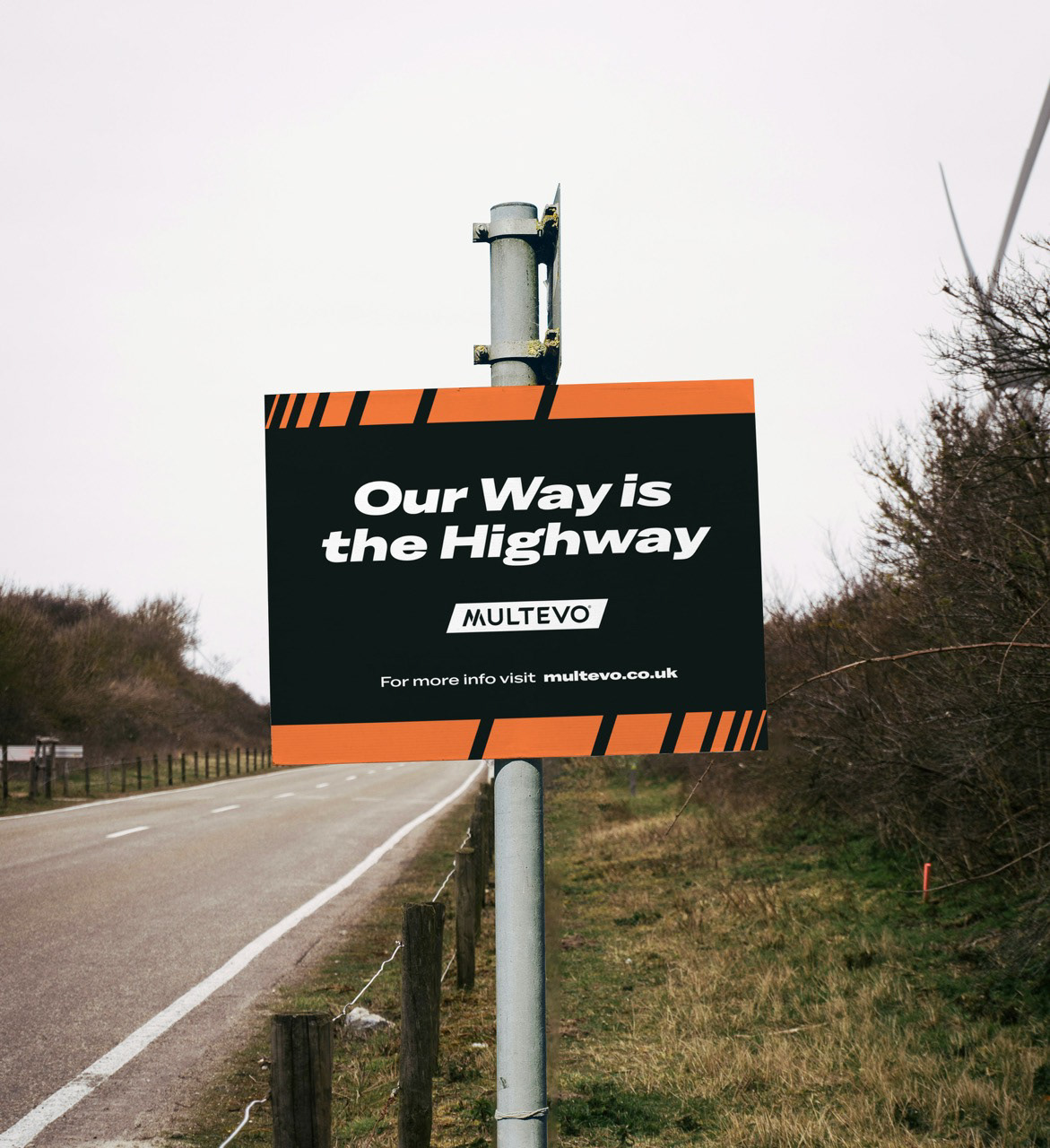
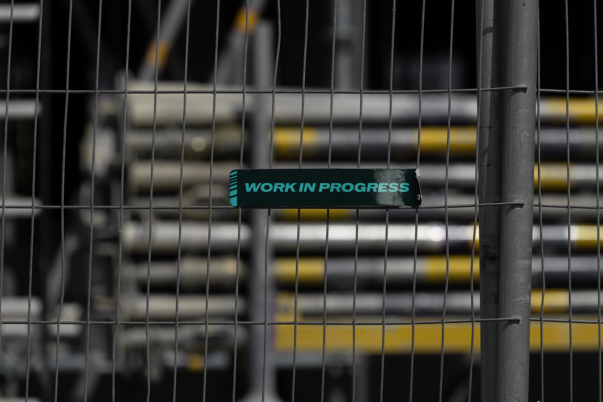
Multevo are a well established turnkey supply chain partner for a variety of civic projects from above ground highways all the way down below the surface of arboriculture.
Operating nationwide, they reached a point where they needed to elevate their brand to better reflect not only the scale of their technical expertise, but also to emphasise the importance of their self-initiated, community-driven responsibilities.
They are committed to fulfilling these duties in a way that is approachable, positive, and brings genuine value to the communities they serve.
The challenge presented to SUN was to articulate Multevo’s full spectrum of capabilities in a way that felt both coherent and compelling, while crafting a brand identity and architecture that reflect the professionalism, innovation, and integrity recognised by both long-standing and prospective clients alike.
Our project began with extensive customer research, engaging directly with Multevo’s clients and partners across its core service sectors. The feedback revealed deep trust in the company’s people and performance, but also highlighted a lack of clarity around how its various divisions connected.
Our project began with extensive customer research, engaging directly with Multevo’s clients and partners across its core service sectors. The feedback revealed deep trust in the company’s people and performance, but also highlighted a lack of clarity around how its various divisions connected.
These insights formed the backbone of the brand, helping to shape Multevo’s tone of voice, sector-specific messaging frameworks, architecture, and overall brand proposition, all centred around its unique commitment to going the extra mile simply because it’s the right thing to do.
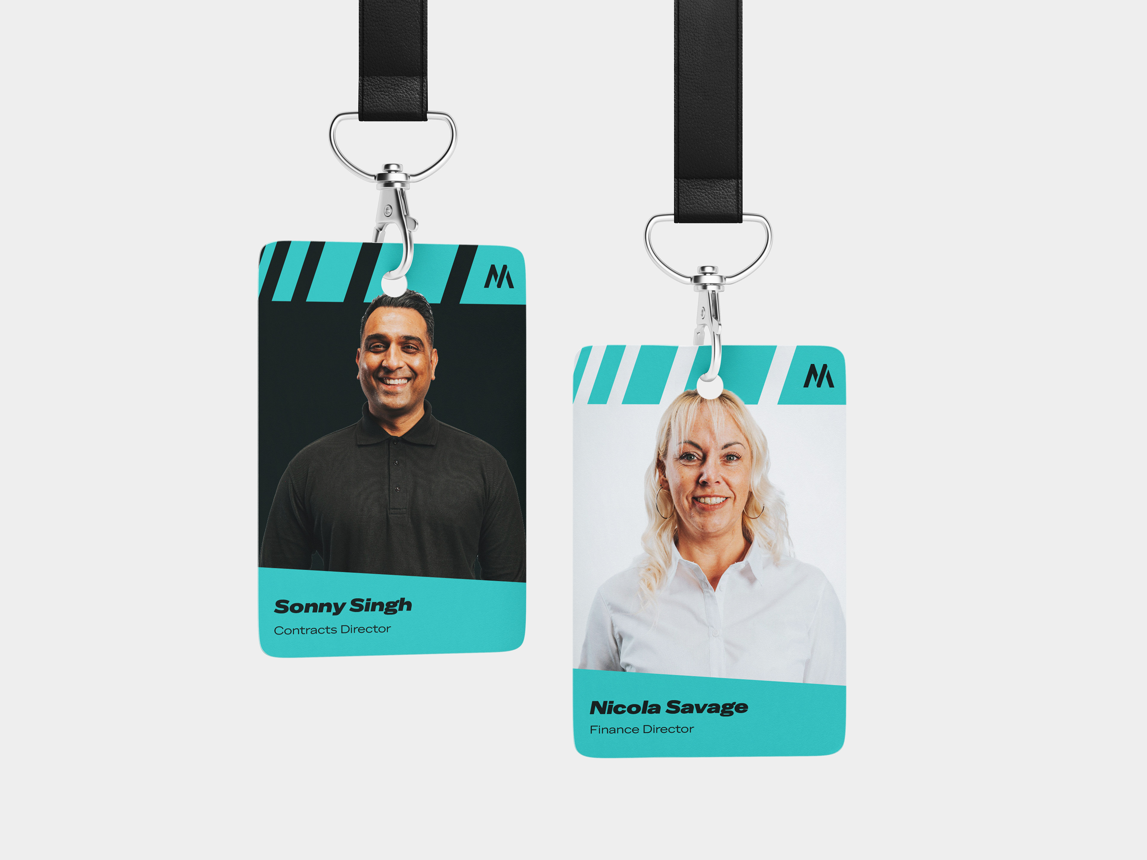
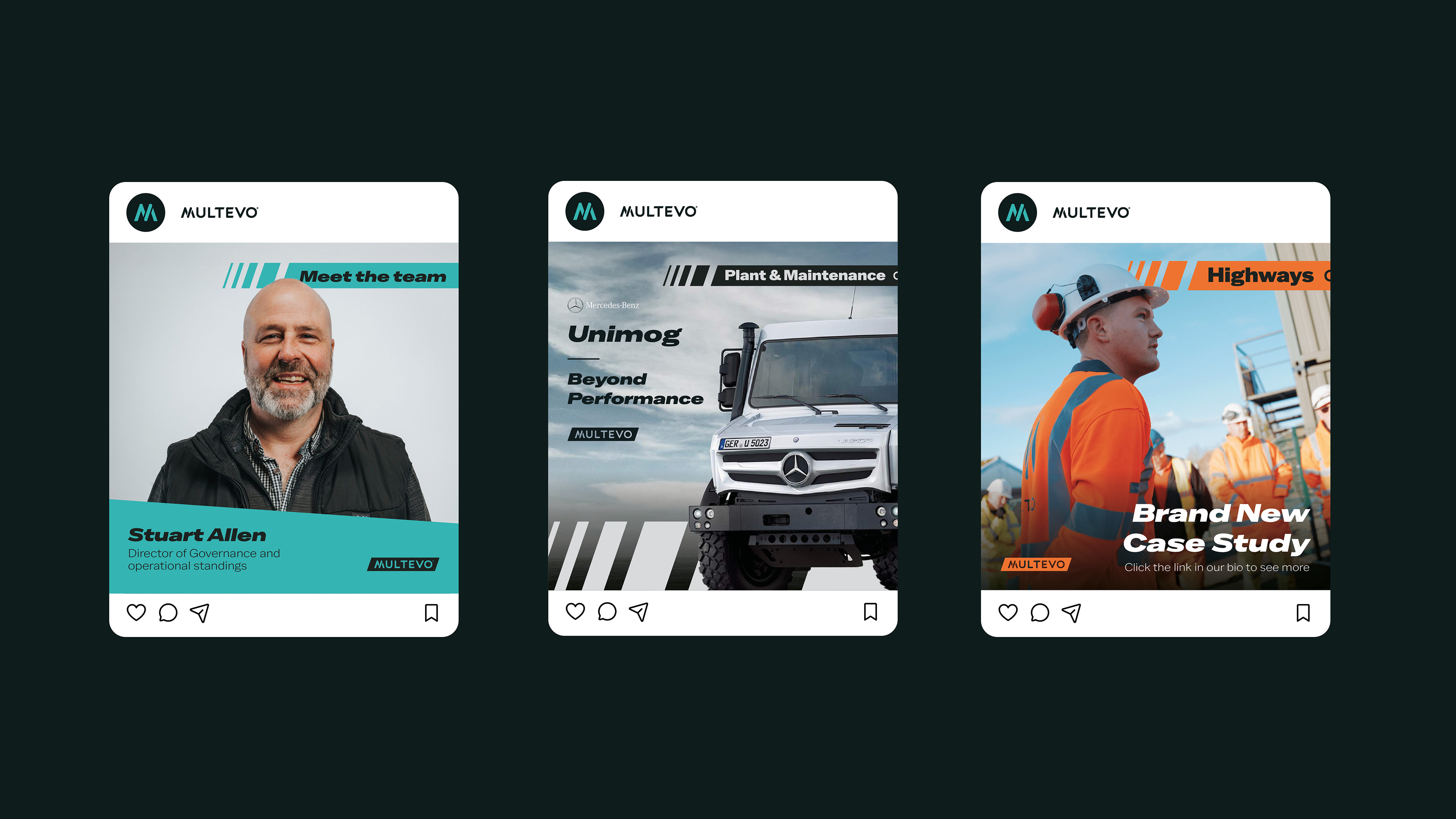
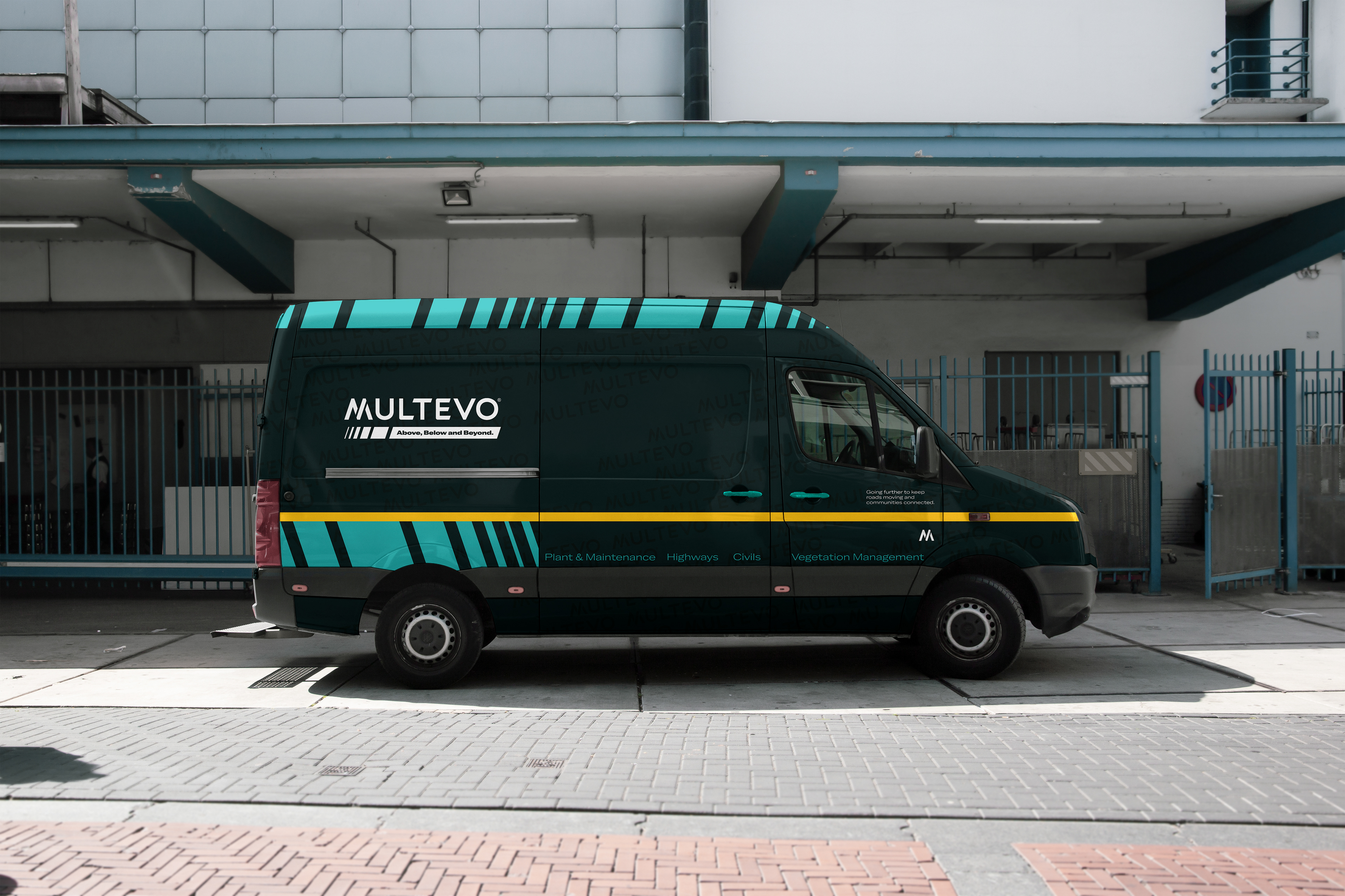
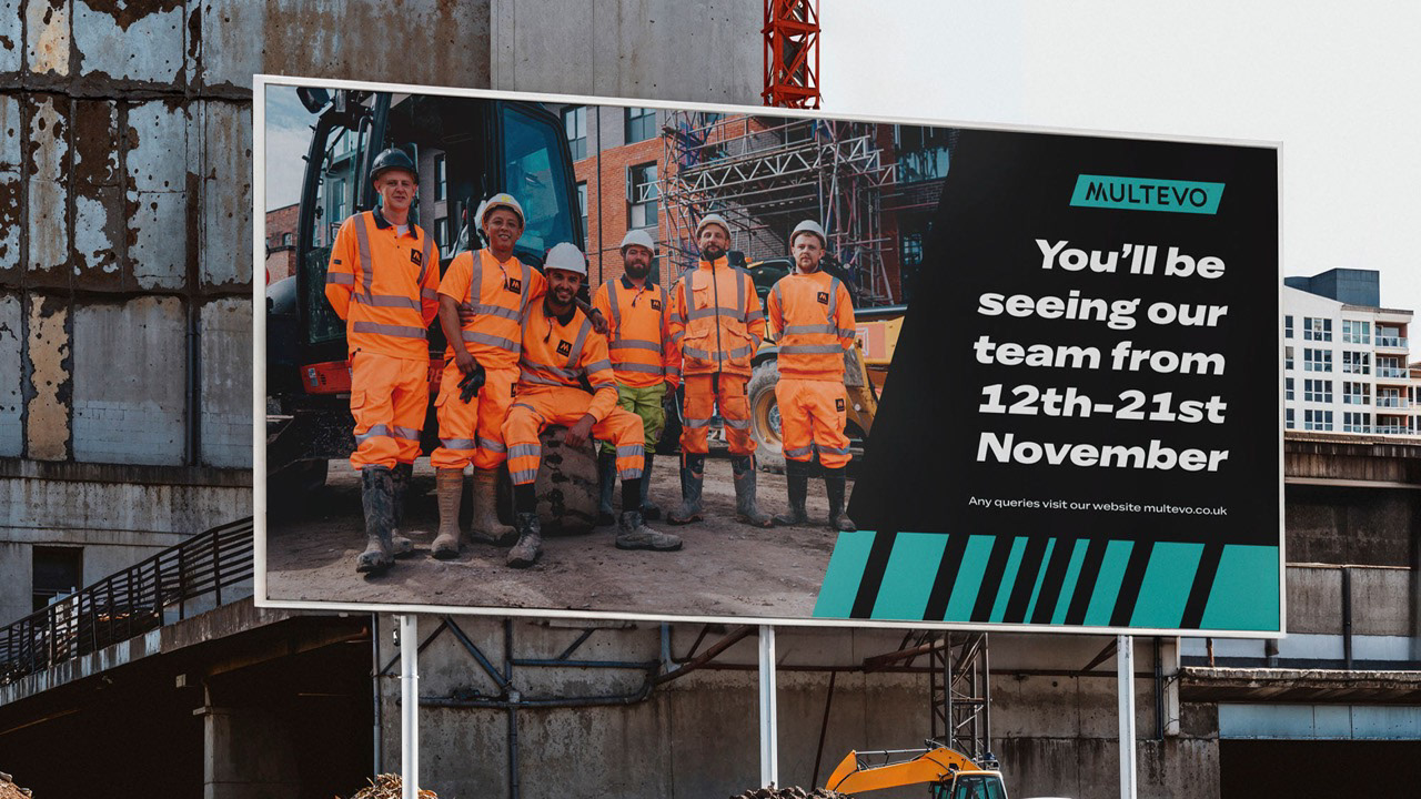
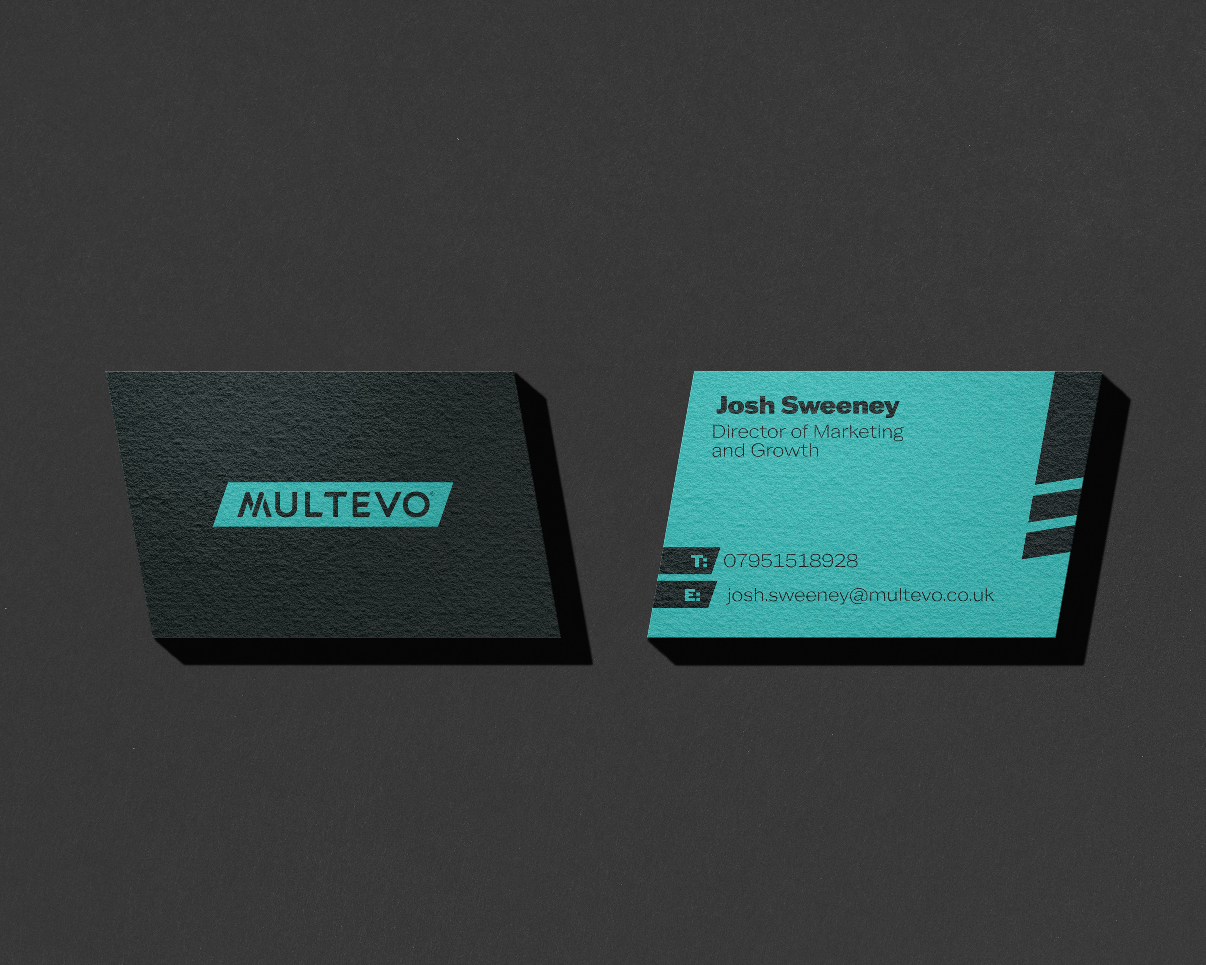
From there, the Multevo identity evolved from a soft, rounded, folding marque into a sharper, more confident wordmark, housed within an angled lozenge. This transformation paved the way for a suite of sub-brands inspired by formula guides that fan out to reveal a spectrum of colour, personality, and capability, all anchored by Multevo as the master brand.

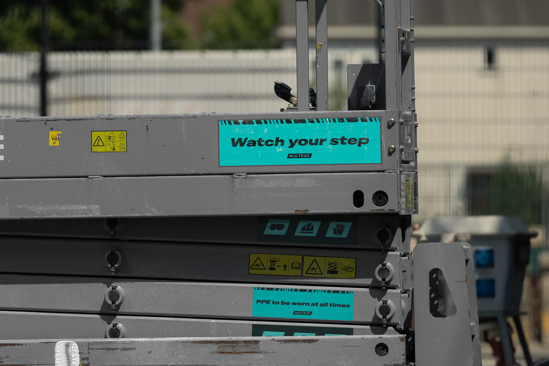
These blooming lozenges evolved into brand patterns, paired with bright, uplifting sub-brand colours to give each identity its own personality while staying unified within the wider visual language.
To further the feel of comfort within our luxury studio, we opted to change the name of key rooms. Instead of “waiting rooms” we have lounges, and instead of “operating rooms” we have suites. These rooms were all designed with our guests in mind, creating welcoming spaces to clear your mind and relax, including a TV screen in the suite to let you sit back and chill while we work with you. Personalised and seasonal aromas were introduced around the studio, further creating a space to be calm. All this while continuing the theme of that re-ignited glow across elements of the studio, from signage to the new smile illuminated mirror reveal. Lightening your mood while brightening your smile.
The rebrand has already strengthened perceptions with existing clients and created a stronger platform for future growth - proving the power of genuine customer insight to drive meaningful brand transformation.
Client: Multevo
Sector: Civic and Public
Discipline: Brand Identity
Sector: Civic and Public
Discipline: Brand Identity
Brand Strategy: Mark Wolstenholme, Jamie Kelly, Ya'Qub Mir
Design Team: Ya’Qub Mir
Placement: Studio Up North
Design Team: Ya’Qub Mir
Placement: Studio Up North