Bear & Stars
Brand: Studio, Career & Recruitment
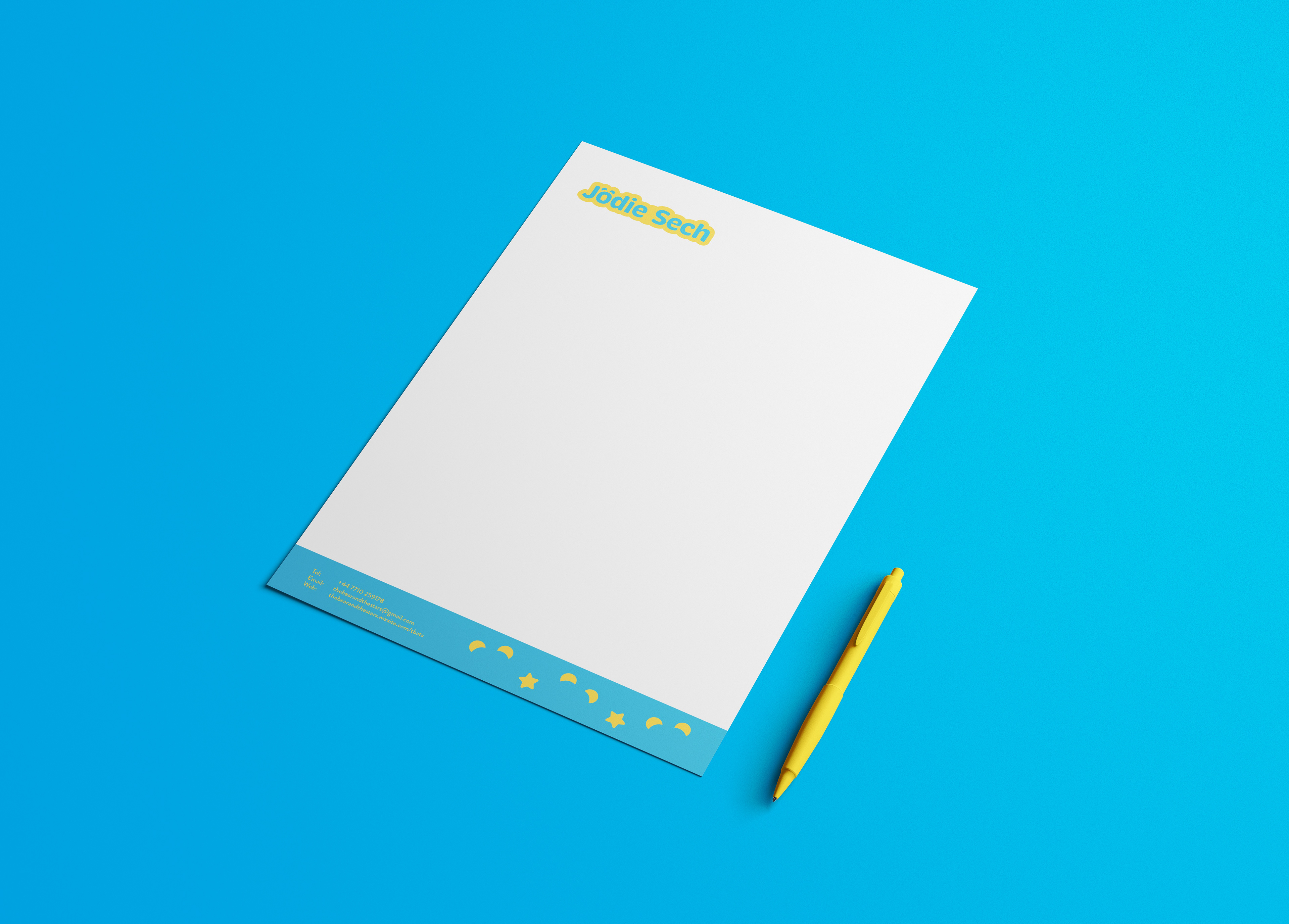
Bear and Stars is the name of a personal brand for a friend named: Jodie Sech. She wanted to update her brand and had expressed interest in her goal and ambition to work in animation, more specifically in Children's TV.
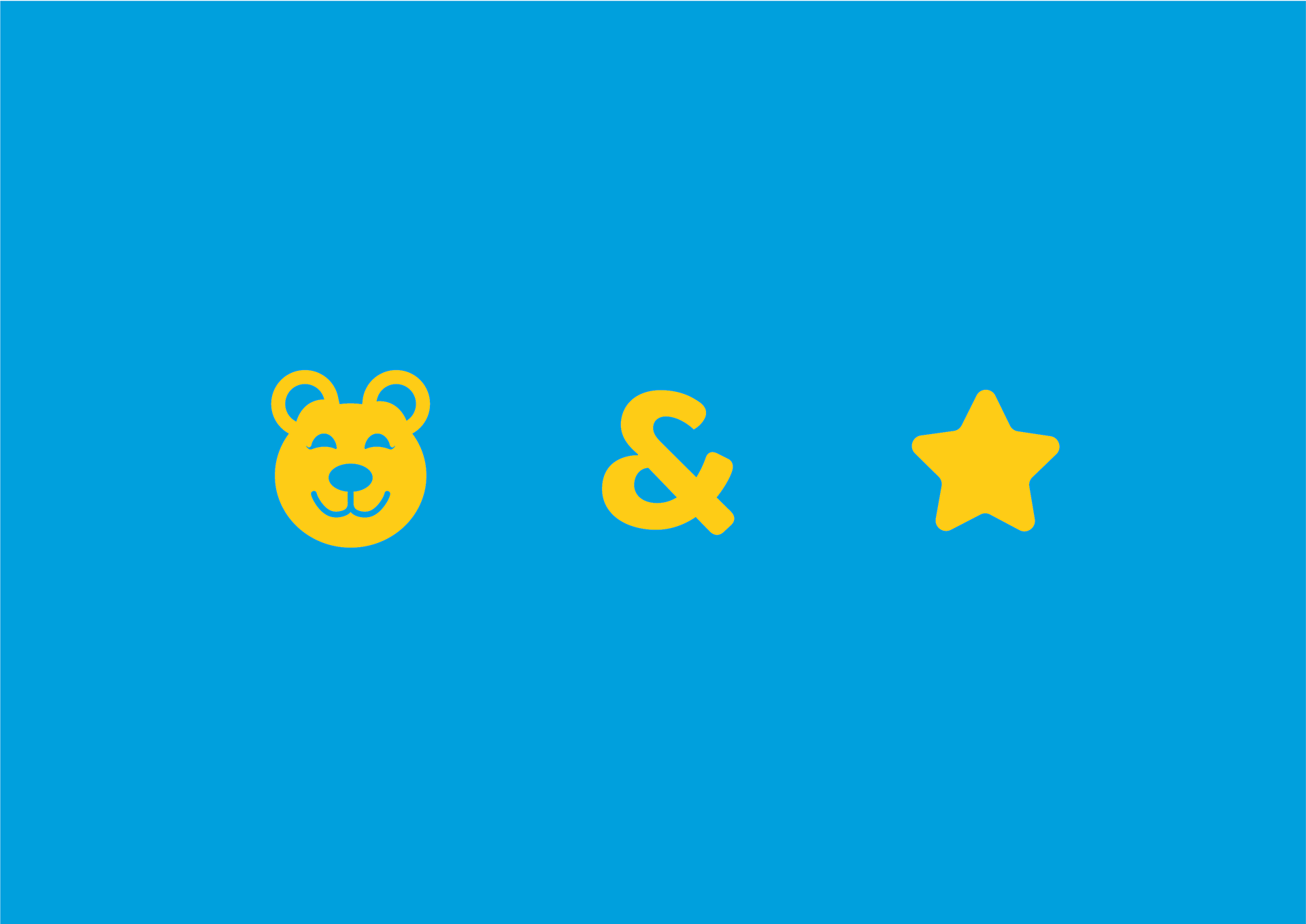
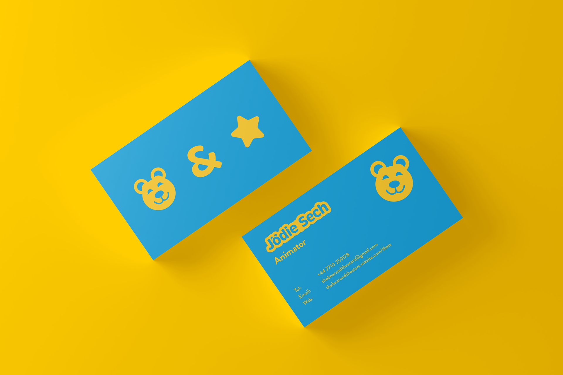
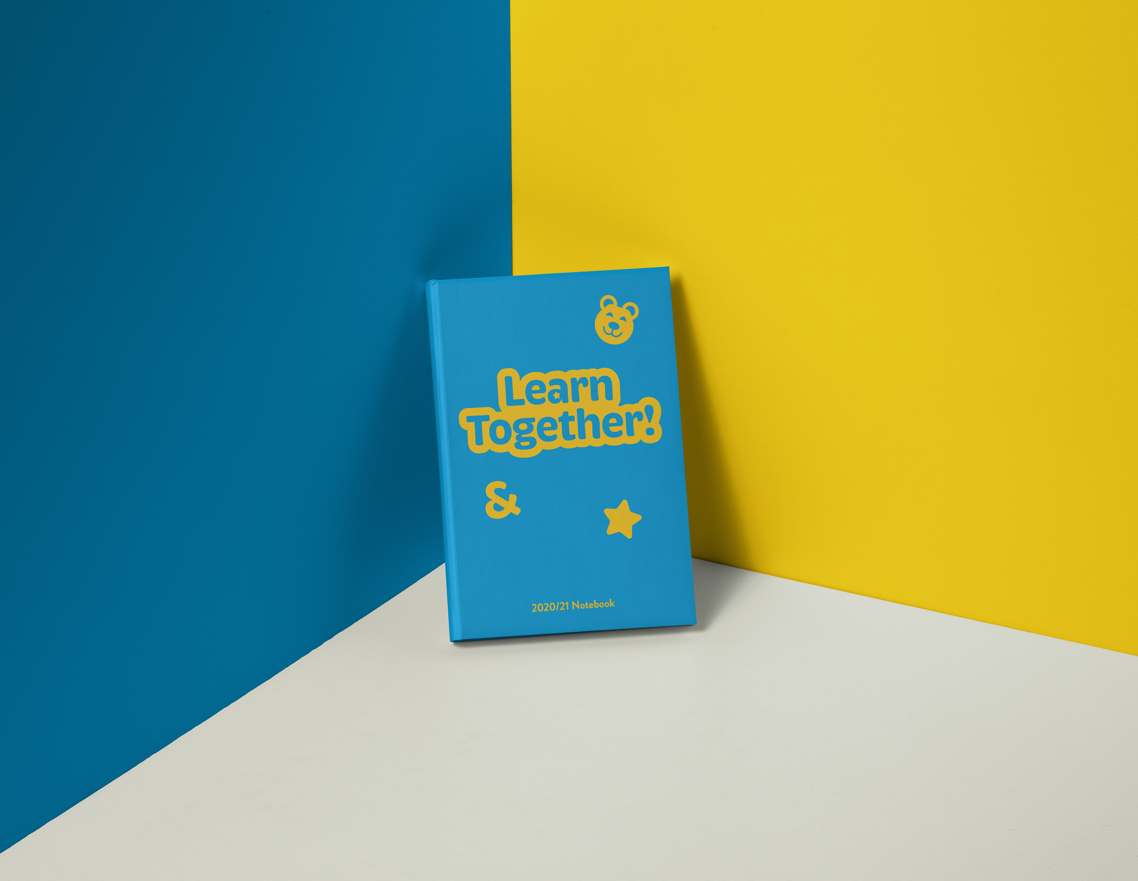
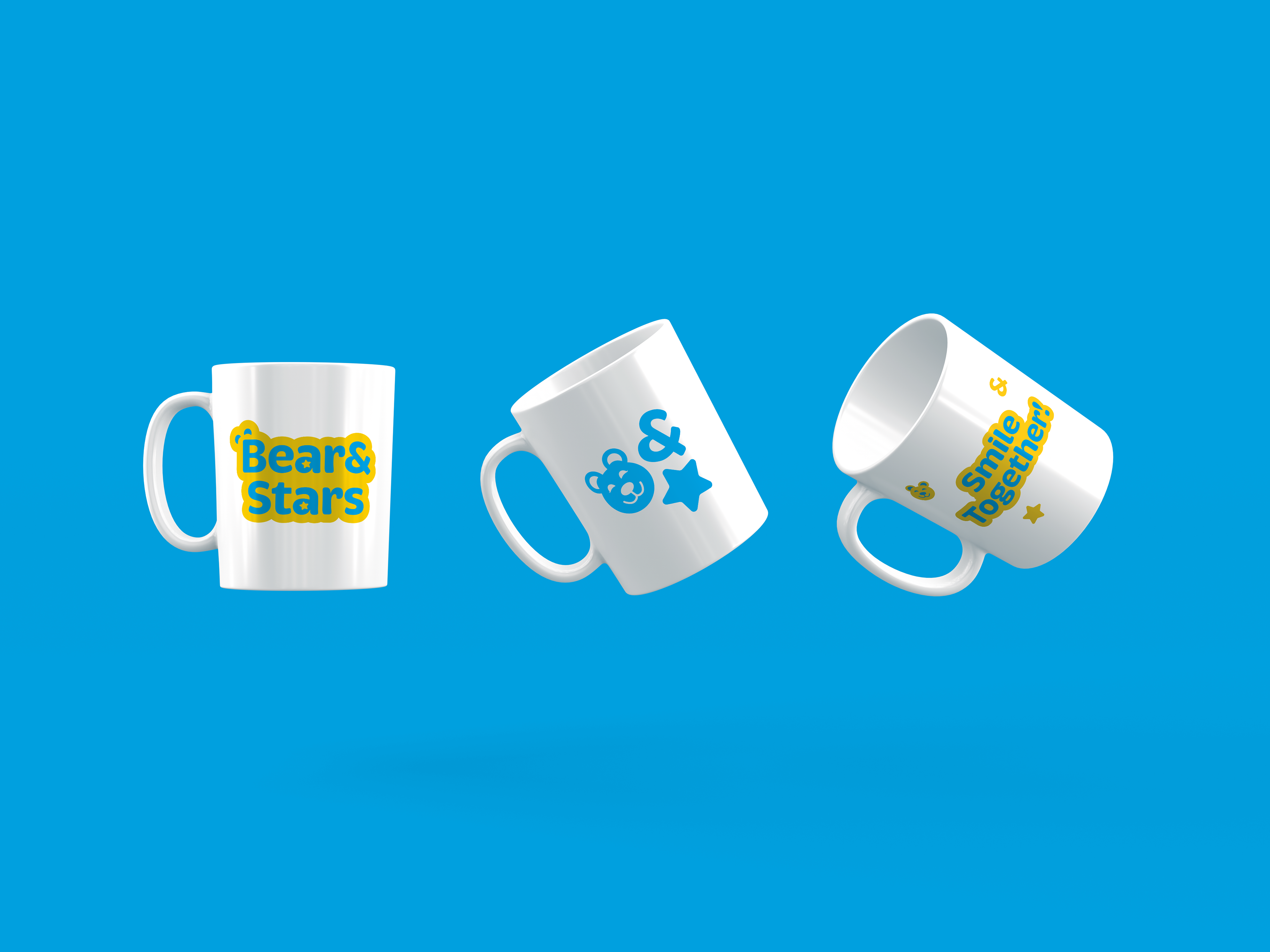
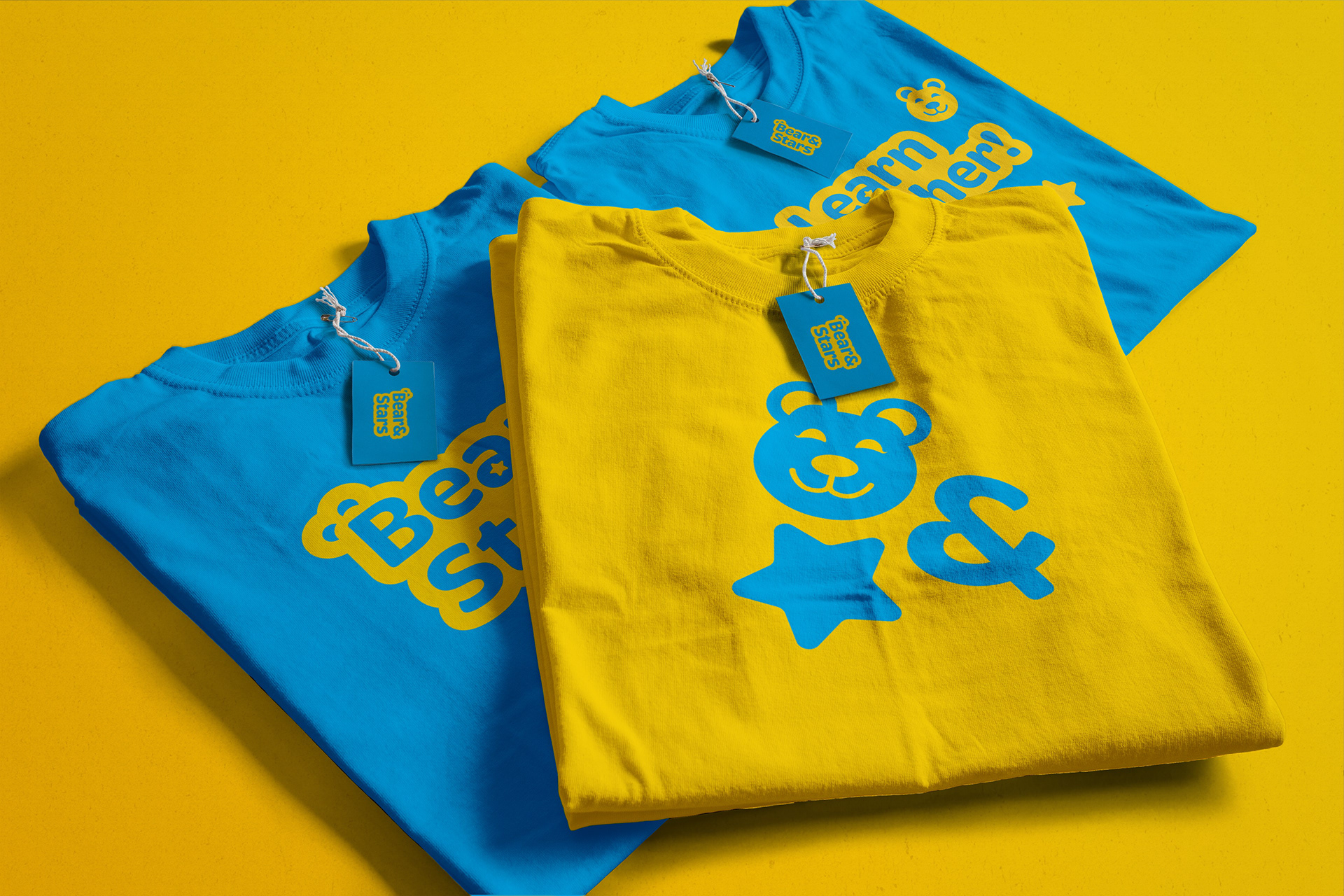
The Logo has bear ears placed over the B, which also doubles as Space Buns, a hairstyle often worn by Jodie. The & has been tilted to show interest and intrigue. A lot of animals, bears included, when curious of something will tilt their heads, and the ampersand is a representation of that natural reaction.
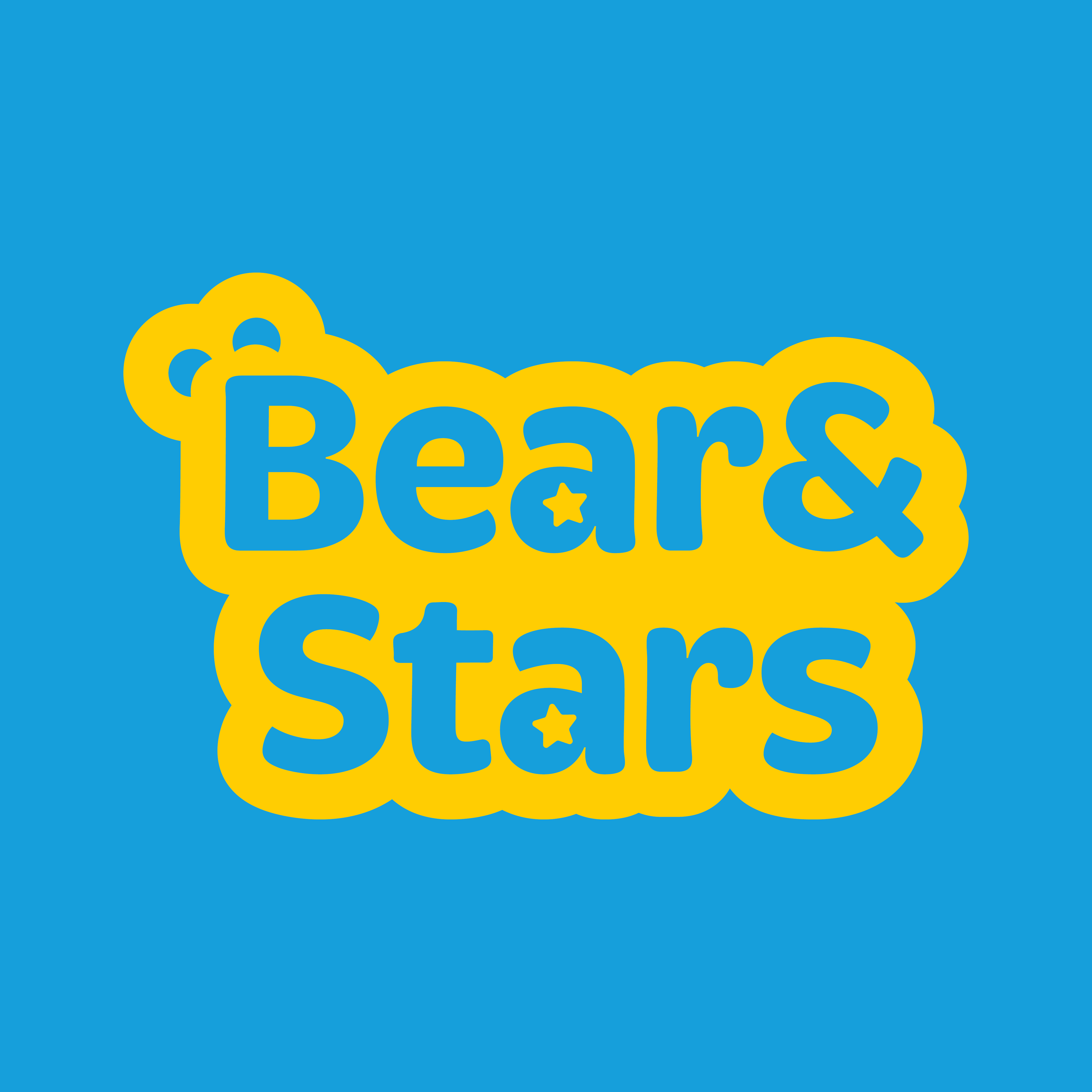
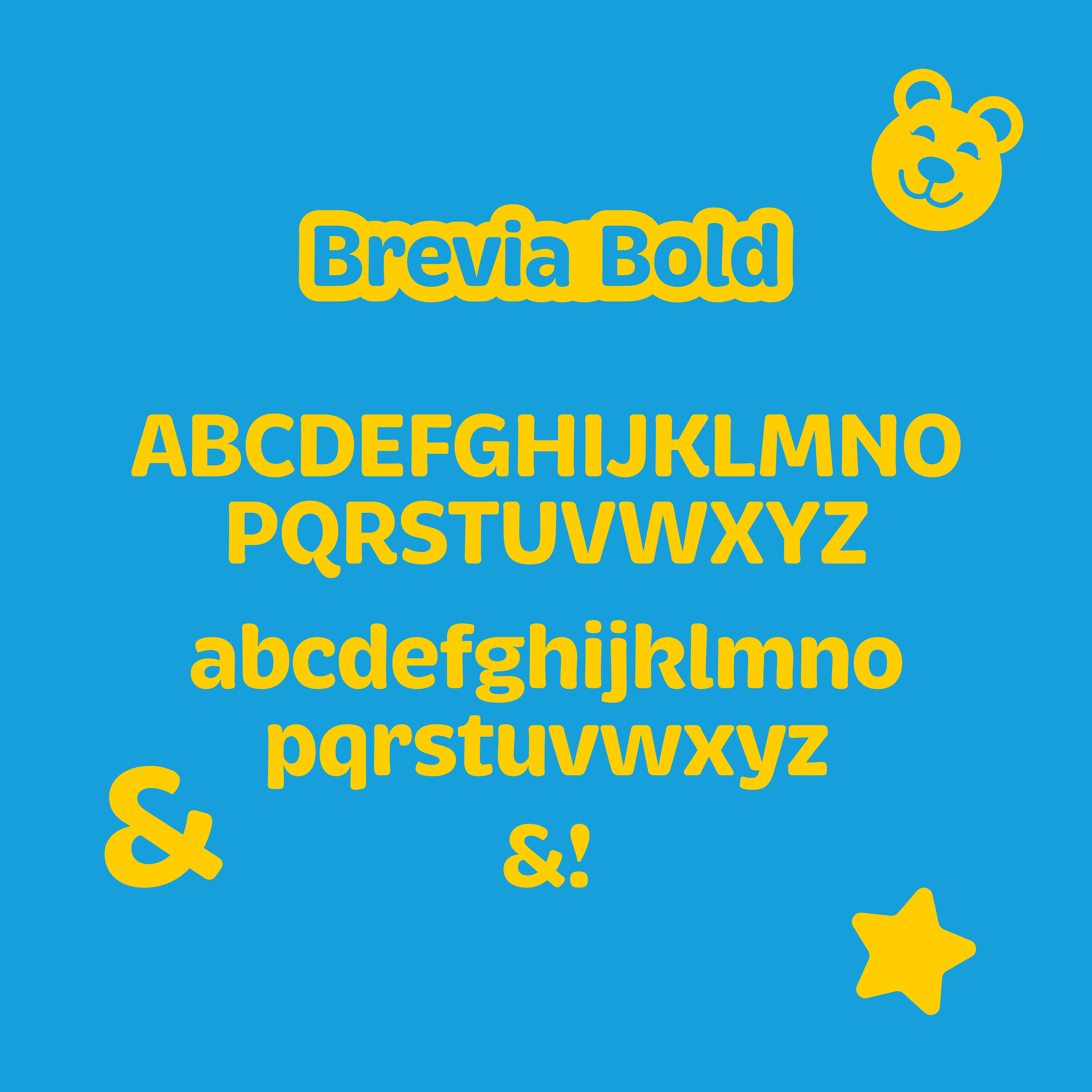
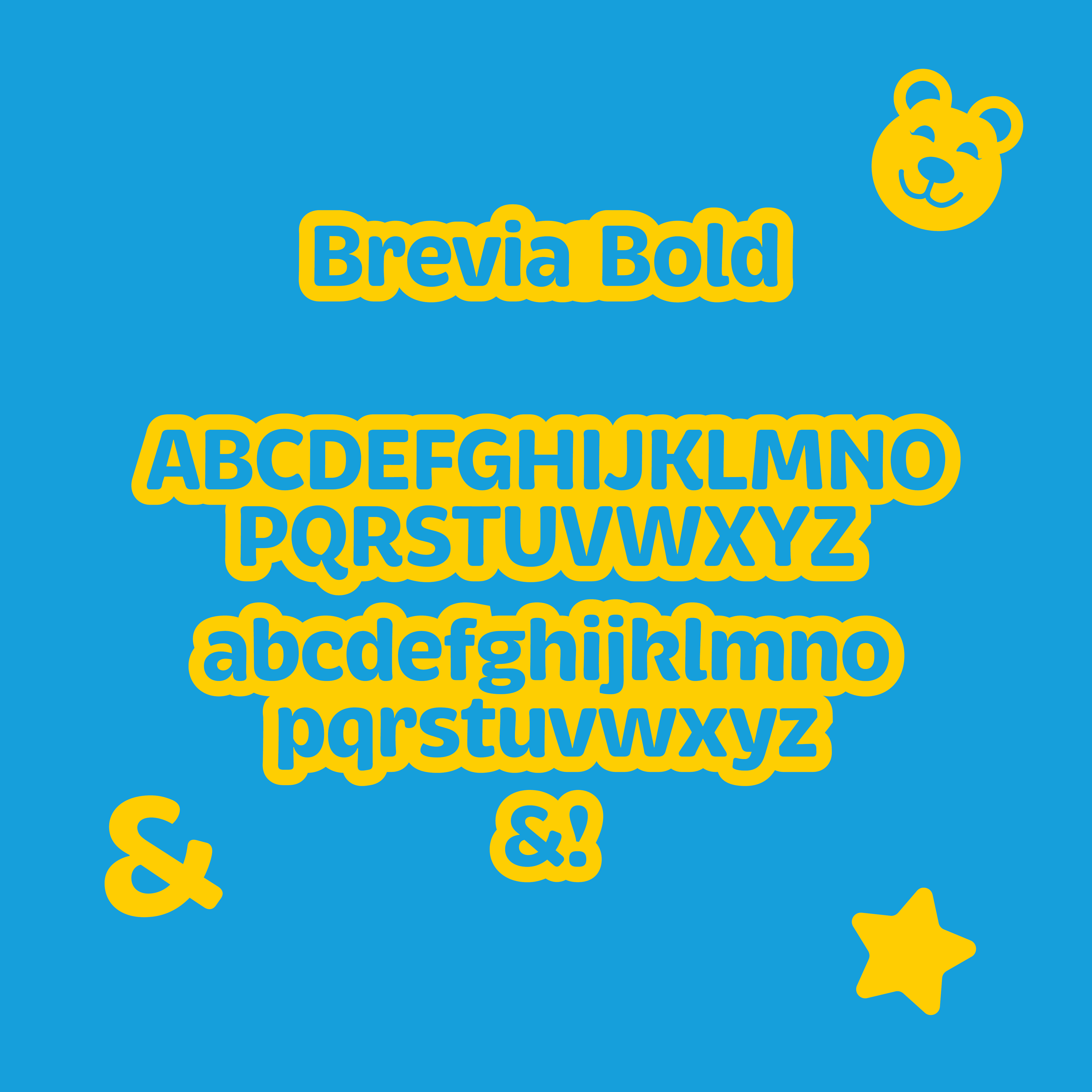
Brevia was chosen as the main typeface as it has a nice round and welcoming personality, similar to Jodie and those characteristics are a staple of children's TV branding, as it is easy to read and friendly/approachable
Why does a teacher do what they do?
The difference between being a teacher for young kids and working in Children's TV is only the method of educating, the why/the beliefs are the same.
The best teachers are the ones that go beyond education. They inspire, they tell their students they can achieve anything if they put their mind to it, they tell them to be nice to people, to tackle a problem head on, to be part of a community and be proud of who you are. They push the next generation to greatness and say:
Let’s do it together!
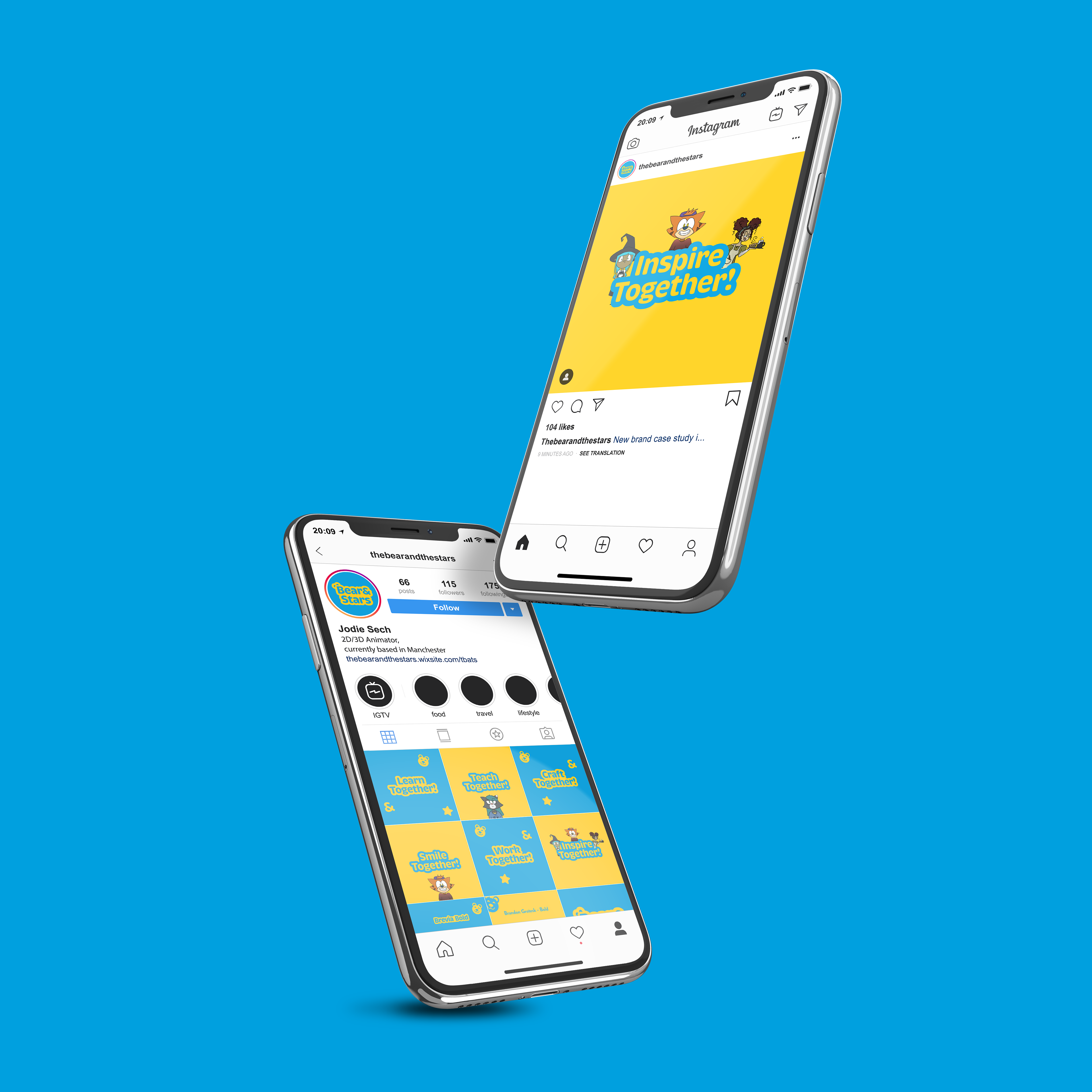
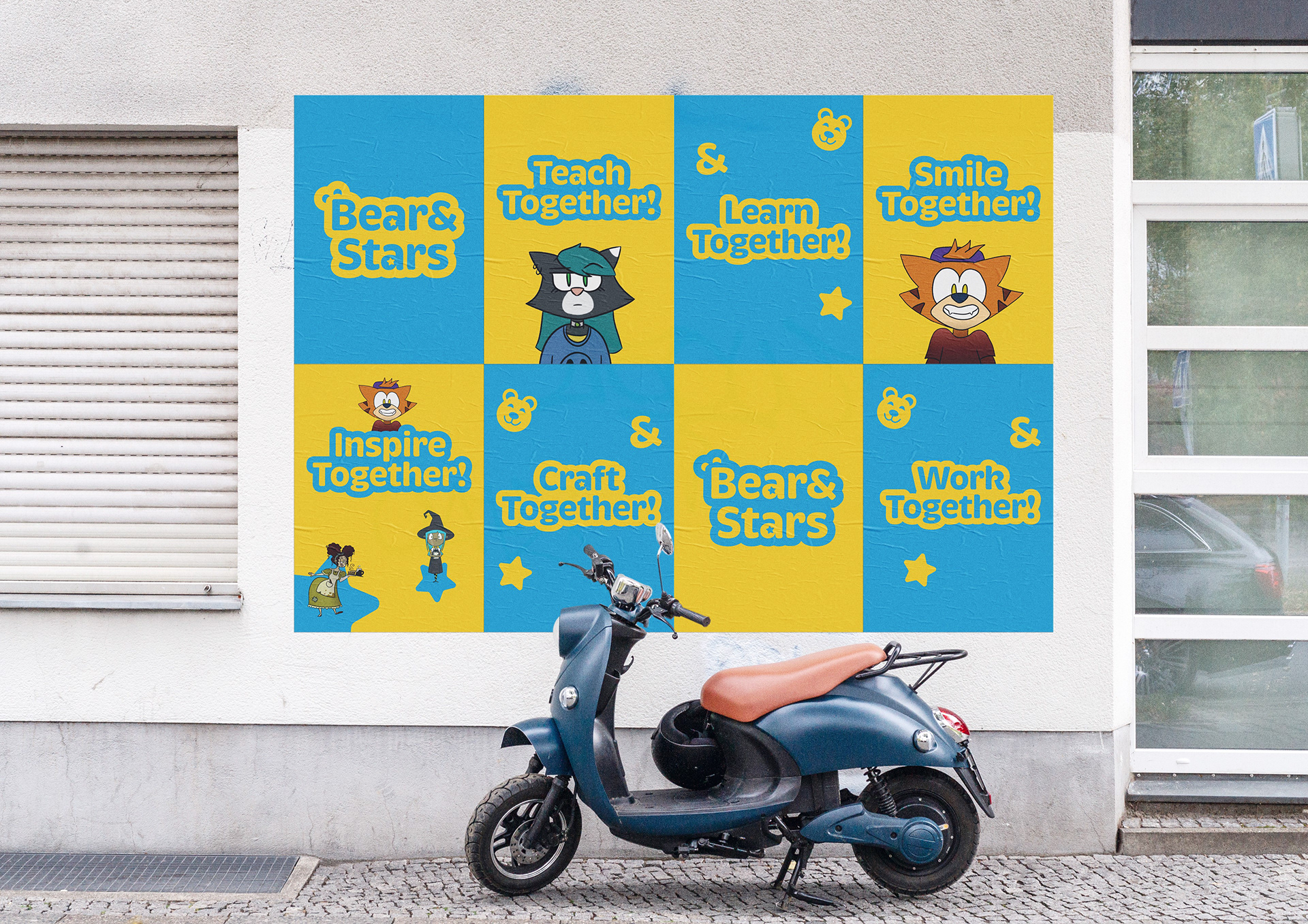
Jodie creates characters from animals as she wishes to educate children about the importance of the preserving the environment and looking out for the animals that live in it.
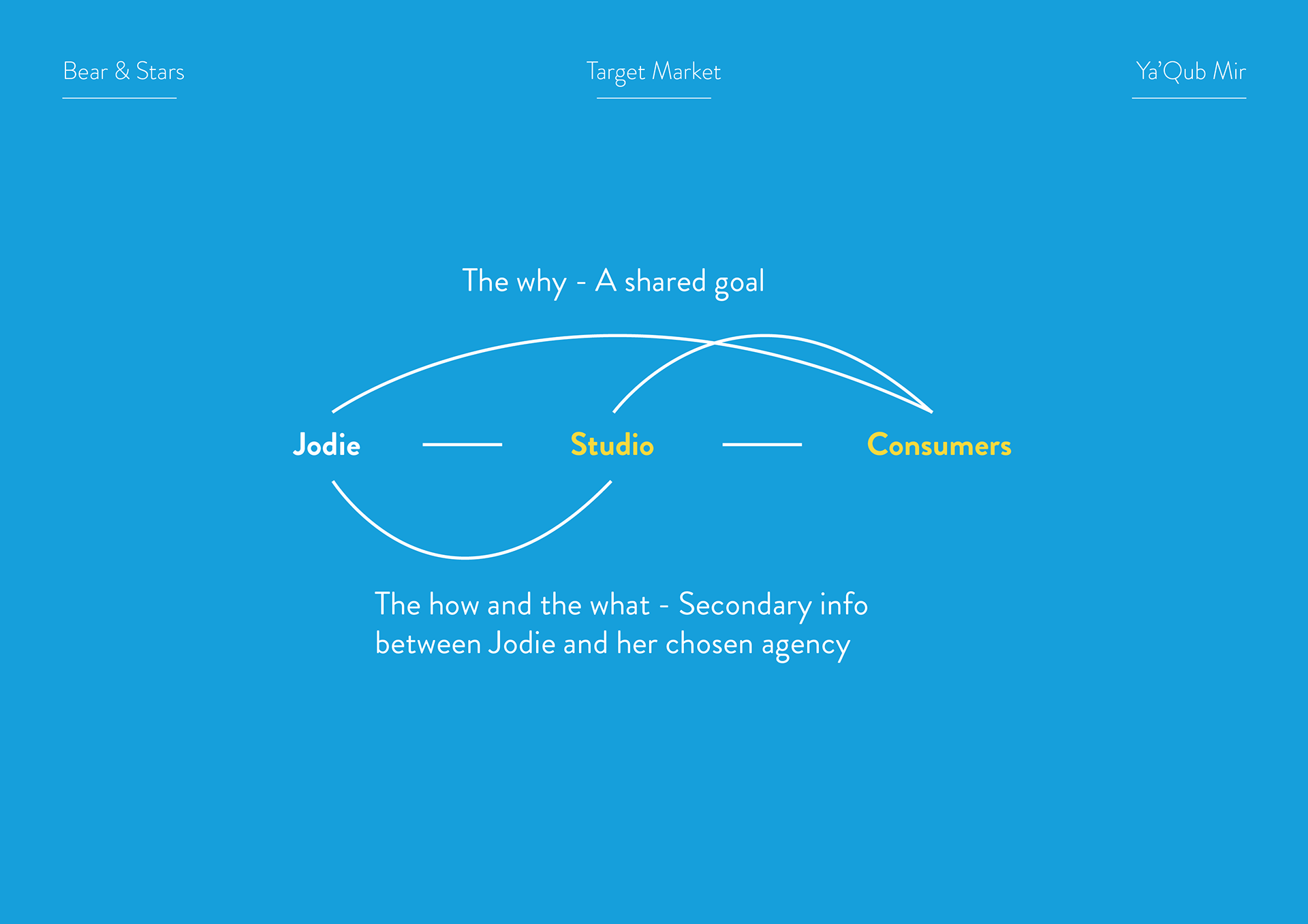
Below is some slides from the strategy presentation
